Curation - Field Properties - UI Properties
Intended audience: END-USERS ANALYSTS DEVELOPERS ADMINISTRATORS
AO Platform: 4.3
Overview
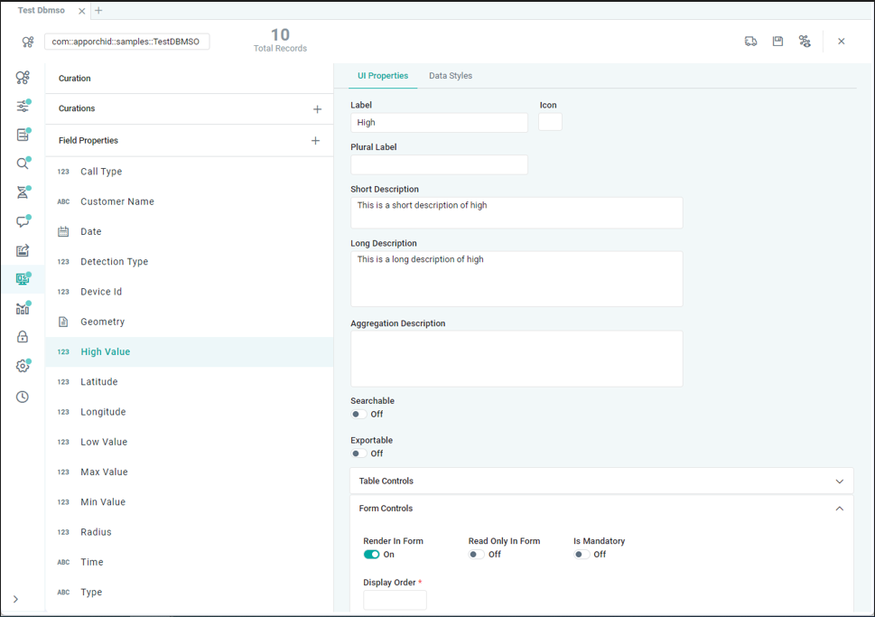
This section contains an overview of all properties MSO Curation > Field Properties > UI Properties tab.
UI Properties
The UI Properties panel is used to configure how the individual field properties of the current MSO will be displayed in the UI specifically for auto-generated Table and Forms.
Label | Description |
|---|---|
Label | The Label field allows user to select a different display label for the selected field property. |
Icon | The Icon field allows user to select an icon to represent the specific Field Property. When clicking the Icon field, the File Manager opens to allow selection of an icon and/or uploading of a new icon. |
Plural Label | The Plural Label field allows user to enter a label description in plural. |
Short Description | The Short Description field allows user to enter a short description used in Search dialogs for easy identification of the MSO field property. |
Long Description | The Long Description field allows user to enter a longer, more explanatory description of the selected field property. |
Aggregation Description | The Aggregation Description field allows user to enter a description for aggregated values for when this field property is used with an aggregation, such as Count, Sum, Min, Max, and Avg. |
Searchable | On/Off toggle |
Exportable | On/Off toggle |
Table Controls | |
Render In Table | When Render In Table option is ON, displays the field property in the table. |
Hide In Table | When Hide In Table is ON, hides the field property in the table. |
Additional Properties | A repeater section of Key / Value pairs to show in the table. |
Form Controls | |
Render In Form | When Render In Form, displays the field property in the form. |
Read Only In Form | When Read Only In Form option is enabled, data for field property cannot be edited. |
Is Mandatory | When Is Mandatory option is ON, displays an asterisk next to label to indicate the field property is a mandatory field. |
Display Order | Add a number to indicate the order between all fields that the current field property will be displayed. |
UI Component | The UI Component dropdown displays a pre-defined list of components allowing user to select how to render the field property in form. Example: Checkbox - for this property, a checkbox control displays. |
Group | The Group dropdown allows user to create field groups, then select a group for the field property to be displayed within. Example: Personal Details, Address Details. |
Validator JS | The Validator JS dropdown allows user to select a JavaScript function which will validate new or updated data for the field property. Example: Use Validate Email as Validator JS for an email field property to ensure that email address entered into field is valid. |
Validator Class | The Validator Class offers additional custom validation as a server-side operation, ie when new/updated data for field property is saved, the data can be validated by the AO Platform server. |
Validation Message | The Validation Message is displayed to the user if validation of new/updated data for field property fails. Example: If a mandatory property is not entered the custom Validation Message will be displayed. |
Edit Format JS | The Edit Format JS option allows user to select a JavaScript function which will determine the formatting of the data for the field property during editing. |
Display Format JS | The Display Format JS option allows user to select a JavaScript function which will determine the formatting of the data for the field property when displayed in the form. Example: Use Format Percent to display the data for field property with %-sign. |
Additional Properties | A repeater section of Key / Value pairs to show in the form. |