Curation - Heatmap Chart
Intended audience: END-USERS ANALYSTS DEVELOPERS ADMINISTRATORS
AO Platform: 4.3
Overview
This section provides an overview of a Heatmap Chart. A Heatmap Chart is a visualization tool that uses colors to represent data values in a matrix-like layout, making it ideal for identifying patterns in large datasets.
Configuration of Heatmap Chart
 |   |  |
Properties
Label | UI Widget | Default | Description |
|---|---|---|---|
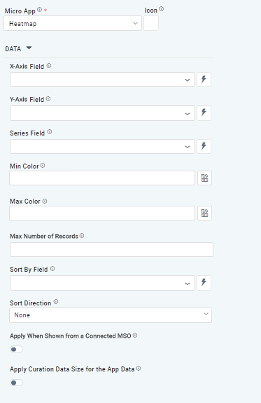
DATA | |||
| Dropdown w/Expression option |
| The X-axis Field allows the user to select the MSO Field Property to represent the X-axis values in the Chart. |
| Dropdown w/Expression option |
| The Y-axis Field allows the user to select the MSO Field Property to represent the Y-axis values in the Chart. |
| Repeater Dropdown w/Additional Properties, Expression, and Color options |
| The Series Fields allows the user to select an MSO Field Property to represent the Series Field. |
|
| Select a color value representing the lowest value in the Heatmap grid. Other values will be colored according to the range of values between lowest and highest value. | |
|
| Select a color value representing the highest value in the Heatmap grid. Other values will be colored according to the range of values between lowest and highest values. | |
| Number Field |
| Option to set a Max number of records to be used by the Chart. |
| Dropdown w/Expression option |
| The Sort By Field option allows the user to select a field to sort the data and provides the flexibility to define a custom expression for more advanced sorting criteria. |
| Dropdown |
| Option to set Sort order for data in the Chart to either Ascending or Descending. |
| ON/OFF Toggle | OFF | If enabled, the curation will be shown if data comes from a Connected MSO. If disabled, the curation will be suppressed. |
| ON/OFF Toggle | OFF | If enabled, the Curation will only be shown if matching the Record Count values selected for Curation Filters. |
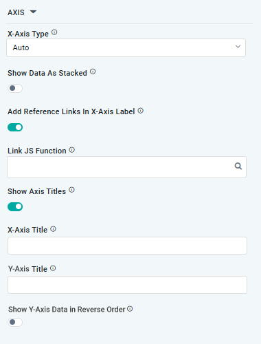
AXIS |
|
|
|
| Dropdown |
| Option to select the format of the X-Axis, including Linear, Logarithmic, DateTime, Category, Color, and BellCurve. |
| ON/OFF Toggle | OFF | If enabled, data for multiple series will be displayed as stacked for each X-Axis value. If disabled, the data will be shown as grouped. |
| ON/OFF Toggle |
| If enabled, X-Axis labels will be converted into clickable links, with their content defined by the JavaScript in the Link JS Function. When disabled, the labels will not include links. |
| Text Field w/Search |
| The Link JS function allows the user to select from an existing JavaScript Function to be used to generate links for the X-Axis Labels |
| ON/OFF Toggle | ON | If enabled, titles can be added to both the X-Axis and Y-Axis. If disabled, the X-Axis and Y-Axis will not have titles. |
… X-Axis Title | Text Field | Enter a Title for the X-Axis. | |
… Y-Axis Title | Text Field | Enter a Title for the Y-Axis. | |
… Show Y-Axis Data in Reverse Order | ON/OFF Toggle | OFF | If enabled, the data displayed on Y-Axis will be displayed in reverse order. |
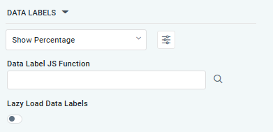
DATA LABELS |
|
|
|
| Dropdown w/Additional Properties option |
| Optional Additional Properties - expressed as a Key/Value pair. |
… Additional Properties |
|
| Optional Additional Properties - expressed as a Key/Value pair. |
| Text Field w/Search |
| The Data Label JS function allows the user to search for and define JavaScript functions that control the display or behavior of data labels in a chart. |
| ON/OFF Toggle | OFF | If enabled, the Heatmap Chart curation controls whether data labels are loaded gradually as the chart is interacted. |
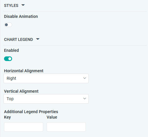
STYLES |
|
|
|
| ON/OFF Toggle |
| The Disable Animation toggle refers to turning off any animated transitions or effects when the chart or visualization is rendered or updated. |
CHART LEGEND | |||
| ON/OFF Toggle | ON | If enabled, the chart will include a chart legend showing what the color values show in the Heatmap Chart. |
| Dropdown | Right | Select the horizontal alignment, including Left, Center, or Right. |
| Dropdown | Top | Select the vertical alignment, including Top, Middle, or Bottom. |
| Optional Additional Properties - expressed as a Key/Value pair. |
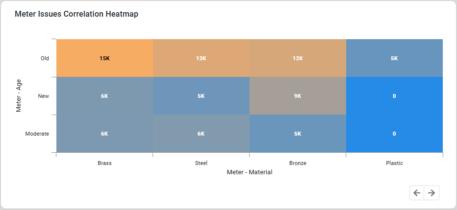
Examples of Curated Heatmap Chart