Curation - Sankey Chart
Intended audience: END-USERS ANALYSTS DEVELOPERS ADMINISTRATORS
AO Platform: 4.3
Overview
This section provides an overview of a Sankey Chart. The Sankey Chart is a flow diagram used to visualize the movement of values, such as resources, data, or energy, between different entities or categories. The chart uses nodes (representing entities) and links (representing flows) to provide an intuitive way to display relationships, proportions, and transitions in a system.
Configuration of Sankey Chart
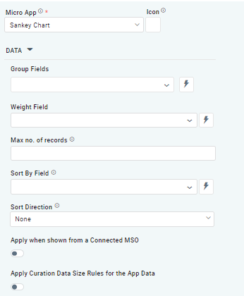  |
Properties
Label | UI Widget | Default | Description |
|---|---|---|---|
| Dropdown w/Expression option | The Group Fields identify the start nodes for each flow link. | |
| Dropdown w/Expression option | The Weight Field identifies a field aggregation. | |
| Number Field | Sets a limit for how many records will be used. | |
| Dropdown w/Expression option | The Sort By Field option allows the user to select a field to sort the data and also provides the flexibility to define a custom expression for more advanced sorting criteriaW | |
| Dropdown | Sets the sorting order for grouped fields, including Ascending, Descending, or None. | |
| ON/OFF Toggle | Disable | The Apply When Shown from a Connected MSO ON/OFF Toggle determines whether the settings or actions are applied specifically when data is displayed through a connected MSO.
|
| ON/OFF Toggle | Disable | If enabled, the Record Count rules will be applied. The series will not be shown if the Record Count rules are not met. |
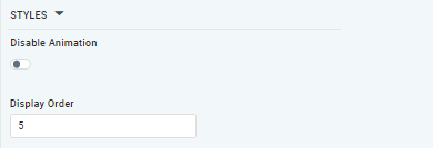
| ON/OFF Toggle |
| The Disable Animation toggle turns off any animated transitions or effects that occur when the chart or visualization is rendered or updated. |
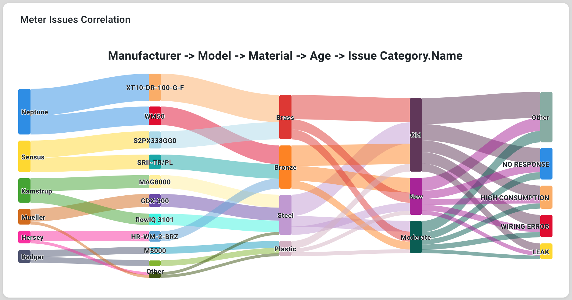
Examples of Curated Sankey Chart