Brand Colors
Intended audience: ADMINISTRATORS DEVELOPERS
AO Platform: 3.5
Overview
This topic describes the style configurations for Brand Colors.
Variable Names
--vux-primary-900
CSS Variable Name | --vux-primary-900 |
|---|---|
Light |  |
Dark |  |
Description
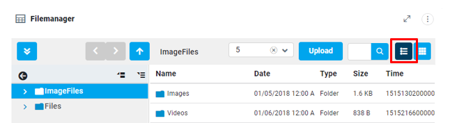
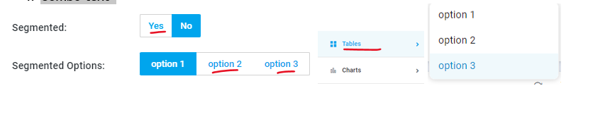
Used for file manager segmented buttons
Examples
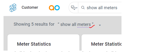
File Manger toolbar - segment - button – selected.
--vux-primary-700
CSS Variable Name | --vux-primary-700 |
|---|---|
Light |  |
Dark |  |
Description
Used for hover of primary color.
Examples
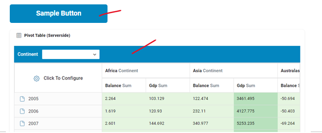
Submit buttons hover.
Accordion header hover
Pivot table (SS) header background color
--vux-primary-600
CSS Variable Name | --vux-primary-600 |
|---|---|
Light |  |
Dark |  |
Description
Used for text in primary color.
Examples
Submit buttons text, with background is white.
Sidebar text color on selection & hover
List selected text color
Combo text
--vux-primary-500
CSS Variable Name | --vux-primary-500 |
|---|---|
Light |  |
Dark |  |
Description
Wherever blue color appearance needed, we are using this variable.
Examples
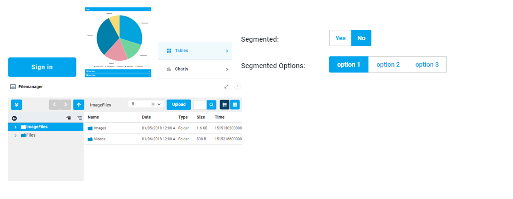
Submit, Segmented buttons background.
Accordion header background
Sidebar icon color on selection & hover
Slider handle color & Range Slider
File manager buttons background.
--vux-primary-50
CSS Variable Name | --vux-primary-50 |
|---|---|
Light |  |
Dark |  |
Description
Used for sidebar hover background.
Examples
Berger menu list hover & selected background color
--vux-secondary-500
CSS Variable Name | --vux-secondary-500 |
|---|---|
Light |  |
Dark |  |
Description
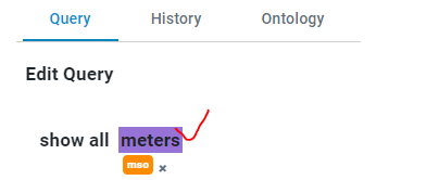
Used for checkbox, input & text area focus border colors.
Examples
Checkbox border color.
Input & Textarea focus border color
Segmented active button background
Icon hover color

--vux-secondary-filled-checkbox
CSS Variable Name | --vux-secondary-filled-checkbox |
|---|---|
Light |  |
Dark |  |
Description
Used for accent-color for checkbox buttons in OL Maps
Examples:
--vux-accent-700
CSS Variable Name | --vux-accent-700 |
|---|---|
Light |  |
Dark |  |
Description
Used for default styles of toc, currently these styles were not using because of solution level template, style overrides.
Examples
ao-vux-toc_item_selected text color.
.webix_list_item.webix_selected, .ao-vux-toc_indicator_checked background.
--vux-accent-500
CSS Variable Name | --vux-accent-500 |
|---|---|
Light |  |
Dark |  |
Description
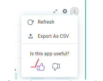
Used for feedback icon selected color.
Examples:
Examples
Feedback icon selected color.
hhhh
.vux_doccontent_number_container background color
--vux-accent-300
CSS Variable Name | --vux-accent-300 |
|---|---|
Light |  |
Dark |  |
Description
Used for highlight-violet background color in tagger.
Examples
highlight-violet background color in tagger.
tag-color-violet background in tagger.
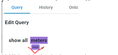
highlight.violet border-bottom color.
querybuilder-header-icon active icon color in query builder.

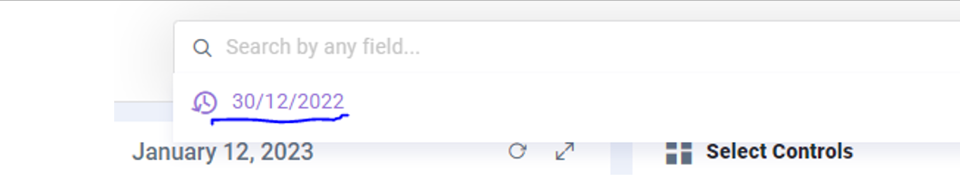
vux-richsearchpopup > list_item_history color.