Disabled Buttons & Inputs
Intended audience: ADMINISTRATORS DEVELOPERS
AO Platform: 3.4
Overview
This topic describes the style configurations for Disabled Buttons & Inputs.
Variable Names
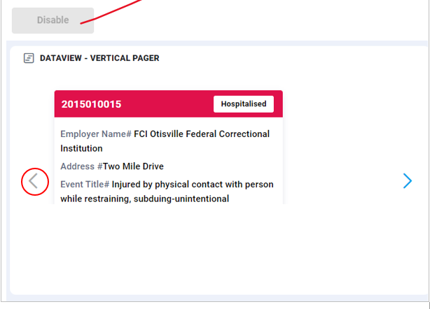
--vux-btn-disable-bg
CSS Variable Name | --vux-btn-disable-bg |
|---|---|
Light |  |
Dark |  |
Description
Used for disabled button background color
Examples
Disabled button background color
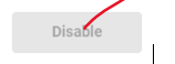
--vux-btn-disable-text
CSS Variable Name | --vux-btn-disable-text |
|---|---|
Light |  |
Dark |  |
Description
Used for disabled button text color
Examples
Disabled button text color
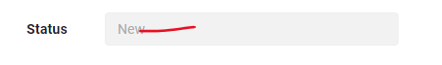
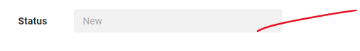
--vux-input-disabled-bg
CSS Variable Name | --vux-input-disabled-bg |
|---|---|
Light |  |
Dark | 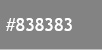 |
Description
Used for disabled input, textarea background
Examples
Disabled input, textarea background
--vux-btn-disable-text
CSS Variable Name | --vux-btn-disable-text |
|---|---|
Light |  |
Dark | 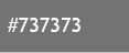 |
Description
Used for disabled input, textarea text
Examples
Disabled input, textarea text