Sidebar Component
Intended audience: ADMINISTRATORS DEVELOPERS
AO Platform: 3.5
Overview
This topic describes the style configurations for Sidebar Component.
Variable Names
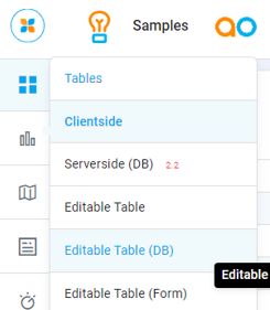
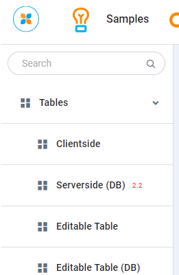
--vux-sidebar-bg
CSS Variable Name | --vux-sidebar-bg |
|---|---|
Light | 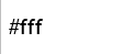 |
Dark |  |
Description
Used for sidebar container background color
Examples
Used for sidebar container background color
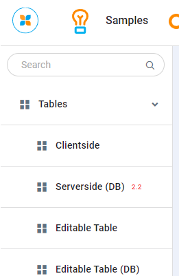
--vux-sidebar-bg-active
CSS Variable Name | --vux-sidebar-bg-active |
|---|---|
Light |  |
Dark |  |
Description
Used for sidebar menu list hover & list active backgrounds
Examples
Used for sidebar menu list hover & list active backgrounds
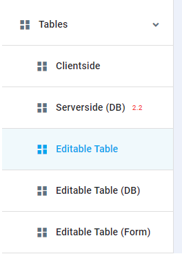
--vux-sidebar-border
CSS Variable Name | --vux-sidebar-border |
|---|---|
Light |  |
Dark | 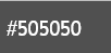 |
Description
Used for sidebar borders color
Examples
Used for sidebar borders color
--vux-sidebar-icon
CSS Variable Name | --vux-sidebar-icon |
|---|---|
Light | 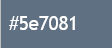 |
Dark | 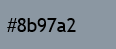 |
Description
Used for sidebar icon color
Examples
Used for sidebar icon color
--vux-sidebar-icon-active
CSS Variable Name | --vux-sidebar-icon-active |
|---|---|
Light |  |
Dark |  |
Description
Used for sidebar hover & activate icon color
Examples
Used for sidebar hover & activate icon color
--vux-sidebar-text
CSS Variable Name | --vux-sidebar-text |
|---|---|
Light |  |
Dark |  |
Description
Used for sidebar text color
Examples
Used for sidebar text color
--vux-sidebar-text-active
CSS Variable Name | --vux-sidebar-text-active |
|---|---|
Light |  |
Dark |  |
Description
Used for sidebar hover & active text color
Examples
Used for sidebar hover & active text color