Curation - Bar Chart
Intended audience: END-USERS ANALYSTS DEVELOPERS ADMINISTRATORS
AO Platform: 4.3
Overview
This topic provides an overview of a Bar Chart. A Bar Chart is a data visualization chart type commonly used to represent and compare values across different categories. It enables quick interpretation of trends, patterns, and comparisons, aiding decision-making.
Configuration of Bar Chart
  |    |    |
Properties
Label | UI Widget | Default | Description |
|---|---|---|---|
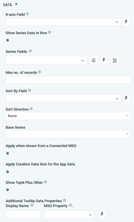
DATA |
|
|
|
| Dropdown w/Expression option |
| The X-axis Field allows the user to select the MSO Field Property to represent the X-axis values in the chart. |
| ON/OFF Toggle | OFF | If enabled, select a single Series Type and Series Field below. If disabled, select one or more Series Fields below. |
… Series Type Field | Dropdown w/Expression option |
| The Series Type Field dropdown in area chart curation allows users to specify a field that determines the type of series displayed in the chart. This property is only available if Show Series Data in Row is enabled. |
… Colors | Text Field w/Color Palette option |
| The Colors allows the user to select which color to use for the area of the series. See Curation - Field Properties - Data Styles | Selection-of-Color. This property is only available if Show Series Data in Row is enabled. |
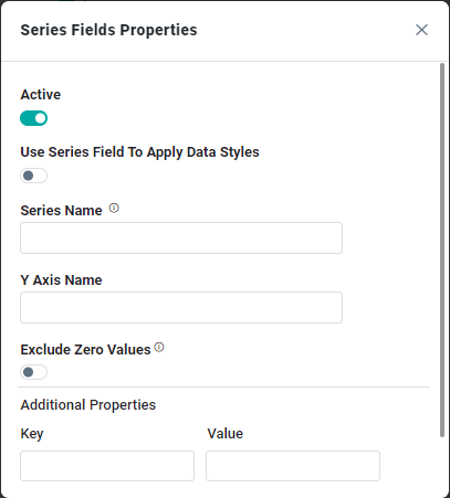
| Repeater Dropdown w/Additional Properties, Expression, and Color options |
| The Series Fields allow the user to select an MSO Field Property to represent the Series Field. |
… Active | ON/OFF Toggle |
| If enabled, the feature or data series is active and will be applied or shown in the Bar Chart. |
… Use Series Field to Apply Data Styles | ON/OFF Toggle |
| The ON/OFF Toggle controls whether data styles are applied based on the series field:
|
… Series Name | Text Field |
| The Series Name allows the user to enter Series Names that will be used to identify the data Series in Legend |
… Y-Axis Name | Text Field |
| The Y-Axis Name field displays the name of Y-Axis. |
… Exclude Zero Values | ON/OFF Toggle | OFF | If enabled, zero values will be excluded. By default, this setting is disabled. |
… Additional Properties | Key / Value - Text Fields |
| Optional Additional Properties - expressed as a Key/Value pair. |
| Number Field |
| Option to set a Max number of records to be used by the chart. |
| Dropdown w/Expression option |
| The Sort By Field option allows the user to select a field to sort the data and to define a custom expression for more advanced sorting criteria. |
| Dropdown |
| Option to set Sort order for data in the Chart to either Ascending or Descending. |
| Dropdown |
| The dropdown Base Series field allows the user to select an option relating to each series Field, such as Bell Curve, Histogram, Pareto. |
| ON/OFF Toggle | OFF | The Apply When Shown from a Connected MSO ON/OFF Toggle determines whether the settings or actions are applied specifically when data is displayed through a connected MSO.
|
| ON/OFF Toggle | OFF | If enabled, the Record Count rules will be applied. If the Record Count rules are not met, the series will not be shown. |
| ON/OFF Toggle | OFF | If Show TopN plus Other enabled, the App will display only the Top N records along with a single aggregated category representing all other records. The number of records shown for the Top N is determined by an MSO Setting in the Easy Answers section. If disabled, the App will display all records based on the user's query. |
| Display Name - Text Field MSO Property - Dropdown |
| The Additional Tooltip Data Properties allow the user to select one or more MSO Field Properties to display their values in the tooltip when the user hovers over a data point. |
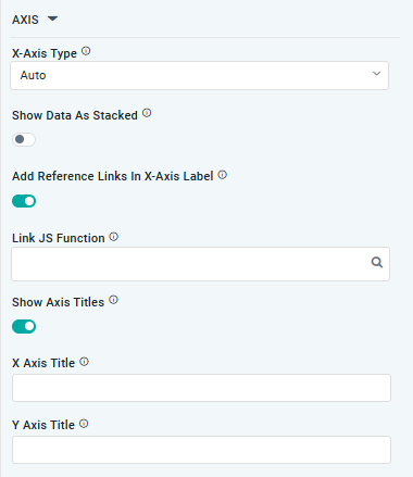
AXIS |
|
|
|
| Dropdown |
| Option to select the format of the X-Axis, including: Linear, Logarithmic, DateTime, Category, Color, and BellCurve. |
| ON/OFF Toggle | OFF | If enabled, data for multiple series will be displayed as stacked for each X-Axis value. If disabled, the data will be shown as grouped. |
| ON/OFF Toggle | OFF | If enabled, X-Axis labels will be converted into clickable links, with their content defined by the JavaScript in the Link JS Function. When disabled, the labels will not include links. |
… Link JS Functions | Text Field w/Search |
| The Link JS function allows the user to select from an existing JavaScript Function to be used to generate links for the X-Axis Labels |
| ON/OFF Toggle | OFF | If enabled, titles can be added to both the X-Axis and Y-Axis. If disabled, the X-Axis and Y-Axis will not have titles. |
… X-Axis Title | Text Field | Enter the Title for the X-Axis. | |
… Y-Axis Title | Text Field | Enter the Title for the Y-Axis. | |
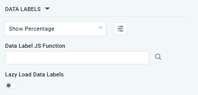
DATA LABELS |
|
|
|
| Dropdown w/Additional Properties option | Show Percentage | Optional Additional Properties - expressed as a Key/Value pair. |
… Additional Properties |
|
| Optional Additional Properties - expressed as a Key/Value pair. |
| Text Field w/Search |
| The Data Label JS function allows the user to search for and define JavaScript functions that control the display or behavior of data labels in a chart. |
| ON/OFF Toggle | OFF | If enabled, in the Bar Chart curation controls whether data labels are loaded gradually as the chart is interacted. |
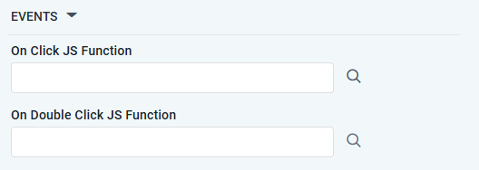
EVENTS |
|
|
|
| Text Field w/Search |
| The On Click JS function allows users to search for and define JavaScript functions that control the behavior when the user clicks a data point in the chart. If left empty, the default behavior for the chart will be used. |
| Text Field w/Search |
| The On Double Click JS function allows users to search for and define JavaScript functions that control the behavior when the user double clicks a data point in the chart. If left empty, the default behavior for the chart will be used. |
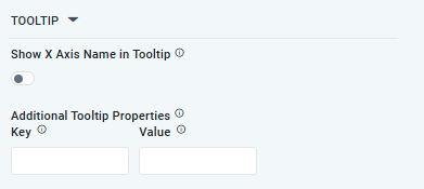
TOOLTIP |
|
|
|
| ON/OFF Toggle | OFF | If enabled, the tooltip displayed when hovering over data in the App will include the X-Axis name. If disabled, only the data value will be shown, without the X-Axis name |
| Key / Value - Text Fields |
| Optional Additional Tooltip Properties - expressed as a Key/Value pair. |
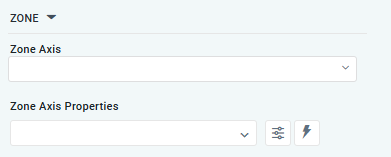
ZONE |
|
|
|
| Dropdown |
| The Zone Axis dropdown allows the user to select different zones within the chart, often used for visual emphasis or categorization. |
| Dropdown w/Additional Properties and Expression options |
| The Zone Axis Properties dropdown allows the user to customize the properties of the Zone Axis in an Bar Chart, |
… Zone Color | Text Field |
| The Zone color refers to the color applied to different zones within a chart. |
… Additional Properties | Key / Value - Text Fields |
| Optional Additional Tooltip Properties - expressed as a Key/Value pair. |
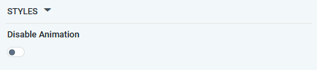
STYLES |
|
|
|
| ON/OFF Toggle | OFF | If enabled, the Disable Animation toggle refers to turning off any animated transitions or effects that occur when the chart or visualization is rendered or updated. |
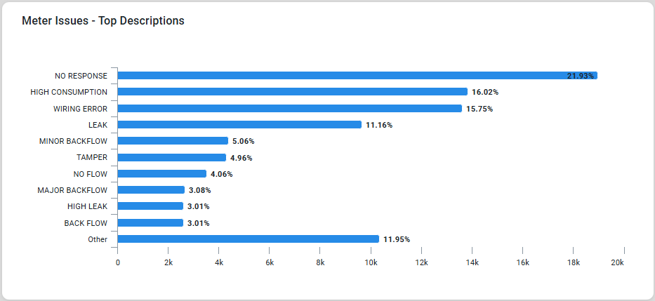
Examples of Curated Bar Chart