Curation - Field Properties - Data Styles
Intended audience: END-USERS ANALYSTS DEVELOPERS ADMINISTRATORS
AO Platform: 4.3
Overview
This section contains an overview of all properties MSO Curation > Field Properties > Data Styles tab.
Data Styles
This tab allows the user to provide configuration for individual MSO field properties - focusing on the styling of the properties during visualization.
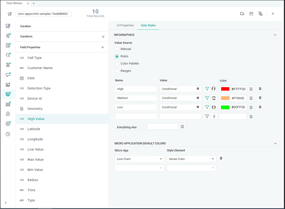
INFOGRAPHICS Section
This section allows the user to configure conditional Icons and Colors for the data values that come from the selected MSO Field Property. Start by selecting a Value Source. Value Sources available depend on the selected Field Property’s Data Type and determine where the Values are coming from and which Icon/Color(s) to apply.
Label | Description |
|---|---|
From Linguistics | From Linguistics radio button option allows user to select any Synonyms (and associated Word Rules) created for the MSO field property. Only available for String data type. |
| A friendly Name for the criteria of the Infographics. |
| The Value field allows user to select absolute Values from the Linguistics configuration from dropdown. Such values will be a combination of generated Value Based Synonyms and other Synonyms created manually on MSO - Linguistics page. |
| Select an Icon from the File Manager dialog representing the Value criteria. If a relevant Icon isn’t available, user can upload a new Icon. |
| Select a Color from palette representing the Value from Linguistics. See #Selection-of-Color. |
| This is the fallback Color selection for any values that are not covered by configured Rules. |
| See #Selection-of-Color. |
Manual | The Manual radio button option allows user to enter Values manually. Available for String and Number data types. |
| A friendly Name for the criteria of the Infographics. |
| The Value field allows user to enter absolute values directly in the text fields, eg. High/Medium/Low, Male/Female, ON/OFF. |
| Select an Icon from the File Manager dialog representing the Value criteria. If a relevant Icon isn’t available, user can upload a new Icon. |
| Select a Color from palette representing the Values added. See #Selection-of-Color. |
| This is the fallback Color selection for any values that are not covered by configured Rules. |
| See #Selection-of-Color. |
Rules | The Rules radio button option allows user to manually configure value criteria based on Data Source values. Available for all data types. |
| A friendly Name for the criteria of the Infographics. |
| The Value field will be populated once the Value Criteria have been configured Using Query Builder. |
| Click the Query Builder icon to open dialog. Add one or more criteria to define the Rules. A few examples:
|
| Select an Icon from the File Manager dialog representing the Value criteria. If a relevant Icon isn’t available, user can upload a new Icon. |
| Select a Color from the palette representing the Value criteria. See #Selection-of-Color. |
| This is the fallback Color selection for any values that are not covered by configured Rules. |
| See #Selection-of-Color. |
Color Palette | The Color Palette radio button option allows user to configure the color selection based on a Color Palette related to one or more Themes. See Selection of Color below. A Min and Max value can be provided for values that the color selection will be applied to. Available for String, Date and Number data types. |
| Select a Color Palette representing the Min and Max values provided. See #Selection-of-Color. |
| See #Selection-of-Color. |
| Enter a Minimum value relevant to the selected Field Property’s data type, eg. String, Date or Number. |
| Enter a Maximum value relevant to the selected Field Property’s data type, eg. String, Date or Number. |
Ranges | The Ranges radio button option allows user to configure the color selection related to one or more Themes for one or more ranges of data values. See Selection of Color below. Data values in ranges not provided will be assigned the color selection for the Everything else choice.
Available for Date, Boolean and Number data types. |
| Enter a From value relevant to the selected Field Property’s data type, eg. Date or Number. |
| Enter a To value relevant to the selected Field Property’s data type, eg. Date or Number. |
| Select a Color from the palette representing the Ranges configured. See #Selection-of-Color. |
| This is the fallback Color selection for any values that are not covered by configured Ranges. |
| Select a single Color for the True values for Field Property. Only applicable to Boolean data type. |
| Select a single Color for the False values for Field Property. Only applicable to Boolean data type. |
| See #Selection-of-Color. |
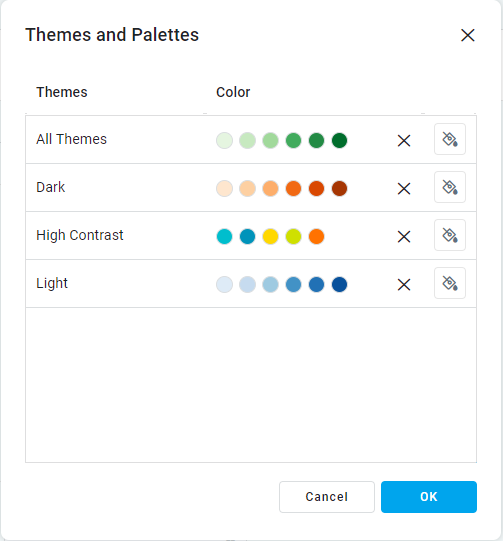
Selection of Color
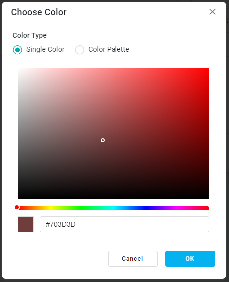
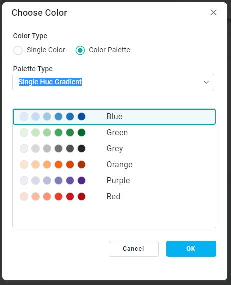
When any of the above Value Sources are selected to create a conditional color representation of the data from selected Field Properties, the Single or Color Palette choice made is done via the Themes and Palettes dialog. Once open, the user will see a list of preconfigured Themes available. A Single or Color Palette choice can be made for each Theme relating to the selected Field Property. Click the paintbrush icon to open the Choose Color dialog. Depending on the data type for the Field Property selected, Choose Color dialog will show options for Single Color, Color Palette, or both as seen in examples below.
If no color choice is made for a Theme entry, the default Color/Color Palette, as configured for the System-level Themes, and only available via the Admin solution, will be used as the fallback.
For the Color Palette option, Color Palettes are viewed by Palette Type - use dropdown to select a Palette Type:
Single Hue Gradient - a series of colors derived from the same single color configuration, eg. shades of blue, green, grey, …
Dynamic - a series of colors derived between a start and end color configuration, eg. blue-to-pink, green-to-blue, blue-to-purple, …
Curated - a series of colors manually selected. Such a Palette can either represent completely different/random colors, or a specific custom gradient.
See [Admin > UI > Color Palettes] page on how to configure Color Palettes.
Themes and Palettes | Choose Single Color | Choose Color Palette |
|---|---|---|
 |  |  |
MICRO APPLICATION DEFAULT COLORS Section
This is a repeater section where the above configuration of Colors can be applied to specific Micro Applications. If nothing is defined, the Micro Applications will be using the Data Style Colors associated with the Theme selected for the Solution.
Label | Description |
|---|---|
Micro App | The Micro App dropdown displays list of micro applications allowing user to select. |
Style Element | The Style Element dropdown displays list of style elements available for the selected Micro App. Select which Style Element for which the Color will be applied. Some examples…
|