
Intended audience: USERS
AO Embedded Easy Answers Agent: 1.1
The End User Experience
This section walks through what an end user will see and do, in the same order they will experience it. Every screenshot in this section is a live capture of the package running against a real App Orchid tenant, in the full-screen layout unless noted.
The Welcome Screen
An empty conversation shows suggested questions fetched from the ontology's welcome-question list.
A large centred avatar, a greeting built from userName, and full-width suggestion cards. The header carries brandLogoUrl + brandName, with a hamburger that opens the conversation menu.
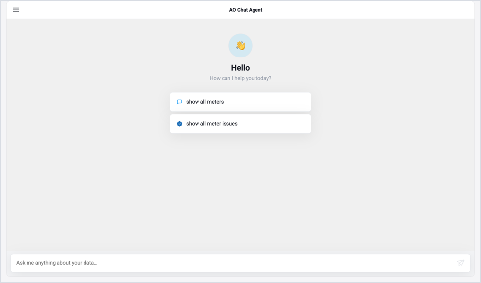
Rich welcome — branded header, avatar greeting, suggestion cards.
Asking a Question
The composer is a growing textarea. Enter submits, Shift+Enter inserts a newline. It is disabled while an answer is in flight, and a tooltip explains why whenever the input is unavailable, including when the tenant has not enabled third-party UI integration.
As-You-Type Spell Correction
English spelling is corrected as the user types. Correction fires on a word boundary.
-
Ontology terms and synonyms. The ontology's vocabulary is fetched once per ontology from
/api/ontology/vocabularyand registered as very-high-frequency words. They are therefore never corrected away, and a typo of a domain term resolves toward it —aloybecomesalloyrather thanally. The list is rebuilt only when the ontology uid or its content version changes.
Gating. The feature is owned by the ontology: enableAutoCorrection in the tenant's Easy Answers Ontology configuration is authoritative. The enableAutoCorrection prop is a host-level kill switch that can only turn correction off — it never forces it on when the ontology has disabled it. Permissions fail open, so while they are still loading, correction is active.
Progress while the agent works
Answering is a multi-stage pipeline, and the component reports it rather than showing an opaque spinner. A progress card names the current stage, counts elapsed seconds, and fills a percentage bar.
The Answer
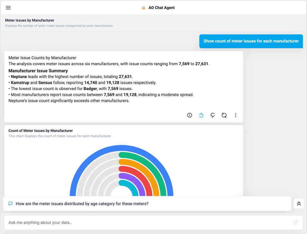
A completed answer is a narration bubble followed by the visualizations the backend selected for the result shape. The narration renders a headline, a summary sentence, a bold-titled findings block with bullets, and a closing observation, with inline markdown emphasis applied to the numbers.
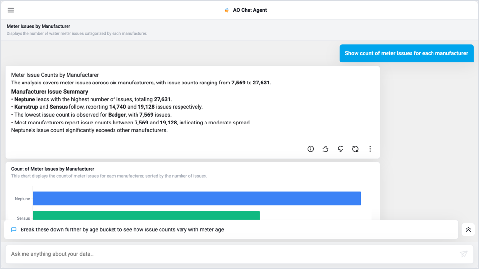
A complete answer — narration, action row, chart, and a follow-up suggestion.
The Answer Action Row
|
Control |
Tooltip |
What it does |
Gated by |
|---|---|---|---|
|
ⓘ |
About this answer |
Opens the About this Answer page for this response. |
always shown |
|
👍 |
Helpful |
Records positive feedback with an optional comment. |
enableFeedback |
|
👎 |
Not helpful |
Records negative feedback with an optional comment. |
enableFeedback |
|
↻ |
Retry |
Re-runs the question. From the About page you can also pick the interpretation mode first. |
enableRetry |
|
⋮ |
More options |
Opens a menu whose entry is Explain Query Reasoning. |
always shown |
|
✓ badge |
Verified answer |
Shown instead of nothing when the answer is verified or implicitly verified. |
verification state |
When a feature is disabled by the tenant's permissions, its control is hidden entirely. When it is present but temporarily unavailable — an answer is still streaming, for instance — the control is dimmed, and its tooltip explains the reason ("Feedback is disabled", "Retry is disabled").
About this Answer
The transparency page. It answers "why did I get this?" without the user needing to understand the pipeline.
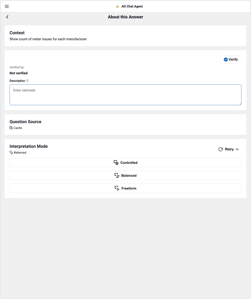
About this Answer — context, verification, source, interpretation mode and retry.
|
Card |
Shows |
|---|---|
|
Context |
The question as the backend interpreted it — the resolved question, not necessarily the literal text the user typed. This is the single most useful field for diagnosing a surprising answer. |
|
Verify |
Verification state: who verified the answer and when, plus a rationale field. An administrator can save or remove a verification from here. |
|
Question Source |
Where the answer came from: |
|
Interpretation Mode |
The accuracy mode used — |
|
Feedback |
Read-only display of any feedback already recorded for this answer. The interactive thumbs live on the bubble, not here. |
Answer Verification
Verification is a trust signal that survives the conversation. An answer can be:
-
Explicitly verified — a person opened the About page, entered a rationale, and saved a verification. The answer then carries a verified badge, and the same question will show that badge in future suggestion lists.
-
Implicitly verified — the backend matched the question to an already-verified question. A distinct badge marks this, with a copy affordance for the matched question text.
-
Not verified — the default.
Verification is gated by enableQuestionVerification in the tenant's agent configuration.
Feedback
Thumbs up or down opens a card inside the transcript with the question restated and a free-text comment field. Submitting records the rating and the comment against the conversation and workflow; the rating then renders as an active thumb on the action row and as a read-only chip in About this Answer.
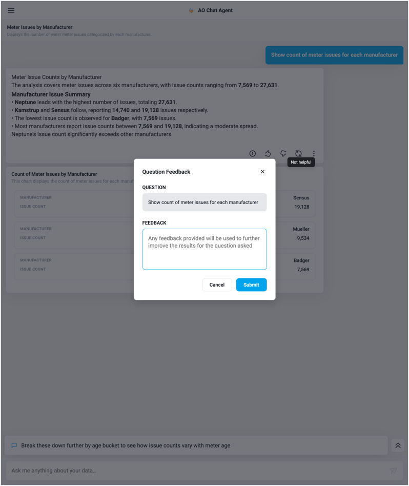
The feedback card — question restated, comment optional. |
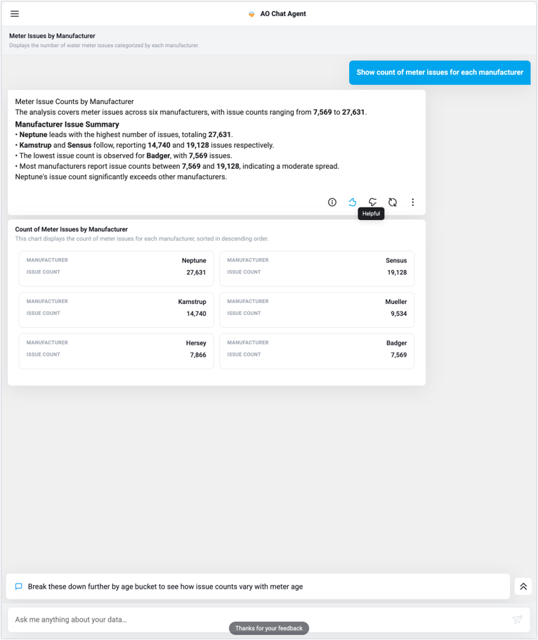
A recorded rating shows as an active thumb. |
|---|
All feedback UI and every feedback API call disappear when enableFeedback is false.
Retry and Interpretation Modes
Retry from the action row re-runs the question immediately at the same settings. Retry from the About page lets the user change how literally the agent should interpret the question first.
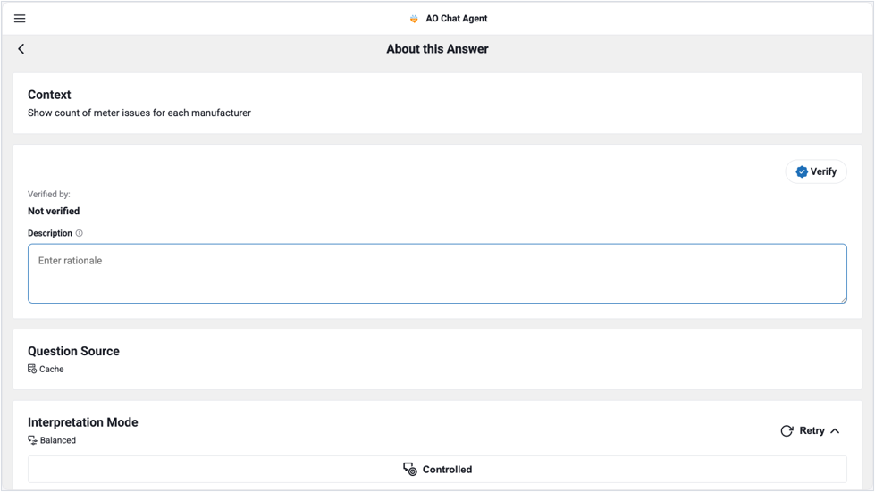
Expanding Retry reveals the interpretation modes.
|
Mode |
Behaviour |
|---|---|
|
Controlled |
Most literal. The agent stays tightly inside curated definitions and known vocabulary — highest precision, least tolerance for loose phrasing. |
|
Balanced |
The default. Some interpretation latitude while still anchored to the ontology. |
|
Freeform |
Most latitude. The agent will reason more freely about intent — useful for exploratory questions, at some cost in determinism. |
The available modes come from the tenant's queryModes configuration, and the whole card is hidden when enableLLMQueryMode is false. With that flag off, retry still works — it simply omits the query mode from the request.
Explain Query Reasoning
The ⋮ menu on any answer opens a reasoning trace: how the natural-language question was tokenised, which ontology objects and properties it was bound to, how ambiguities were resolved, and the steps the generated query performs.
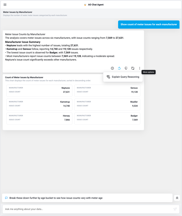
The More options menu. |
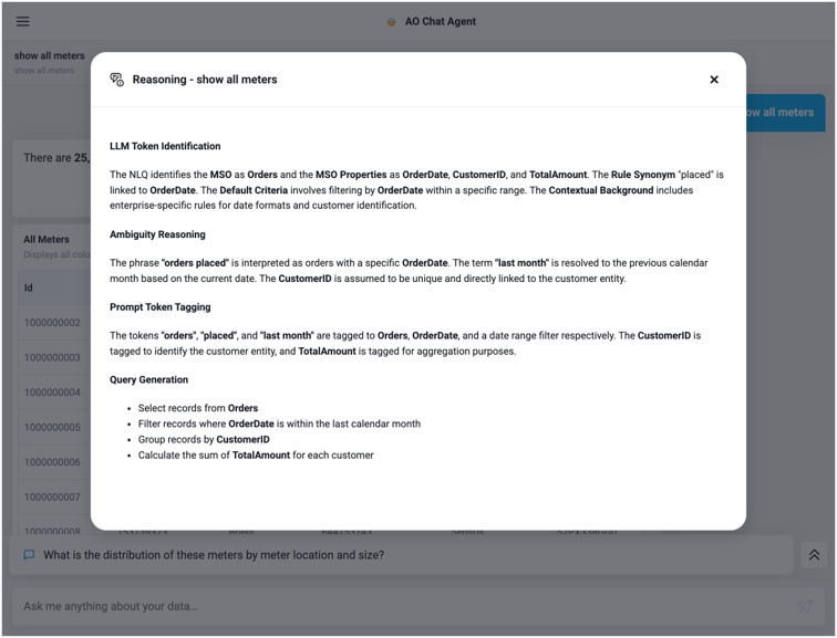
The reasoning trace. |
Suggested Follow-Up Questions
After each answer, the package fetches follow-up questions scoped to the conversation and workflow, and shows them in a collapsible strip above the composer. The chevron expands the strip to show all of them; tapping one submits it as the next question.
A follow-up suggestion sits above the composer.
Set enableNextQuestionSuggestions to false in the tenant configuration, and the suggestions are neither fetched nor rendered — in live exchanges or when replaying a conversation from history. Welcome-screen prompts are unaffected.
Visualizations in the Conversation
The backend chooses a visualization for the shape of each result — the number of records and the mix of categorical, temporal and quantitative fields. The package resolves the mobile template for that choice and renders it in its own card beneath the narration. Charts are interactive: tooltips on hover, legend entries, and drilldown where the payload supports it.
Pass showVisualizations={false} to skip visualization API calls entirely and render narration only.
Changing the Visualization Type
When a payload carries suggested template UIDs and enableVisualizationSwitching is on, a control appears in the card footer. It opens a picker of alternative renderings for the same data; choosing one re-renders the card in place.
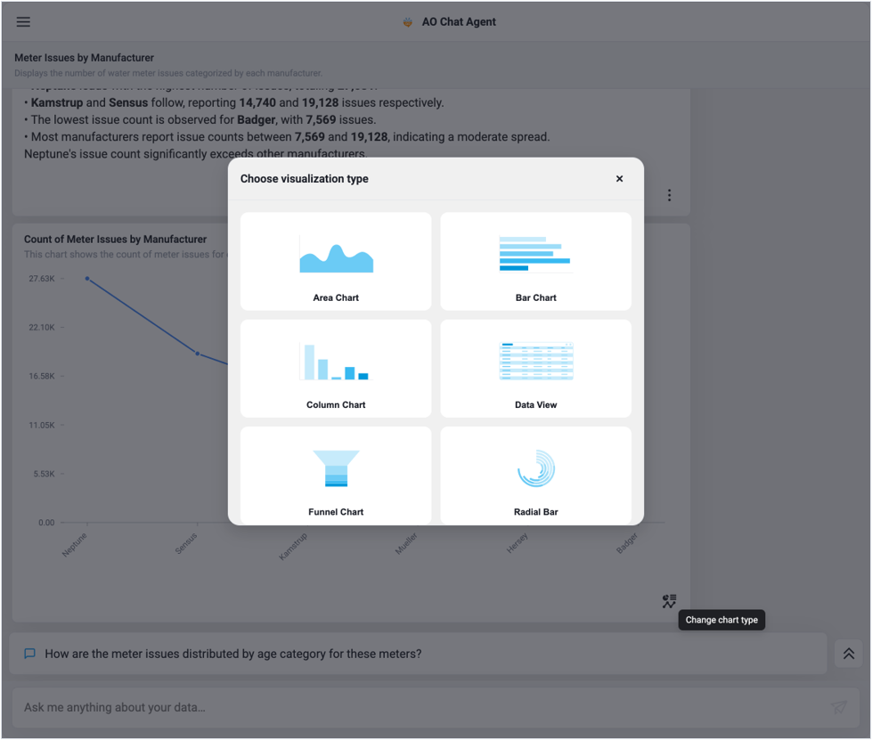
The visualization picker offers alternative renderings of the same result.
Tables, Pagination and Drilldown
Result sets too large to chart come back as tables. These are server-side paginated: the package holds one page at a time and fetches the next on demand, so a 25,000-row answer costs one page of transfer. The footer shows page numbers, first/previous/next/last arrows, and a total record count.
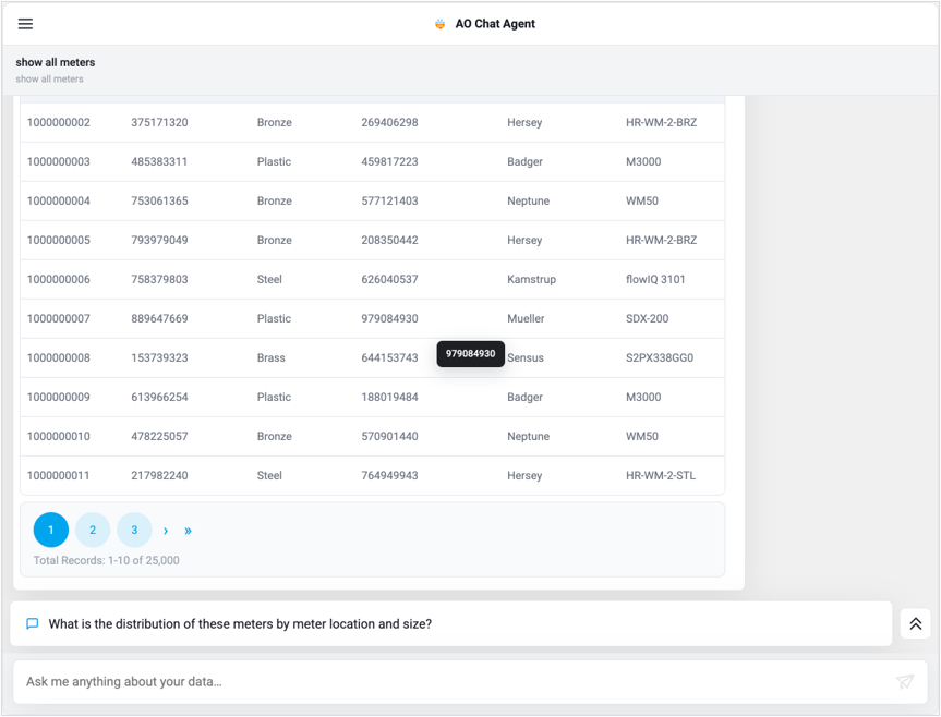
A server-paginated table — 10 of 25,000 records, with a cell tooltip.
Columns the backend marks as links are clickable. Clicking one builds a criteria from that cell and asks the backend for a fresh, related visualization, which opens in a drilldown sheet titled after the column and value. Tables inside that sheet page independently.
Conversation History
The hamburger opens the conversation menu: a New Chat action, a search box, and the user's conversations grouped by recency (TODAY, EARLIER). Each entry shows the conversation's generated title, its description, and its time. The active conversation is highlighted.
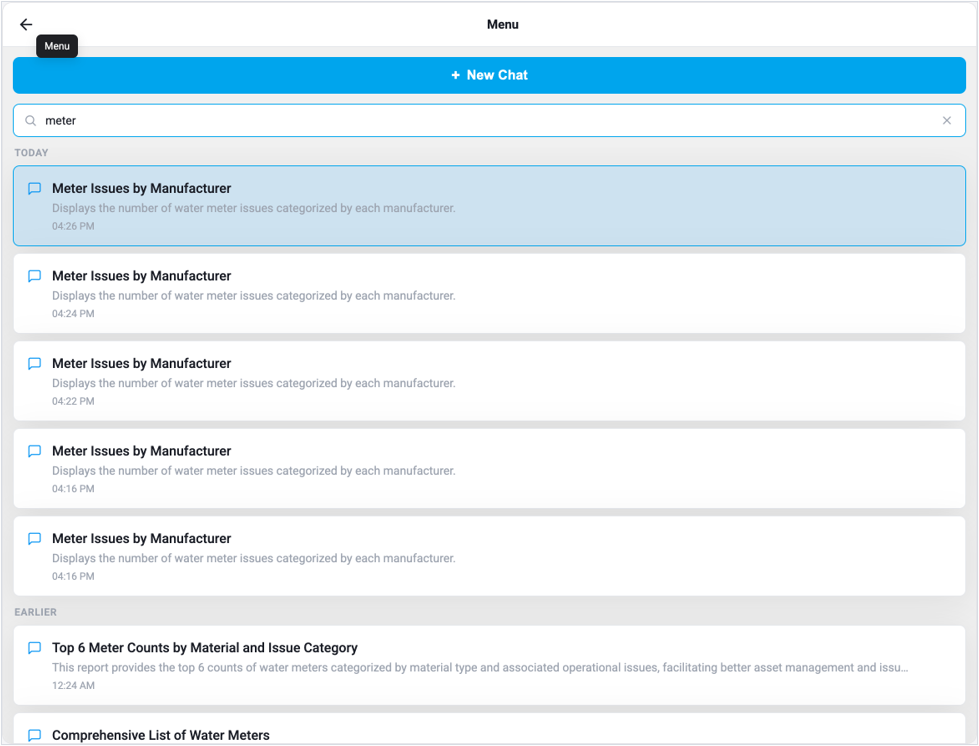
Conversation history with search — grouped, highlighted, deletable.
-
Selecting a conversation replays it — messages, visualizations, and feedback state all restored.
-
Search queries the server, not just the loaded page.
-
The list pages as the user scrolls.
-
Each entry has a delete action.
-
While an answer is in flight, list interactions are disabled with a
"Please wait for the response to complete"tooltip, so a conversation switch cannot orphan a running workflow.
Open a specific conversation on mount with initialConversationId, or open on the history page with initialPage="history".
Ambiguity and Clarification
When the agent cannot confidently resolve part of a question, it does not guess. An inline clarification card replaces the answer and asks the user to resolve it before continuing.
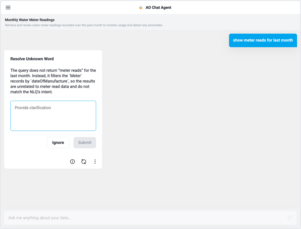
A clarification card explains what could not be resolved and asks for guidance.
The card appears in one of two modes, driven by what the backend detected:
-
Option mode — the agent offers candidate interpretations. The user picks one, or picks Something Else and types a clarification. The chosen token is sent back with the resolved question.
-
Error mode — the agent explains what it could not resolve and why the result would not match the question's intent. The user can type a clarification, or press Ignore to proceed with the agent's own reading.
Submitting replaces the clarification card with the real answer. The card carries its own About and Retry controls, so the user can inspect or re-run without resolving.
Contact App Orchid | Disclaimer