
Intended audience: Developers administrators
AO Embedded Easy Answers Agent: 1.1
Overview
This topic provides insight into how to embed the App Orchid Easy Answers Agent, a conversational AI experience (ao-chat-agent), into a host web application, and what end users will see and do.
For Developers
The AO Chat Agent is a framework-agnostic, drop-in React component library that delivers the App Orchid Easy Answers conversational AI experience directly inside any web product. It’s designed to embed in tenant-facing portals, internal operations consoles, and field-service tools with a single component mount - no provider setup, no global CSS, and no hand-rolled state wiring.
The integration surface is intentionally minimal: A host application imports a single component, passes credentials and tenant identifiers as props, and the library handles authentication, polling, conversation history, charting, theming, and user feedback internally.
For End-Users
The end-user experience is purpose-built for business questions: Users open the Easy Answers Agent, see suggested starter questions, ask in plain English, watch a real-time progress indicator as the AI works, and receive a summarized answer with a visualization and follow-up suggestions — all within the host application's branding. See AO Embedded Easy Answers Agent - The End User Experience.
Solution Overview - for Developers
ao-chat-agent is a framework-agnostic web package that embeds the App Orchid Easy Answers conversational analytics experience into any React application. A user asks a question in plain English; the package handles authentication, calls the App Orchid agent pipeline, polls for the answer, renders a written narration, and draws the accompanying charts, tables, and data views, all inside a component you drop into your own layout.
|
Export |
Kind |
What it Does |
|---|---|---|
|
AOChatAgentView |
React component |
The complete chat experience — welcome screen, composer, answer bubbles, visualizations, conversation history, About/feedback/retry panels, theming and error banners. Manages its own agent lifecycle and conversation state. |
What You Get Out of the Box
-
Natural-language Q&A against a chosen solution + ontology, with live progress reporting while the agent works.
-
Written narration — a headline, summary paragraph, and bulleted key findings, rendered with inline markdown emphasis.
-
Automatic visualizations — the backend picks a chart type for the shape of the result; the package resolves the mobile template and renders it. Over 29 chart visualizations.
-
Answer transparency — an About this Answer page showing the interpreted question, the answer source (LLM / Cache / Template), the interpretation mode, and verification state.
-
Human-in-the-loop controls — thumbs up/down with a comment, retry at a different accuracy mode, answer verification, and an Explain Query Reasoning trace.
-
Ambiguity resolution — when the agent cannot resolve a phrase, an inline clarification card asks the user to disambiguate before continuing.
-
Conversation history — searchable, paginated, deletable, and resumable across sessions.
-
Suggested questions — welcome prompts for an empty conversation and follow-up suggestions after each answer.
-
Full theming — light, dark, or any number of named brand palettes, supplied inline, fetched from a folder of theme files.
-
Server-driven feature gating — feedback, retry, suggestions, query modes and third-party embedding are all switched on or off by the tenant's agent configuration.
How a Question Flows Through the System
-
The host renders
<AOChatAgentView>with credentials, asolutionUid, and anontologyUid.
-
On mount, the component bootstraps: it fetches an agent context ID, the tenant's agent configuration (permissions + theme), and the ontology's welcome questions.
-
The user submits a question. We are calling the agent executor API
-
A progress card reports the current stage (Understanding Your Question → Generating Semantic SQL → …) with an elapsed timer and a percentage.
-
The completed response is mapped into chat messages: a narration bubble plus zero or more visualization payloads.
-
For each visualization payload, the package resolves a mobile template and renders it with the visualization renderer.
-
Follow-up question suggestions are fetched and shown beneath the answer.
The component is written against the DOM but uses react-native-web internally for the visualization layer, so the same renderer code powers the App Orchid mobile app and this web package. That is an implementation detail — hosts only need react and react-dom.
Requirements and Installation
Peer Dependencies
|
Peer Dependency |
Version |
Required |
Notes |
|---|---|---|---|
|
react |
>= 17 |
Yes |
Hooks are used throughout. |
|
react-dom |
>= 17 |
Yes |
Browser rendering. |
|
react-native-svg |
>= 13 |
Optional |
Only needed when consuming the published bundle's chart path. The self-contained bundle inlines it. |
The core bundle has no native dependencies and works in Vite, webpack, Rollup, Next.js, and Parcel with no extra bundler configuration. react-native itself is never imported — the build rewrites those specifiers to react-native-web and stubs the Fabric / TurboModule internals react-native-svg references but never calls on the web path.
Entry Points and Build Outputs
|
Specifier |
File |
Contains |
|---|---|---|
|
Self-contained bundle |
|
|
Quick Start
Rendering the whole experience is a single component. Everything else in this document is refinement.
Embed with an API Key
The simplest integration. An API key authenticates every call through the X-API-Key header; no token rotation is involved.
import { AOChatAgentView } from “ao-chat-agent";

export function Assistant() {
  return (
    <div style={{ height: 640 }}>
      <AOChatAgentView
        serverUrl="https://server-instance.apporchid.com"
        apiKey={AO_API_KEY}
        solutionUid="com::apporchid::customerai::customerai"
        ontologyUid="com::apporchid::utilityai::UtilityAIOntology"
      />
    </div>
  );
}
Embed with OAuth Tokens
When your app already authenticates the user, pass the access token and the refresh token. Persist the rotated pair from onTokenRefresh so a re-render never rolls the agent back to an expired token.
import { useState } from "react";
import { AOChatAgentView } from "@apporchid/ao-chat-agent";

export function Assistant({ session }) {
  const [tokens, setTokens] = useState(session);

  return (
    <AOChatAgentView
      serverUrl={SERVER_URL}
      accessToken={tokens.accessToken}
      refreshToken={tokens.refreshToken}
      solutionUid={SOLUTION_UID}
      ontologyUid={ONTOLOGY_UID}
      userName={session.displayName}
      brandName="Acme Insights"
      brandLogoUrl="/brand/mark.svg"
    />
  );
}
Authentication
Three authentication paths are supported. Pick one; the view resolves precedence for you.
|
Mode |
Props |
Token Refresh |
When to Use |
|---|---|---|---|
|
API key |
|
None. A 401 surfaces an error banner. |
Server-to-server style embeds, kiosks, internal tools, and any host that already trusts the page. |
|
OAuth tokens |
|
In-band. The client refreshes on 401 and calls |
The normal integration: your app authenticates the user and hands the session down. |
Why refreshToken Matters
When you authenticate with an access token, always pass refreshToken alongside it. Without it, the chat breaks the moment the access token's TTL expires, and the component's own configuration validator raises a banner saying so. Hosts that manage their own refresh cycle can pass an empty string and ignore the warning, but the typical embed should supply both.
The component tracks the last prop value it applied rather than comparing against the agent's internal token, so a silent in-band rotation is never overwritten by a stale prop on the next render. Persisting onTokenRefresh into the state that drives the props keeps host and client in step.
AOChatAgentView — Props Reference
Only four values are genuinely required: an authentication credential (apiKey or accessToken + refreshToken), a solutionUid, an ontologyUid, and a serverUrl. Everything else is presentation or behaviour tuning.
Connection and Identity
|
Prop |
Type |
Default |
Description |
|---|---|---|---|
|
serverUrl |
string |
dev tenant |
Base URL of the App Orchid backend. Only used when the view builds its own client (i.e. when |
|
apiKey |
string |
— |
API key for |
|
accessToken |
string |
— |
OAuth access token. Optional when |
|
refreshToken |
string |
— |
Refresh token used for in-band rotation. Strongly recommended with |
|
solutionUid |
string |
— |
Required. The solution the questions are answered against. |
|
ontologyUid |
string |
— |
Required. The ontology within that solution. |
|
ontologyName |
string |
derived |
Display name used by history queries. Defaults to everything after the final :: in |
Presentation
|
Prop |
Type |
Default |
Description |
|---|---|---|---|
|
title |
string |
"Easy Answers" |
Header title. |
|
brandName |
string |
"AO Chat Agent" |
Brand name shown in the rich header next to the logo. |
|
brandLogoUrl |
string |
— |
Logo shown to the left of the brand name. |
|
onClose |
() => void |
— |
When supplied, an ✕ button is rendered in the header. Required for modal and drawer layouts. |
|
botMessageWidthInPercent |
number |
80 |
Max width of assistant bubbles as a percentage of the chat container on wide layouts. Clamped to 20–100; containers ≤ 420px always stretch to 100%. |
Behaviour
Ontology Level Configurations
|
Prop |
Type |
Default |
Description |
|---|---|---|---|
|
showVisualizations |
boolean |
true |
When false, all visualization API calls are skipped and no charts or tables render — narration only. |
|
enableVisualizationSwitching |
boolean |
false |
Shows the change-visualization control on answers whose payload carries suggested template UIDs. |
|
enableAutoCorrection |
boolean |
true |
Host-level kill switch for as-you-type spell correction. Can only turn correction off — the ontology's own setting still wins when it is disabled there. |
Permissions and Feature Gating
Several features are not the host's decision — they belong to the tenant. On bootstrap, the package calls the solution's agent configuration endpoint and applies the flags it returns. Every flag fails open: on a network error, a timeout, or an unparseable payload, the defaults below apply, so a configuration problem degrades transparency rather than breaking the chat.
|
Flag |
Default |
Effect When False |
|---|---|---|
|
enableThirdPartyUIIntegration |
true |
The composer and all suggested questions are disabled, and an error banner explains that the host system has not enabled third-party UI integration. This is the master switch for embedding. Available in Admin Configuration Property and at Solution level |
|
enableFeedback |
true |
All feedback UI is hidden (both thumbs, the comment card, the read-only About chip) and no feedback API calls are made. |
|
enableRetry |
true |
The Retry icon and the About page's retry card are hidden, and the internal retry action becomes a no-op. |
|
enableNextQuestionSuggestions |
true |
Follow-up suggestions are neither fetched nor shown, live or replayed from history. Welcome prompts are unaffected. |
|
enableLLMQueryMode |
true |
The interpretation-mode selector is hidden and retry omits the query mode from its request. |
|
enableQuestionVerification |
true |
Answer-verification UI is hidden. |
|
enableAutoCorrection |
true |
As-you-type spell correction in the composer is off. The host prop cannot re-enable it. |
|
queryModes |
Controlled, Balanced, Freeform |
Defines which interpretation modes the retry selector offers. |
|
themeJson |
undefined |
No server-supplied theme; the host props or the built-in palette apply. |
When the endpoint explicitly reports third-party UI integration as off, the package raises a ThirdPartyUIDisabledError carrying a permissions object with that flag forced false — so the UI can lock the input and still surface the banner. Both the error class and the isPermissionRelatedError() helper are exported for hosts that want to branch on this.
The resolved flags are also readable from a client instance via agent.getPermissions(), typed as AgentPermissions. They are not a component prop — the tenant is the source of truth.
Theming
The whole surface is token-driven. You can re-colour one thing, ship a full brand palette, or offer users a set of named themes they switch at runtime with no remount.
Where a Theme Can Come From
Sources are tried in this order; the first that yields usable tokens wins, and whatever wins is still merged over the built-in light or dark base so unset keys keep their defaults.
|
# |
Source |
Notes |
|---|---|---|
|
1 |
theme prop |
Always wins. Use this when the host fetches and slices its own theme file. |
|
2 |
themesPath + themeName |
Fetches |
|
3 |
themeJson prop |
The baked-in fallback that survives a missing, unreachable, or malformed theme file. |
|
4 |
themeJson from the agent configuration endpoint |
The tenant's own palette, applied without the host doing anything. |
|
5 |
Built-in light / dark |
Always present as the base. |
Resilience A theme file that 404s or fails to parse never resets the widget to the built-in default — it keeps whichever theme last applied, then falls back to the themeJson prop. A source that carries no tokens at all (a blank or malformed JSON string, or an empty object) is skipped rather than applied, so a misconfigured theme falls through instead of silently rendering the default.
The Three Shapes a Theme Can Take
1 — A Flat Token Map
One object of tokens, applied to the whole UI.
{ "primary": "#00A5ED", "buttonRadius": 16 }
2 — A Named-Variant Map
Top-level keys are theme names; each value is a flat token map. Light and dark are conventional, but any name works. The active one is selected by themeName, else by the current light/dark mode, else the first entry.
{ "light": { … }, "dark": { … }, "highContrast": { … }, "ocean": { … } }
3 — A Backend Palette
The older App Orchid mobile palette shape (backgroundRoot, messageBubbleAI, cardBackground, …). Fully supported and mapped onto the modern tokens automatically. The exported mapBackendThemeToAgentTheme() and mapBackendThemeToVizTheme() helpers do the same conversion if you need it yourself.
Unknown keys are ignored, and a value of the wrong type (a string where a number is expected) is ignored so the default survives. Light versus dark base is chosen from an explicit isDark / mode in the config, else inferred from the background colour, else the widget's current mode — which is why a dark variant that sets only a background and a few accents still renders fully dark.
Token Groups
Around 120 tokens are recognised. They fall into these groups; the package's THEMING.md carries the exhaustive key-by-key reference with every default value and legacy alias.
|
Group |
Representative Tokens |
Controls |
|---|---|---|
|
Palette |
primary, accent, textPrimary, textSecondary, textMuted, dangerBg, errorText, successBg, likeIcon |
Brand and semantic colours. |
|
Typography |
fontFamily, bodySize, bodyLineHeight, headingSize, headingWeight |
Global font and text metrics. |
|
Backgrounds |
background, headerBg, cardBg, inputBg, overlayBg |
Surfaces and modal scrims. |
|
Borders & shadows |
borderColor, subtleBorder, inputBorder, inputBorderFocus, shadowCard, shadowModal |
Dividers, focus rings, elevation. |
|
Buttons & input |
buttonPrimary, buttonPrimaryText, buttonRadius, inputText, inputRadius |
Send, New chat, primary actions, composer. |
|
Message bubbles |
userMessageBg, userMessageText, chatAssistantBg, chatAssistantText, aiBubbleRadius |
The transcript itself. |
|
Welcome & suggestions |
avatarBg, avatarText, avatarSize, suggestionListBg, suggestionRadius |
Empty state and prompt cards. |
|
Progress & loaders |
loader, progressBarFill, progressBarTrack, progressBarTint, indicatorBg |
Spinners and the thinking indicator. |
|
Icons & toasts |
icon, iconActive, actionIcon, historyListIcon, toastBg |
Glyph colours and floating toasts. |
|
History list |
historyItemBg, historyItemText, historyItemSecondaryText, historyItemRadius |
Conversation rows. |
|
Tables & data views |
tableHeaderBg, tableCellBg, tableLinkText, pagerBg, pagerButtonBgActive, tablePopupBg |
Every part of a rendered table, including the pager and drilldown popup. |
|
Charts |
colors, chartDataLabel, tooltipBg, tooltipText |
Series ramp, on-fill labels, tooltips. Bridged into the visualization theme. |
|
Scrollbars |
scrollbarTrack, scrollbarThumb |
Every scrollable region inside the widget. |
The Token Cascade
Some component tokens fall back to a parent token unless set explicitly, so you can re-colour broad areas with one key.
|
Set This |
…and These Follow (Unless Set Explicitly) |
|---|---|
|
primary |
buttonPrimary, loader, tableLinkText, pager button colours, chart-picker series ramp |
|
accent |
iconActive, historyListIcon |
|
onPrimary |
buttonPrimaryText |
|
cardBg |
suggestionPopupBg, suggestionListBg |
|
textPrimary |
suggestionListText, tableHeaderText |
|
chatAssistantBg |
tableCellBg, tablePopupBg |
|
actionBarBg |
tableHeaderBg, pagerBg |
Setting primary alone re-colours buttons, loaders and table links together. Setting buttonPrimary as well moves only the buttons — the loader keeps following primary. Explicit always wins over the cascade.
Colours accept any CSS colour string. The built-in defaults use hex, with 8-digit #RRGGBBAA for transparency (#00000066 is black at 40%).
Worked examples
A Single Brand Color
<AOChatAgentView {...config} theme={{ primary: "#7C3AED", buttonRadius: 12 }} />
Light and Dark, Switched by the Host
const [mode, setMode] = useState(prefersDark ? "dark" : "light");

<AOChatAgentView
  {...config}
  theme={{ light: lightTokens, dark: darkTokens }}
  themeName={mode}
/>
A Folder of Themes Served as Static Assets
// public/themes/{light,dark,aurora,highContrast}.json

<AOChatAgentView
  {...config}
  themesPath="/themes"
  themeName={selectedTheme}   // change freely at runtime
  themeJson={bakedInDefault}  // survives a missing or broken file
/>
A Non-Standard File Layout
<AOChatAgentView

  {...config}
  themesPath="https://cdn.example.com/brand"
  themeName="acme"
  getThemeUrl={(path, name) => `${path}/${name}/chat-agent.theme.json`}
/>
The Built-In Dark Theme
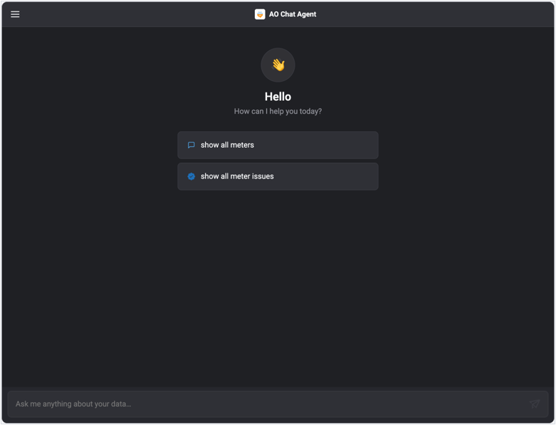
Dark — welcome screen. |
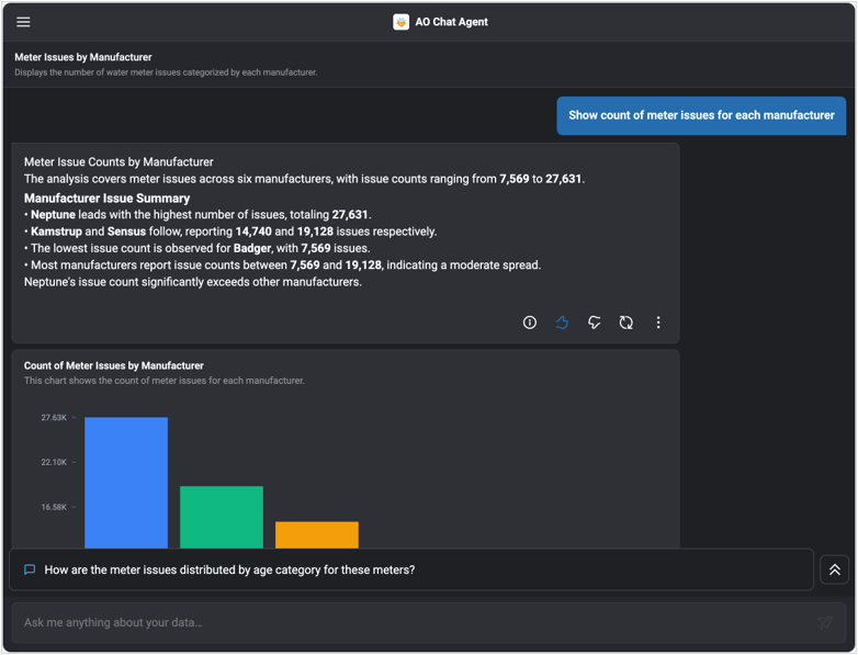
Dark — narration, action row and result. |
A Custom Palette
The same UI under a custom named theme. Only the tokens the palette sets are overridden; everything else — spacing, radii, table chrome, chart series — follows the cascade and the dark base.
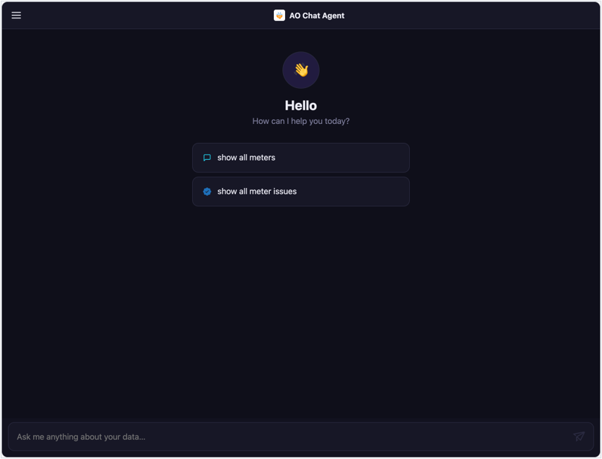
Custom palette — welcome screen. |
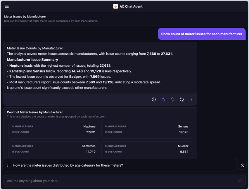
Custom palette — the same answer, re-themed. |
Error Handling and Diagnostics
Two classes of problems are surfaced in the same dismissible banner at the top of the widget: configuration problems, caught client-side before any network call, and runtime problems, categorised from the bootstrap probes. Both are typed as BootstrapError, with a machine-readable kind, a user-facing message, an optional list of offending fields, and the raw error text as detail for a Show details toggle.
|
Kind |
Cause |
Message Shown |
|---|---|---|
|
missingFields |
Required props absent or blank. Every problem is listed at once rather than one at a time. |
"Missing or invalid props (n)" plus a line per field |
|
auth |
Invalid or expired API key, expired access token, 401/403, access denied. |
"Invalid API key…", "Your API key has expired…", "Your access token is expired…", or the endpoint's own message verbatim |
|
cors |
A cross-origin target plus a generic fetch failure — the textbook CORS signature, since the browser hides the specifics from script. |
"Unable to connect to the server. Please contact your admin." |
|
network |
Connection refused, DNS failure, offline, unreachable host. |
"Unable to connect to the server. Please check your connection or contact your admin." |
|
ontologyNotFound |
The welcome-questions probe 404s — attributed to ontologyUid. |
The endpoint's own message, e.g. naming the missing UID |
|
solutionNotFound |
The chat-history probe 404s — attributed to solutionUid. |
As above |
|
server |
Any other backend failure. |
The endpoint's own message, with the raw text under Show details |
Missing or Invalid Props
Caught immediately, with no network round trip, and every issue named at once so you fix them in one pass rather than discovering them serially.
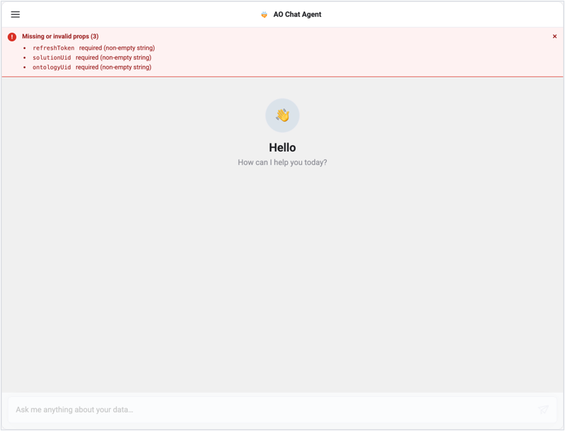
Client-side validation names all three missing props at once.
Rejected Credentials
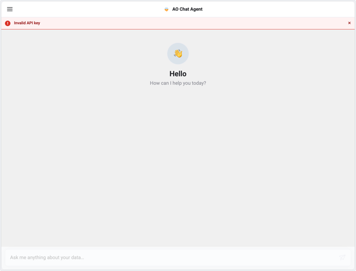
An invalid API key.
A UID that does not exist
404s are attributed to the specific prop the failing probe depends on, so the message points at the right field.
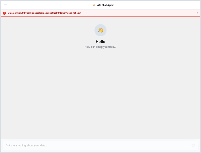
A non-existent ontology UID, named in the message.
Failure Behaviour Worth Knowing
-
Permissions fail open — a failed configuration fetch leaves every feature enabled rather than silently stripping the UI.
-
Charts fail soft — a visualization that throws is caught by an error boundary and replaced with
"Unable to display chart"; the rest of the answer still renders.
-
Empty results are explicit — a payload with no rows renders
"No data available"rather than an empty box.
-
Theme failures are non-destructive — see §8.1.
-
Pagination errors are surfaced — a failed page fetch shows a message in the table footer instead of truncating the data silently.
Backend API’s Used
Useful for allow-listing, proxy configuration, and CORS review. All paths are relative to serverUrl.
|
Endpoint |
Method |
Purpose |
|---|---|---|
|
/oauth/token · /openid/token |
POST |
Password login and refresh-token rotation. |
|
/api/configuration/appconfig/loginurl |
GET |
OAuth client configuration discovery. |
|
/api/configuration/appconfig/group/CORE/property/enable_mobile_app |
GET |
Tenant gate for mobile / third-party app access. |
|
/api/agora/getAgentContextId |
GET |
Agent context id, cached for the session. |
|
/api/agora/agentExecutor |
POST |
Submit a question to the agent. |
|
/api/solution/agent/all |
GET |
Permissions flags and the server-supplied theme. |
|
/api/solution/mobileenabled/all |
GET |
Solutions available to the user. |
|
/api/vux/getUserInfo |
GET |
Authenticated user's profile. |
|
/api/ontology/agent/welcomequestions/all |
GET |
Welcome prompts for an ontology. |
|
/api/ontology/vocabulary |
GET |
Ontology vocabulary, seeding the spell-correction dictionary. |
|
/api/pipeline/run |
POST |
The pipeline bus — chat polling and history ( |
|
/api/mobile/template/application |
POST |
Resolve the mobile template for a visualization payload. |
|
/api/mobile/template/suggested/application |
POST |
Alternative templates for the visualization picker. |
|
/api/mobile/template/refreshApplication |
POST |
Re-render a payload with a different template. |
|
/api/mobile/template/drilldown/application |
POST |
Resolve a table cell's showLink drilldown. |
CORS A browser reports a blocked cross-origin request and a genuine network failure with the same opaque error, so the package infers CORS from the combination of a cross-origin target and a generic fetch failure. If you see the CORS banner kind, check the backend's Access-Control-Allow-Origin for your host origin before looking anywhere else. Routing calls through a same-origin proxy avoids the class of problem entirely.
Development
cd ao-chat-agent

npm install
npm run build         # ESM + CJS + declarations + the self-contained bundle
npm run build:watch   # rebuild on change
npm run typecheck     # tsc --noEmit
npm run lint          # eslint src
dist/

├── index.js          ESM core bundle
├── index.cjs         CJS core bundle
├── index.d.ts        Core type declarations
├── chart.js          ESM chart entry
├── chart.cjs         CJS chart entry
├── chart.d.ts        Chart type declarations
└── bundle/
    └── ao-chat-agent.js   Self-contained ESM bundle (react-native-web + svg inlined)
The Reference Demo
The repository ships a Vite demo application that renders the component in all six layouts, on a realistic host dashboard, plus a visualization workbench that renders any VisualizationData JSON you paste or import. Every screenshot in this document and in the companion catalogue was captured from it.
The demo consumes the self-contained bundle from vendor/ao-chat-agent.js rather than the package source, so rebuild the package after changing src/ for the demo to pick up the change.
Next: AO Embedded Easy Answers Agent - The End User Experience
Contact App Orchid | Disclaimer