Editing a Template
Intended audience: END-USERS DEVELOPERS
AO Platform: 4.3
Overview
To edit, select a Template from the list on the main Template page and click Edit in the Actions menu. The Template configuration is broken into the following sections:
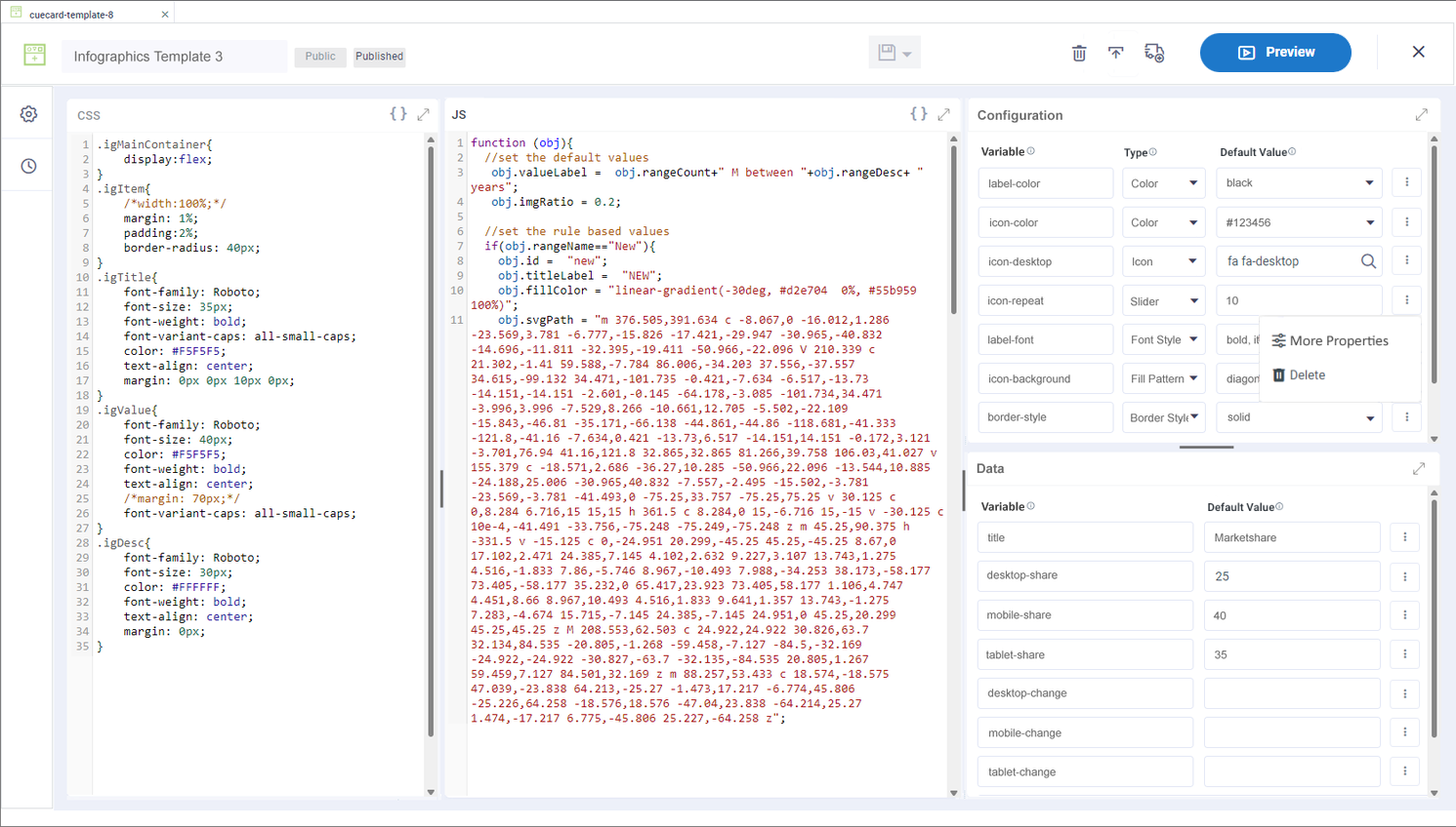
Design
The Template Composer has the following user interface for editing Data Table, Cue Card and Data View and Infographics Templates, including: CSS, JavaScript and Configuration and Data Variables. The Preview panel will show the rendered version of the Template.
User Actions
Header
Select Resolution - the Resolution buttons are only available if Resolutions of the Template design have been saved.
Save - various options to Save the Template:
Save - saves the current state of the Template configuration.
Save as - various options to Save the Template as:
Template - creates a new Template based on the configuration state of the current Template.
Version - creates a new Version of the configuration state of the current Template. Template Versions can be found under Version History.
Resolution-XS/S/M/L/XL/XXL - creates an instance of Template based on selected screen resolution: XS = Extra Small, etc… Once saved, the Header will show the different resolutions saved.
Autosave - toggle allowing for the Template to be automatically saved every 5 minutes.
Delete Draft - deletes the current Template configuration. If the Template has been published, both Draft and Published Templates can be deleted after confirmation.
Publish Draft - publishes the Template and updates the status from Draft to Published. The template is made read-only.
Edit Template - this option is only available once the Template has been published. If selected, the Template will be opened again, allowing the Template to be further configured and, if required, re-published.
Add to Transport - adds the Template to Transport.
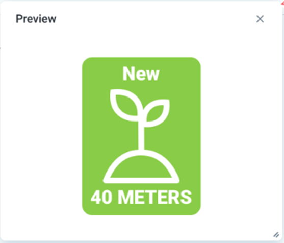
Preview - allows the user to open Preview in a separate pop-up window. This pop-up will provide the What-You-See-Is-What-You-Get (WYSIWYG) representation of the template, ie how the user will experience the Data Table, Cue Card, Data View, and Infographics that the template is designed for.
Exit - returns to the Template Composer list view.
CSS
This panel includes the Cascading Style Sheet (CSS) instructions that will add layout, color, and style to the template. Use the “pretty print” icon in the top-right corner to auto-format the panel.
JS
This panel includes the JavaScript (JS) code that will add functionality and data to the template. Configuration and Data variables are used in JavaScript to represent where data and other content, such as icons, will be shown in the template. Use the “pretty print” icon in the top-right corner to auto-format the panel. Once Configuration and Data variables are configured in their respective panels, see sections below, the JS panel will offer lookup support when entering the variables using the obj. syntax. There are two different syntax options:
obj.config.variableobj.data.variable
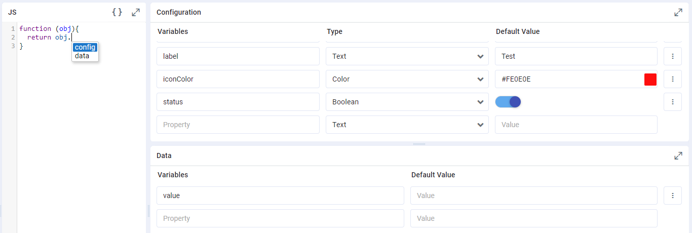
Configuration
This panel includes the Configuration Variables configured to be used by the template. Variables represent the configuration properties available when the template is used in either Application Composer or added as a Micro Application in Ontology Composer > MSO Curation.
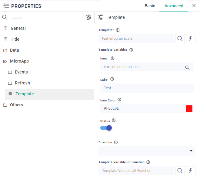
This screenshot shows the saved Configuration variables as they will appear in the Properties > MicroApp > Template section in Application Composer
Properties
Label | Description |
|---|---|
Variable | Variable name to be referenced in JS panel as |
Type | This is the data Type for the Variable. This will be used to provide better UI controls during configuration of the Variable. Types include: Text, Color, Icon, Numeric, Boolean, and Dropdown. |
Default Value | Add a Default Value to be used when Previewing the Template being created. Same Default Value will also appear in Application Composer and/or MSO Curation when the Template is added for configuration. |
Under More Properties… | |
| This is the same as Variable. |
| Add/update a Display Name for the Variable/Property Name. |
| Add a short Description to explain how the configuration variable will be used. |
| Repeater section for multiple values to be entered. Only available if the Type property is configured to be a dropdown. |
Data
This panel includes the Data Variables configured to be used by the template. Variables represent the data available in the data source that feeds the Data Table, Cue Card, Data View, and Infographics templates.
Properties
Label | Description |
|---|---|
Variable | Variable name to be referenced in JS panel as |
Default Value | Add a Default Value to be used when Previewing the Template being created. |
Settings
The Settings page available from the left-side navigational panel allows the user to configure some basic properties for the Template - see list of Properties below.
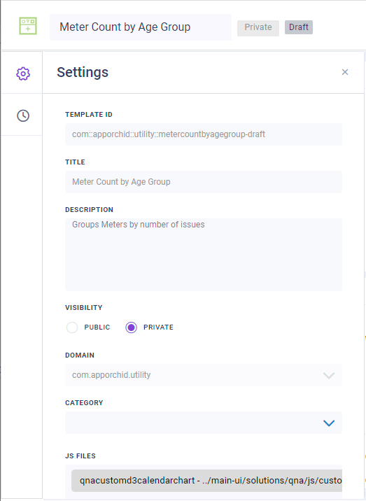
Properties
Label | Description |
|---|---|
Template ID | An autogenerated, non-changable ID given to the Template based on the selected Domain and Title. This property can only be set in the Create dialog when creating a new Template. |
Title | The friendly name of the Template. This property can only be set in the Create dialog when creating a new Template. |
Description | A short description for the Template. This description is used in the Search dialog elsewhere in the AO Platform where there’s a need to search for Templates. |
Visibility | Select between Public or Private. If Private, no other users can view/access. |
Domain | Use dropdown to select from existing Domain names. A Domain can be used to signify an organizational / ownership grouping. |
Category | Use dropdown to select between Data Table, Data View, Cuecard, or Infographics. This will be used to filter the Template types when searching for Templates elsewhere across the AO Platform. |
JS Files | Select one or more JavaScript (JS) files from dropdown that’ll be used/referenced by the Template. |
CSS Files | Select one or more Cascading Style Sheet (CSS) files from dropdown that’ll be used/referenced by the Template. |
Tags | Add one or more descriptive tags that will be used when searching for Templates elsewhere across the AO Platform. |
Width | Set the Width of the Template UI |
Height | Set the Height of the Template UI |
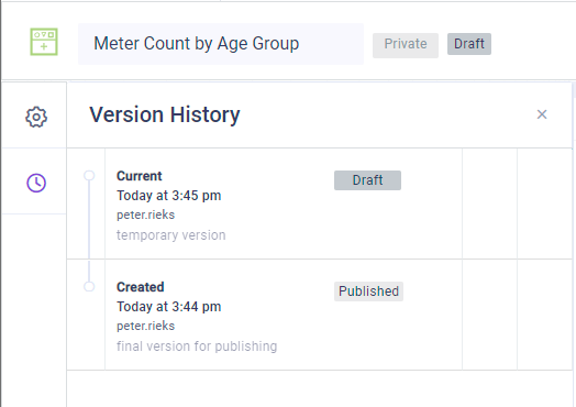
Version History
The Version History page will automatically be updated when a Template is saved as a Version, essentially allowing users to create multiple different versions (or snapshots) over time of a given Template. Also, when a Template moves from Draft to being Published, a Version is created automatically of the Published Template.
User Actions
Open - opens the configuration of the selected version in read-only mode.
Restore - restores the configuration of the selected version as the current version.