Editing an Annotation
Intended audience: END-USERS DEVELOPERS
AO Platform: 4.3
Overview
To edit, select an Annotation component from the list on the main Annotation page and click Edit in the More menu. The Annotation configuration is broken into the following sections:
Design
The Annotation Composer has the following user interface for editing Annotation, including: Palette, Canvas, and Properties. The Preview panel will show the rendered version of the Annotation.
User Actions
Header
Insert Column - click to add a new column to the selected cell in the current Layout.
Insert Row - click to add a new row to the selected cell in the current Layout.
Save - various options to save the Annotation:
Save - saves the current state of the Annotation configuration.
Save as - various options to save the Annotation as:
Annotation - creates a new Annotation based on the configuration state of the current Annotation.
Version - creates a new Version of the configuration state of the current Annotation. Annotation Versions can be found under Version History. See Versions and Version History.
Autosave - toggle allowing for the Annotation to be automatically saved every 5 minutes.
Undo - click to undo the last action.
Redo - click to redo the last action.
Clear - clears the selected cell from the Canvas.
Delete Draft - deletes the current Annotation configuration. If the Annotation has been published, both the Draft and published Annotation can be deleted after confirmation.
Publish Draft - publishes the Annotation and updates the status from Draft to Published. Annotation is made read-only.
Edit Annotation - this option is only available once Annotation has been published. If selected, the Annotation will be opened again, allowing the Annotation to be further configured and, if required, re-published.
Add to Transport - adds the Annotation to Transport.
Exit - returns to the Annotation Composer list view.
Palette
Search - allows the user to search for any Palette Task by name.
Drag/Drop - adds/replaces a Task to/on the Canvas.
Property Details
Basic / Advanced - select between mandatory (Basic) properties and many additional properties (Advanced) for ultimate flexibility.
Palette
Use options in the left-side panel to insert various types of Annotation components into the Layout cell(s), as well as updating any Layout organization, and/or to see a quick Outline.
The Insert tab has the following organization. To get the best overview of how Annotations render in an Application, see Samples Solution.
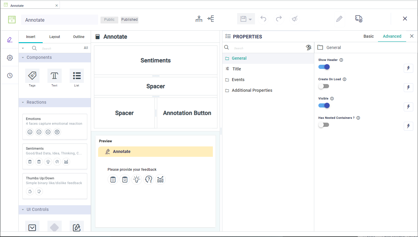
Components - these are the basic UI widgets for an Annotation: Tags, Text, or List
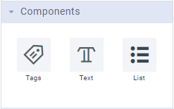
Reactions - this category of Annotations makes it easy for a user to express a reaction to something, including the use of Emotions (using emoticons), Sentiments, Thumbs Up/Down
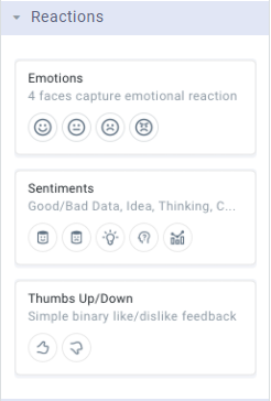
UI Controls - this category provides some additional UI Controls for easy capturing input as well as actioning an Annotation
Custom - allows any custom Annotation to be created/configured
 |  |  |
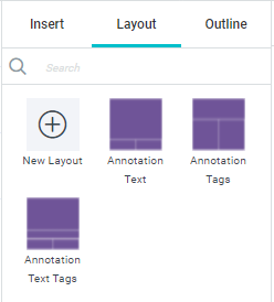
Similarly, the Layout tab shows the available Layouts created in the Layout Composer - see Layout Composer.
Canvas
Use options in the left-side Palette panel to insert Annotation components, including Reactions and UI Controls, into the Layout cell(s) as well as updating any Layout organization.
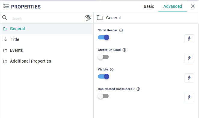
Properties
Each Annotation added to the Canvas will have Properties, some mandatory (identified by an * after the Property label), others optional. Use the Property Panel to configure a minimum the mandatory Properties. There are two general groups of Properties: Basic and Advanced. As the Properties for Annotations can be quite extensive, the first column in the Property Panel is an organization of all Properties into relevant categories. See Configuring Properties.
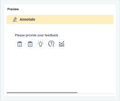
Preview
This panel will provide the What-You-See-Is-What-You-Get (WYSIWYG) representation of the Annotation.
Settings
The Settings page available from the left-side navigational panel allows the user to configure some basic properties for the Annotation component - see list of Properties below.
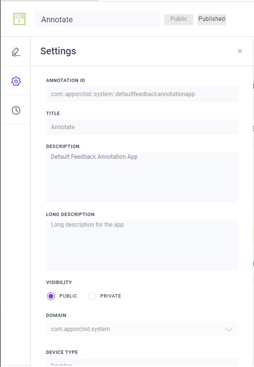
Properties
Label | Description |
|---|---|
Annotation ID | An autogenerated, non-changeable ID given to the Annotation based on the selected Domain and Title. This property can only be set in the Create dialog when creating a new Annotation. |
Title | The friendly name of the Annotation. This property can only be set in the Create dialog when creating a new Annotation. |
Description | A short description for the Annotation. This description is used in the Search dialog elsewhere in the AO Platform where there’s a need to search for Annotations. |
Long Description | This description can be used to further provide details for documentation purposes. |
Visibility | Select between Public or Private. If Private, no other users can view/access. See Visibility and Ownership of Composer Objects. |
Domain | Use the dropdown to select from existing Domain names. A Domain can be used to signify an organizational / ownership grouping. |
Device Type | Use the dropdown to select between Desktop and Mobile device types. This generally determines screen size/resolution for the Annotation. This property can only be set in the Create dialog when creating a new Annotation. |
Expression Engine | |
Property Value Expressions | |
Tags | Add one or more descriptive tags that will be used when searching for Annotations elsewhere across the AO Platform. |
Version History
See Versions and Version History.