Intended audience: end-users analysts developers administrators
AO Platform: 4.5
Overview
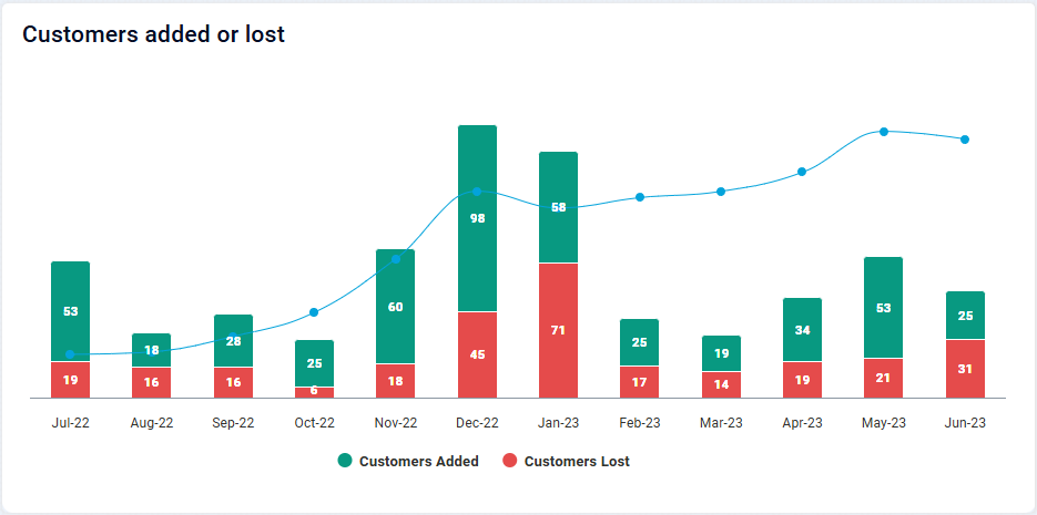
This section offers an overview of Multi XY Series Chart. The Multi XY Series Chart allows you to plot multiple data series on the same X and Y axes, making it ideal for comparing trends or relationships across different datasets.
Example
Configuration of Multi XY Series Chart
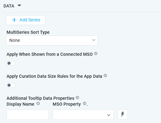
DATA Properties
|
Label |
UI Widget |
Default |
Description |
|---|---|---|---|
|
+ Add Series |
|
|
See the separate table below for Series Field Properties. |
|
Dropdown |
None |
Options include: None, Sort By Sort Field, or Sort by X-Axis Field. |
|
ON/OFF Toggle |
|
The Apply When Shown from a Connected MSO ON/OFF Toggle determines whether the settings or actions are applied specifically when data is displayed through a connected MSO.
|
|
ON/OFF Toggle |
|
If enabled, the Record Count rules will be applied. If the Record Count rules are not met, the series will not be shown. |
|
Display Name - Text Field MSO Property - Dropdown w/Expression option |
|
The Additional Tooltip Data Properties allow the user to select one or more MSO Field Properties to display their values in the tooltip when the user hovers over a data point. |
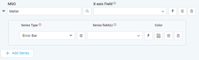
+ Add Series
|
Label |
UI Widget |
Default |
Description |
|---|---|---|---|
|
Search Field |
|
|
|
Dropdown w/Expression option |
|
The X-axis Field allows the user to select the MSO Field Property to represent the X-axis values in the Chart. |
|
Icon |
|
See the separate table below for X-Axis Properties. |
|
Icon |
|
Deletes the MSO/X-Axis Series in the chart and the associated Data Series from the chart configuration |
|
|
|
|
|
|
Dropdown |
|
The Series Type Field dropdown in area chart curation allows the user to specify a field that determines the type of series displayed in the chart. |
|
Icon |
|
See the separate table below for Series Type Properties. |
|
… Property / Value |
|
|
Repeater section. |
|
Dropdown w/Expression options |
|
The Series Field allows the user to select an MSO Field Property to represent the Series Field. |
|
Icon for Color selection |
|
The Colors allows the user to select which color to use for the multi XY series. See Curation - Field Properties - Data Styles | Selection of Color. |
|
Icon |
|
See the separate table below for Series Field Properties. |
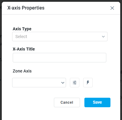
X-Axis Properties
|
X-Axis Properties |
Zone Axis Properties |
|---|---|
|
|
|
Label |
UI Widget |
Default |
Description |
|---|---|---|---|
|
Dropdown |
|
|
|
Text Field |
|
|
|
Dropdown w/Expression option |
|
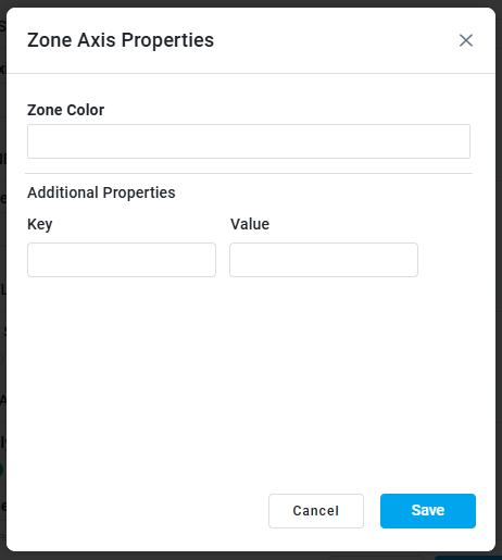
The Zone Axis dropdown enables users to select either the X or Y axis in the chart for Zone identification. |
|
Icon w/Dialog |
|
The Zone Axis Properties dropdown allows the user to configure different zones within the chart, which is often used for visual emphasis or categorization, eg. select Temperature and create functions for values (celcius) identifying the following thresholds: less than 0 = black, 0-9.9 = blue, 10-19.9 = green, 20-24.9 = orange, and 25 and above = red. |
|
… Zone Color |
Color Field |
|
The Zone color refers to the color applied to different zones within a chart or graph. |
|
… Additional Properties - Key/Value |
Text Fields |
|
Repeater section. Optional Additional Properties - expressed as a Key/Value pair. |
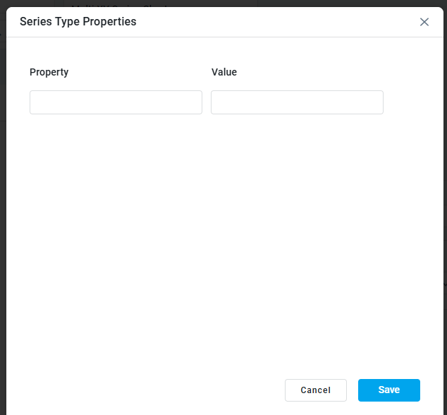
Series Type Properties
|
Label |
UI Widget |
Default |
Description |
|---|---|---|---|
|
… Property / Value |
Text Fields |
|
Repeater section. |
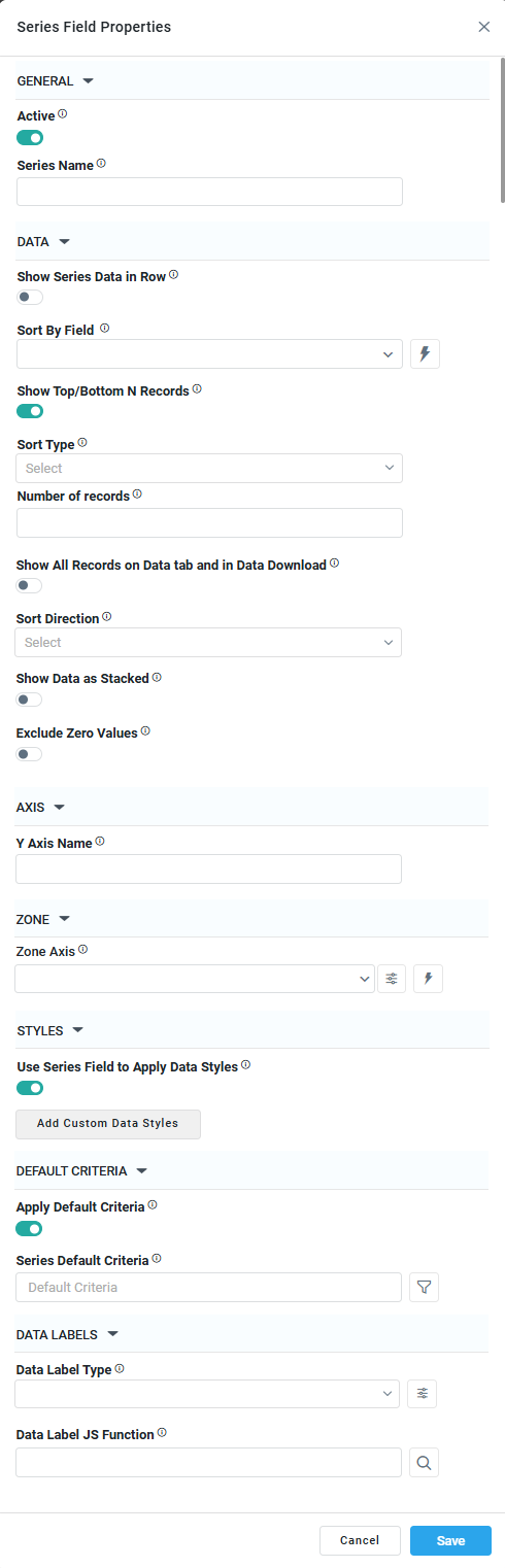
Series Field Properties
|
|
|
|
|---|---|---|
|
|
|
|
Label |
UI Widget |
Default |
Description |
|---|---|---|---|
|
GENERAL |
|
|
|
|
ON/OFF Toggle |
|
|
|
Text Field |
|
|
|
DATA |
|
|
|
|
ON/OFF Toggle |
OFF |
|
|
Dropdown w/Expression option |
|
|
|
|
OFF |
|
|
Dropdown |
|
|
|
ON/OFF Toggle |
OFF |
|
|
Dropdown |
|
|
|
ON/OFF Toggle |
OFF |
|
|
ON/OFF Toggle |
OFF |
|
|
AXIS |
|
|
|
|
Text Field |
|
|
|
ZONE |
|
|
|
|
Dropdown w/Expression option |
|
|
|
Icon w/Dialog |
|
See Zone Axis Color screenshot with options above. |
|
STYLES |
|
|
|
|
ON/OFF Toggle |
OFF |
|
|
Button w/Dialog |
|
|
|
DEFAULT CRITERIA |
|
|
|
|
ON/OFF Toggle |
OFF |
|
|
Text Field w/Query Builder option |
|
See Query Builder functionality in Getting Started section. |
|
DATA LABELS |
|
|
|
|
Dropdown |
|
|
|
Icon w/Dialog |
|
See Data Label Type screenshot with options above. |
|
Text Field w/Search |
|
|
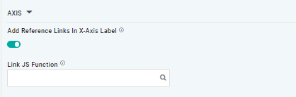
AXIS Properties
|
Label |
UI Widget |
Default |
Description |
|---|---|---|---|
|
ON/OFF Toggle |
OFF |
|
|
Text Field w/Search |
|
The Link JS function allows the user to select from an existing JavaScript Function to be used to generate links for the X-Axis Labels |
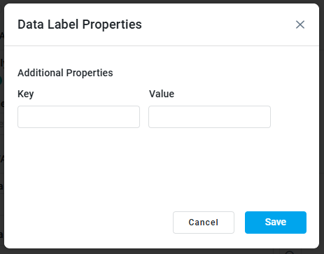
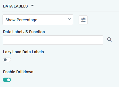
DATA LABELS Properties
|
Label |
UI Widget |
Default |
Description |
|---|---|---|---|
|
Dropdown w/Additional Properties option |
|
Optional Additional Properties - expressed as a Key/Value pair. |
|
… Additional Properties |
|
|
Optional Additional Properties - expressed as a Key/Value pair. |
|
Text Field w/Search |
|
The Data Label JS function allows the user to search for and define JavaScript functions that control the display or behavior of data labels in a chart. |
|
ON/OFF Toggle |
OFF |
If enabled, in the chart curation controls whether data labels are loaded gradually as the chart is interacted. |
|
ON/OFF Toggle |
ON |
|
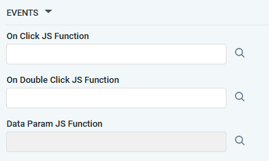
EVENTS Properties
|
Label |
UI Widget |
Default |
Description |
|---|---|---|---|
|
Text Field w/Search |
|
|
|
Text Field w/Search |
|
|
|
Text Field w/Search |
|
|
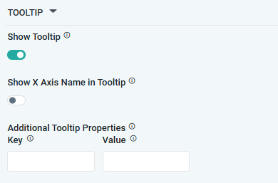
TOOLTIP Properties
|
Label |
UI Widget |
Default |
Description |
|---|---|---|---|
|
ON/OFF Toggle |
ON |
|
|
ON/OFF Toggle |
OFF |
|
|
|
|
Optional Additional Properties - expressed as a Key/Value pair. |
STYLES Properties
|
Label |
UI Widget |
Default |
Description |
|---|---|---|---|
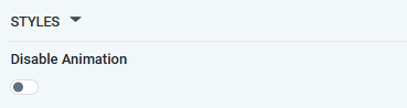
|
ON/OFF Toggle |
OFF |
The Disable Animation toggle refers to turning off any animated transitions or effects when the chart or visualization is rendered or updated. |
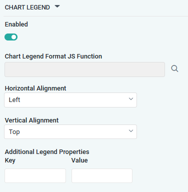
CHART LEGEND Properties
|
Label |
UI Widget |
Default |
Description |
|---|---|---|---|
|
ON/OFF Toggle |
ON |
|
|
Text Field w/Search |
|
|
|
Dropdown |
Left |
|
|
Dropdown |
Top |
|
|
|
|
Optional Additional Properties - expressed as a Key/Value pair. |
Contact App Orchid | Disclaimer