Intended audience: end-users analysts developers administrators
AO Platform: 4.5
Overview
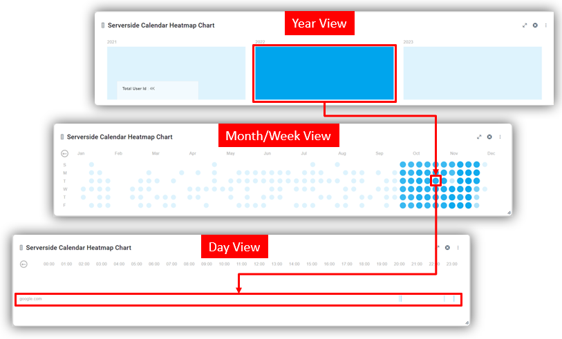
This section provides an overview of the Serverside Calendar Heatmap Chart for a Curation Micro Application. The Serverside Calendar Heatmap Chart is a data visualization tool that displays values in a calendar-like grid, where each cell represents a specific period and is color-coded to reflect data intensity. This Serverside implementation is designed for handling large datasets efficiently, as data processing and aggregation are performed on the server before being displayed in the chart.
Example
Configuration of Serverside Calendar Heatmap Chart
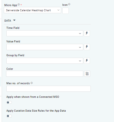
DATA Properties
|
Label |
Description |
|
|
|---|---|---|---|
|
Dropdown w/Expression option |
|
The Time Field allows the user to select an MSO Property that holds temporal information, such as dates or timestamps. This field is used to map and plot data in the calendar heatmap layouts. |
|
Dropdown w/Expression option |
|
The Value Field allows the user to select an aggregated value from an MSO Property (eg, Count)
|
|
Dropdown w/Expression option |
|
The Group By Field allows the user to select an MSO Property that defines categories for the data points. Grouping data enables the chart to display variations across categories within the most detailed calendar representation (typically an hourly view). |
|
Text Field w/Color Palette option |
|
The Color allows the user to select which color by Theme to use for the values in the chart. A gradient is automatically created within the Color selected. See Curation - Field Properties - Data Styles | Selection of Color. |
|
Number Field |
|
Option to set a Max number of records to be used by the chart. |
|
ON/OFF Toggle |
OFF |
If enabled, the Apply When Shown from a Connected MSO ON/OFF Toggle determines whether the settings or actions are applied specifically when data is displayed through a connected MSO.
|
|
ON/OFF Toggle |
OFF |
If enabled, the Record Count rules are applied. If the criteria are not met, the series will not be displayed. |
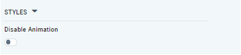
STYLES Properties
|
Label |
Description |
|
|
|---|---|---|---|
|
ON/OFF Toggle |
OFF |
The Disable Animation toggle refers to turning off any animated transitions or effects when the chart or visualization is rendered or updated. |
Contact App Orchid | Disclaimer