Intended audience: end-users analysts developers administrators
AO Platform: 4.5
Overview
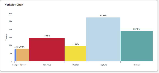
This section offers an overview of the Variwide Chart. A Variwide Chart (also known as a variable-width column chart) is a powerful visualization that extends the traditional bar or column chart by incorporating a third dimension: the width of the columns.
Example
Configuration of Variwide Chart
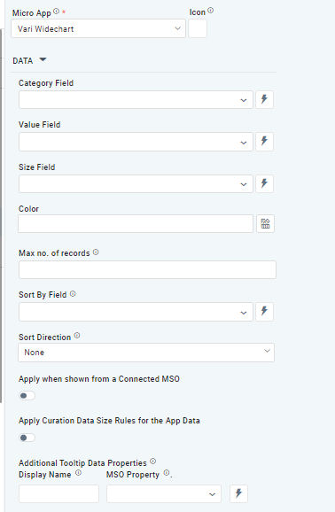
DATA Properties
|
Label |
UI Widget |
Default |
Description |
|---|---|---|---|
|
Dropdown w/Expression option |
|
The Category Field dropdown allows the user to select the category. |
|
Dropdown w/Expression option |
|
The Value Field dropdown allows the user to select a value. |
|
Dropdown w/Expression option |
|
The Size Field dropdown allows the user to select a size. |
|
Text Field w/Color Palette option |
|
The Colors allows the user to select which color to use for the Pie of the chart. See Curation - Field Properties - Data Styles | Selection of Color. |
|
Number Field |
|
Option to set a Max number of records to be used by the Chart. |
|
Dropdown w/Expression option |
|
The Sort By Field option allows the user to select a field to sort the data and also provides the flexibility to define a custom expression for more advanced sorting criteria. |
|
Dropdown |
|
Option to set the Sort order for data in the chart to either Ascending or Descending. |
|
ON/OFF Toggle |
OFF |
The Apply When Shown from a Connected MSO ON/OFF Toggle determines whether the settings or actions are applied specifically when data is displayed through a connected MSO.
|
|
ON/OFF Toggle |
OFF |
If enabled, the Record Count rules will be applied. The series will not be shown if the Record Count rules are not met. |
|
Display Name - Text Field MSO Property - Dropdown |
|
The Additional Tooltip Data Properties allow the user to select one or more MSO Field Properties to display their values in the tooltip when the user hovers over a data point. |
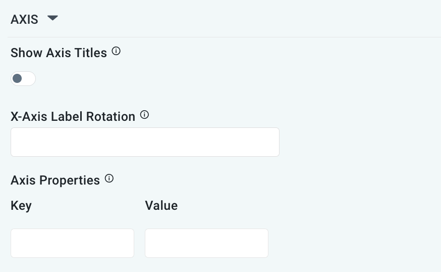
AXIS Properties
|
Label |
UI Widget |
Default |
Description |
|---|---|---|---|
|
ON/OFF Toggle |
OFF |
If enabled, titles can be added to both the X-Axis and Y-Axis. If disabled, the X-Axis and Y-Axis will not have titles. |
|
Text Field |
|
Enter a rotation value to influence how the axis labels are displayed. |
|
Key / Value - Text Fields |
|
Optional Axis Properties - expressed as a Key/Value pair. For instance, to change the linewidth to 10 for the Axis, add the following values:
|
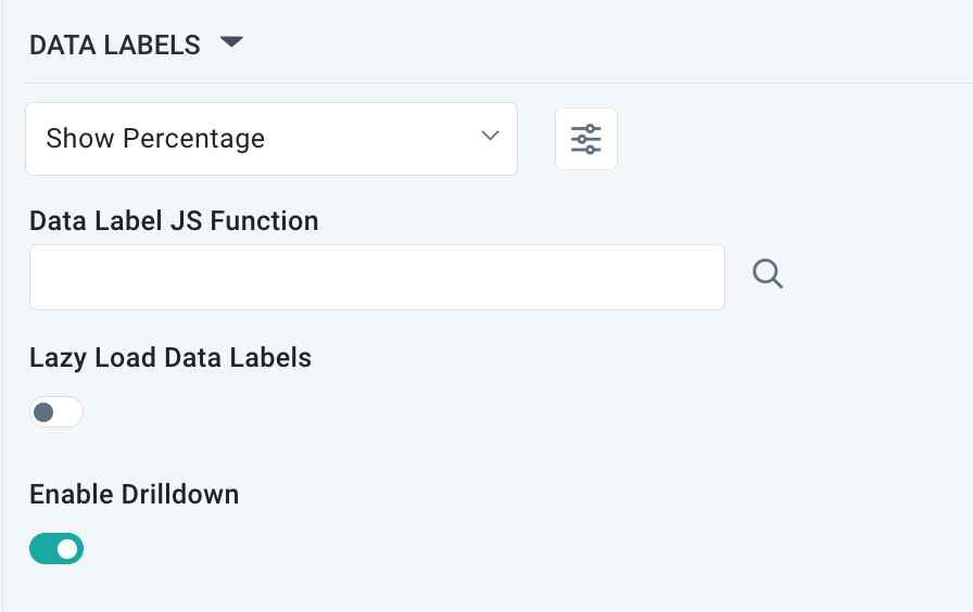
DATA LABELS Properties
|
Label |
UI Widget |
Default |
Description |
|---|---|---|---|
|
Dropdown w/Additional Properties option |
Show Percentage |
Optional Additional Properties - expressed as a Key/Value pair. |
|
… Additional Properties |
|
|
Optional Additional Properties - expressed as a Key/Value pair. |
|
Text Field w/Search |
|
The Data Label JS function allows the user to search for and define JavaScript functions that control the display or behavior of data labels in a chart. |
|
ON/OFF Toggle |
OFF |
If enabled, in the bar chart curation controls whether data labels are loaded gradually as the chart is interacted. |
|
ON/OFF Toggle |
ON |
|
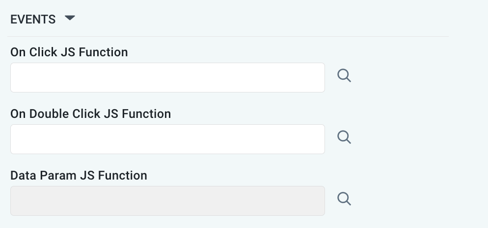
EVENTS Properties
|
Label |
UI Widget |
Default |
Description |
|---|---|---|---|
|
Text Field w/Search |
|
|
|
Text Field w/Search |
|
|
|
Text Field w/Search |
|
|
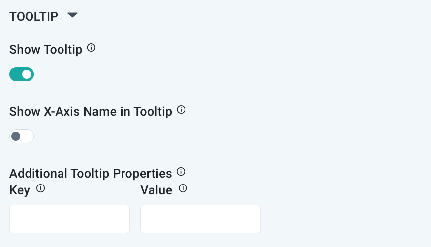
TOOLTIP Properties
|
Label |
UI Widget |
Default |
Description |
|---|---|---|---|
|
ON/OFF Toggle |
ON |
|
|
ON/OFF Toggle |
OFF |
If enabled, the tooltip displayed when hovering over data in the App will include the X-Axis name. If disabled, only the data value will be shown, without the X-Axis name |
|
Key / Value - Text Fields |
|
Optional Additional Tooltip Properties - expressed as a Key/Value pair. |
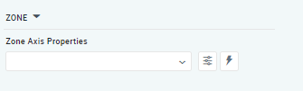
ZONE Properties
|
Label |
UI Widget |
Default |
Description |
|---|---|---|---|
|
Dropdown w/Additional Properties and Expression options |
|
The Zone Axis Properties dropdown allows the user to configure different zones within the chart, which is often used for visual emphasis or categorization, eg. select Temperature and create functions for values (celcius) identifying the following thresholds: less than 0 = black, 0-9.9 = blue, 10-19.9 = green, 20-24.9 = orange, and 25 and above = red. |
|
… Zone Color |
Text Field |
|
The Zone color refers to the color applied to different zones within a chart or graph. |
|
… Additional Properties |
Key / Value - Text Fields |
|
Optional Additional Tooltip Properties - expressed as a Key/Value pair. |
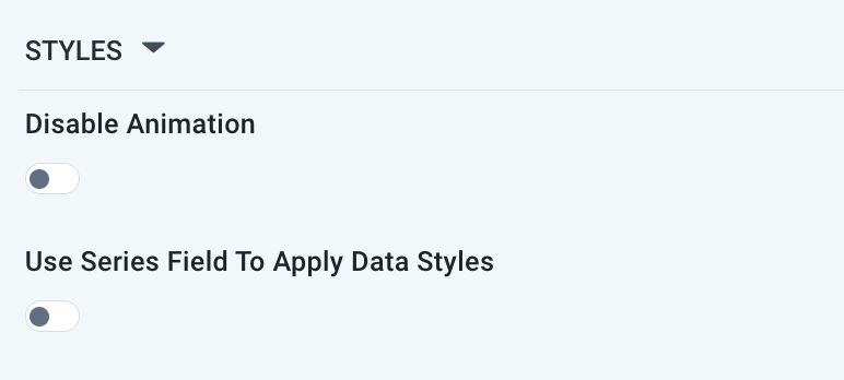
STYLES Properties
|
Label |
UI Widget |
Default |
Description |
|---|---|---|---|
|
ON/OFF Toggle |
OFF |
The Disable Animation toggle refers to turning off any animated transitions or effects that occur when the chart or visualization is rendered or updated. |
|
ON/OFF Toggle |
OFF |
|
Contact App Orchid | Disclaimer