Intended audience: administrators Developers
AO Platform: 3.5
Overview
This topic describes the style configurations for Input Colors.
Variable Names
--vux-input-bg
|
CSS Variable Name |
--vux-input-bg |
|---|---|
|
Light |

|
|
Dark |

|
Description
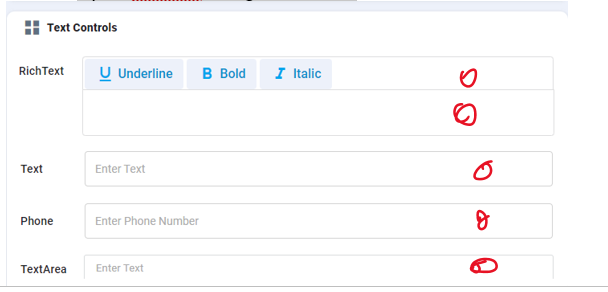
Used for input, textarea background color
Examples
-
Input, textarea background color
--vux-input-text
|
CSS Variable Name |
--vux-input-text |
|---|---|
|
Light |

|
|
Dark |

|
Description
Used for input, textarea text color
Examples
-
Input, Textarea text color

--vux-input-ghost-text
|
CSS Variable Name |
--vux-input-ghost-text |
|---|---|
|
Light |

|
|
Dark |

|
Description
Used for placeholder text color
Examples
-
Input, textarea input placeholder text color
--vux-input-border
|
CSS Variable Name |
--vux-input-border |
|---|---|
|
Light |

|
|
Dark |

|
Description
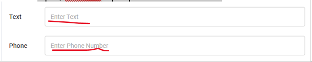
Used for input, textarea border color
Examples
-
Inputs, Textareas border color
--vux-input-border-hover
|
CSS Variable Name |
--vux-input-border-hover |
|---|---|
|
Light |

|
|
Dark |

|
Description
Used for inputs, textareas border hover color
Examples
-
Inputs, textareas border hover color

--vux-input-border-focus
|
CSS Variable Name |
--vux-input-border-focus |
|---|---|
|
Light |

|
|
Dark |

|
Description
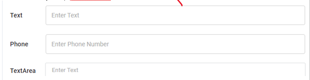
Used for inputs & textareas focus border color
Examples
-
Input, textarea input focus border color’

Contact App Orchid | Disclaimer