Intended audience: end-users analysts developers administrators
AO Platform: 4.4
Overview
This section provides an overview of a Serverside Datatable. A Server-Side Datatable is a highly efficient data visualization and management tool designed for handling large datasets. It includes pagination options in the footer of the Table App to allow the user to jump to specific pages of data or simply move from one page to another. Pagination is done to allow huge (in the millions of records) datasets to be handled in browser-based data representations, such as Table Apps.
Example
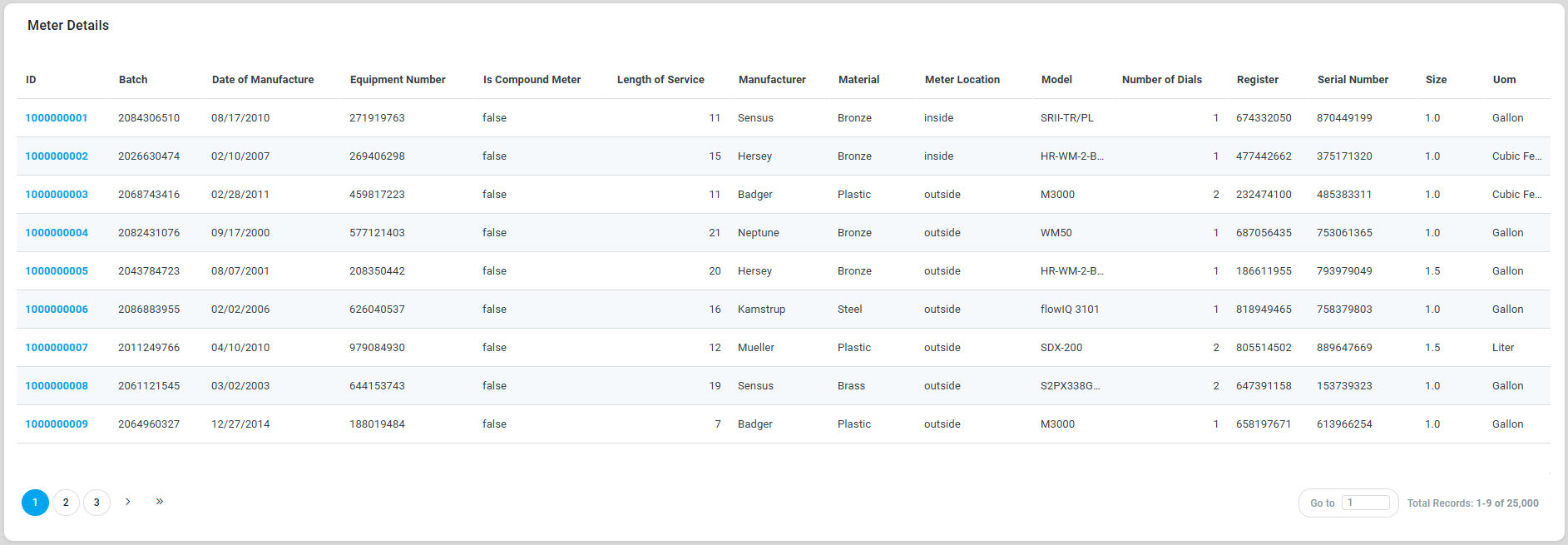
Configuration of Serverside Datatable
|
|
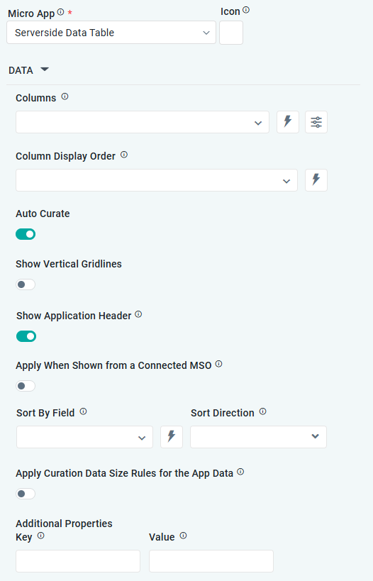
DATA Properties
|
Label |
UI Widget |
Default |
Description |
|---|---|---|---|
|
Dropdown w/Expression option |
|
The Column dropdown allows the user to select one or more MSO Field Properties to be included in the Datatable App. |
|
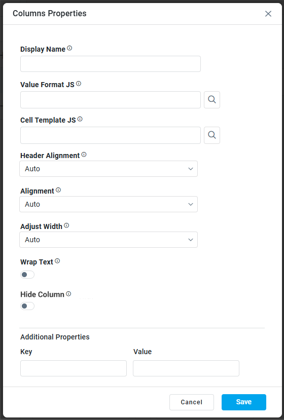
Column Properties |
|
|
|
|
Text Field |
|
The Display Name field displays the name. |
|
Text Field w/Search |
|
The Value Format JS in a Simple Datatable allows users to apply custom JavaScript code to format the values displayed in the table. |
|
Test Field w/Search |
|
The Cell Template JS allows users to customize the appearance and content of individual cells in a Simple Datatable using JavaScript. |
|
Dropdown |
Auto |
Select Alignment for Header, including Auto, Left, Center, or Right. |
|
Dropdown |
Auto |
Select Alignment for Column content, including Auto, Left, Center, or Right. |
|
Dropdown |
Auto |
Select how to Adjust Width, including Auto, By Pixels, or By Percentage. |
|
Number Field |
100 |
Enter the number of pixels for the Column Width. This property is only visible if the Adjust Width property value is By Pixels. |
|
ON/OFF Toggle |
OFF |
If enabled, the row height in the table will be based on the available text. |
|
ON/OFF Toggle |
OFF |
If enabled, the table column will not show in the app. |
|
Key / Value - Text Fields |
|
Optional Additional Properties - expressed as a Key/Value pair. |
|
|
|
|
|
|
|
|
The Column Display Order allows the user to select the display order for one or more selected MSO field properties. |
|
ON/OFF Toggle |
ON |
The Auto Curate Toggle allows the user to enable or disable automated data curation for a dataset. When enabled, the system applies predefined rules and logic to automatically process and organize the data. When disabled, users have full control and can manually curate the dataset. |
|
ON/OFF Toggle |
OFF |
|
|
ON/OFF Toggle |
ON |
If enabled, the App will show the App Header with an Icon and Title. If disabled, only the visual component from the Template will be shown. |
|
|
|
|
|
Dropdown |
|
The Sory By Field option allows the user to select a field to sort the data and also provides the flexibility to define a custom expression for more advanced sorting criteria. |
|
Dropdown |
|
Option to set the Sort order for data in the chart to either Ascending or Descending. |
|
ON/OFF Toggle |
OFF |
If enabled, the Record Count rules will be applied. If the Record Count rules are not met, the series will not be shown. |
|
Key / Value - Text Fields |
|
Optional Additional Properties - expressed as a Key/Value pair. |
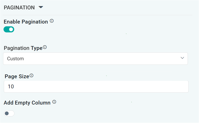
PAGINATION Properties
|
Label |
UI Widget |
Default |
Description |
|---|---|---|---|
|
ON/OFF Toggle |
ON |
If enabled, page numbers will be added as links below the table App
|
|
Dropdown |
Auto |
Select from available options, including Auto or Custom. If Custom, the number of records to be shown per page can be added in the Page Size property. |
|
Number Field |
10 |
Enter the number of records that will be shown in the table per “page”. |
|
ON/OFF Toggle |
OFF |
If enabled, an extra empty column will be added as the last column of a table. This is useful if only a few columns are shown in a table in order to push columns with values closer together. |
Contact App Orchid | Disclaimer