Intended audience: end-users analysts developers administrators
AO Platform: 4.4
Overview
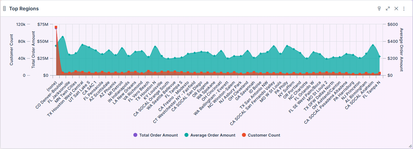
This section contains an overview of Area Range Chart. The Area Range Chart allows users to visualize multiple time series or categorical data series while highlighting volume differences between y-axis series.
Example
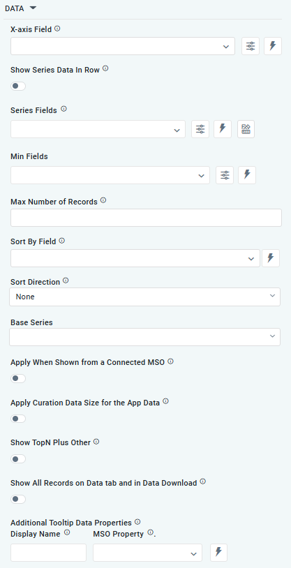
Configuration of Area Range Chart
DATA Properties
|
|
|
Label |
UI Widget |
Default |
Description |
|---|---|---|---|
|
Dropdown w/Expression option |
|
The X-axis Field allows the user to select the MSO Field Property to represent the X-axis values in the chart. |
|
ON/OFF Toggle |
OFF |
If enabled, select a single Series Type and Series Field below. If disabled, choose one or more Series Fields below. |
|
… Series Type Field |
Dropdown w/Expression option |
|
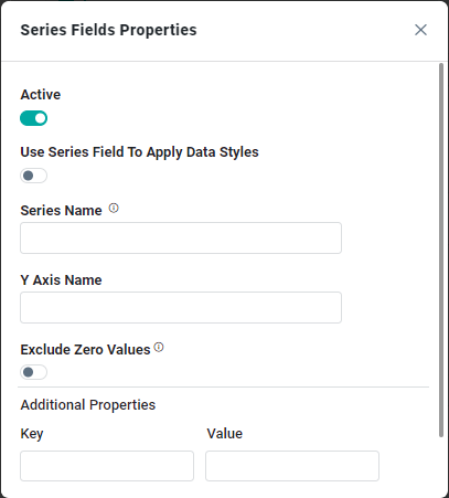
The Series Type Field dropdown in Area Range Chart curation allows users to specify a field that determines the type of series displayed in the chart. This property is only available if Show Series Data in Row is enabled. |
|
… Colors |
Text Field w/Color Palette option |
|
The Colors allows the user to select which color to use for the area range of the chart. See Curation - Field Properties - Data Styles | Selection of Color. This property is only available if Show Series Data in Row is enabled. |
|
Repeater Dropdown w/Additional Properties, Expression, and Color options |
|
The Series Field allows the user to select an MSO Field Property to represent the Series Field. |
|
… Active |
ON/OFF Toggle |
ON |
If enabled, the feature or data series is active and will be applied or shown in the Area Range Chart. |
|
… Use Series Field to Apply Data Styles |
ON/OFF Toggle |
OFF |
The ON/OFF Toggle controls whether data styles are applied based on the series field:
|
|
… Series Name |
Text Field |
|
The Series Name allows the user to enter Series Names that will be used to identify the data Series in the Legend. |
|
… Y-Axis Name |
Text Field |
|
The Y-Axis Name field displays the name of Y-Axis. |
|
… Exclude Zero Values |
ON/OFF Toggle |
OFF |
If enabled, zero values will be excluded. By default, this setting is disabled. |
|
… Additional Properties |
Key / Value - Text Fields |
|
Optional Additional Properties - expressed as a Key/Value pair. |
|
Dropdown w/Additional Properties and Expression options |
|
The Min Field allows the user to select an MSO Field Property to represent the minimum values for the data in the Series. |
|
… Series Names |
Name / Display Name - Text Fields |
|
The Series Name allows the user to enter Series Names that will be used to identify the data Series in the Legend. |
|
Number Field |
|
Option to set a Max number of records to be used by the chart. |
|
Dropdown |
|
The Sort By Field option allows users to select a field to sort the data and also provides the flexibility to define a custom expression for more advanced sorting criteria. |
|
Dropdown |
|
Option to set the Sort order for data in the chart to either Ascending or Descending. |
|
Dropdown |
|
The dropdown Base Series field allows the user to select an option relating to each series Field, such as Bell Curve, Histogram, or Pareto. |
|
ON/OFF Toggle |
OFF |
The Apply When Shown from a Connected MSO ON/OFF Toggle determines whether the settings or actions are applied specifically when data is displayed through a connected MSO.
|
|
ON/OFF Toggle |
OFF |
If enabled, the Record Count rules will be applied. If the Record Count rules are not met, the series will not be shown. |
|
ON/OFF Toggle |
OFF |
If Show TopN plus Other is enabled, the App will display only the Top N records and a single aggregated category representing all other records. An MSO Setting determines the number of records shown for the Top N in the Easy Answers section. If disabled, the App will display all records based on the user's query. |
|
ON/OFF Toggle |
OFF |
If enabled, all records, otherwise excluded by the LIMIT clause when “Show TopN Plus Other” is enabled, and used by the App, will be shown on the App’s Data tab as well as in the Download Data option. |
|
Display Name - Text Field MSO Property - Dropdown |
|
The Additional Tooltip Data Properties allow the user to select one or more MSO Field Properties to display their values in the tooltip when the user hovers over a data point. |
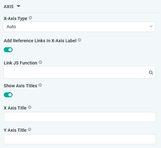
AXIS Properties
|
Label |
UI Widget |
Default |
Description |
|---|---|---|---|
|
Dropdown |
|
Option to select the format of the X-Axis, including: Linear, Logarithmic, DateTime, Category, Color, BellCurve. |
|
ON/OFF Toggle |
OFF |
If enabled, X-Axis labels will be converted into clickable links, with their content defined by the JavaScript in the Link JS Function. When disabled, the labels will not include links. |
|
… Link JS Functions |
Text Field w/Search |
|
The Link JS function allows the user to select from an existing JavaScript Function to be used to generate links for the X-Axis Labels |
|
ON/OFF Toggle |
OFF |
If enabled, titles can be added to both the X-Axis and Y-Axis. If disabled, the X-Axis and Y-Axis will not have titles. |
|
Text Field |
|
Enter the Title for the X-Axis. |
|
Text Field |
|
Enter the Title for the Y-Axis. |
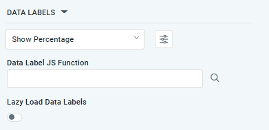
DATA LABELS Properties
|
Label |
UI Widget |
Default |
Description |
|---|---|---|---|
|
Dropdown w/Additional Properties option |
Show Percentage |
Optional Additional Properties - expressed as a Key/Value pair. |
|
… Additional Properties |
|
|
Optional Additional Properties - expressed as a Key/Value pair. |
|
Text Field w/Search |
|
The Data Label JS function allows users to search for and define JavaScript functions that control the display or behavior of data labels in a chart. |
|
ON/OFF Toggle |
OFF |
If enabled, the Area Range Chart curation controls data labels are loaded gradually as the chart is interacted. |
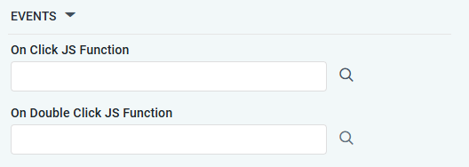
EVENTS Properties
|
Label |
UI Widget |
Default |
Description |
|---|---|---|---|
|
Text Field w/Search |
|
The On Click JS function allows users to search for and define JavaScript functions that control the behavior when the user clicks a data point in the chart. If left empty, the default behavior for the chart will be used. |
|
Text Field w/Search |
|
The On Double Click JS function allows users to search for and define JavaScript functions that control the behavior when the user double clicks a data point in the chart. If left empty, the default behavior for the chart will be used. |
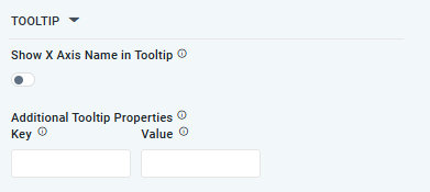
TOOLTIP Properties
|
Label |
UI Widget |
Default |
Description |
|---|---|---|---|
|
ON/OFF Toggle |
OFF |
If enabled, the tooltip displayed when hovering over data in the App will include the X-Axis name. If disabled, only the data value will be shown, without the X-Axis name |
|
Key / Value - Text Fields |
|
Optional Additional Tooltip Properties - expressed as a Key/Value pair. |
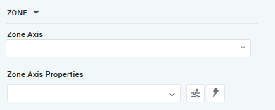
ZONE Properties
|
Label |
UI Widget |
Default |
Description |
|---|---|---|---|
|
Dropdown |
|
The Zone Axis dropdown allows the user to select different zones within the chart, often used for visual emphasis or categorization. |
|
Dropdown w/Additional Properties and Expression options |
|
The Zone Axis Properties dropdown allows users to customize the properties of the Zone Axis in an Area Range Chart. |
|
… Zone Color |
Text Field |
|
The Zone Color refers to the color applied to different zones within a chart. |
|
… Additional Properties |
Key / Value - Text Fields |
|
Optional Additional Tooltip Properties - expressed as a Key/Value pair. |
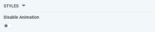
STYLES Properties
|
Label |
UI Widget |
Default |
Description |
|---|---|---|---|
|
ON/OFF Toggle |
OFF |
If enabled, the Disable Animation toggle refers to turning off any animated transitions or effects when the chart or visualization is rendered or updated. |
Contact App Orchid | Disclaimer