Intended audience: administrators Developers
AO Platform: 3.5
Overview
This topic describes the style configurations for Shadow Component.
Variable Names
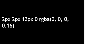
--vux-shadow-500
|
CSS Variable Name |
--vux-shadow-500 |
|---|---|
|
Light |
|
|
Dark |
|
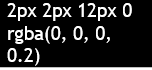
Description
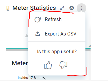
Used for QnA on hover vux-app shadow
Examples
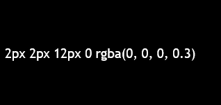
--vux-shadow-300
|
CSS Variable Name |
--vux-shadow-300 |
|---|---|
|
Light |
|
|
Dark |
|
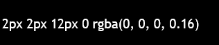
Description
Used for QnA vux-app shadow
Examples
--vux-shadow-popup
|
CSS Variable Name |
--vux-shadow-popup |
|---|---|
|
Light |
|
|
Dark |
|
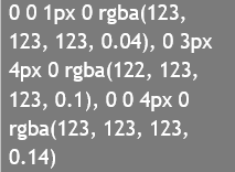
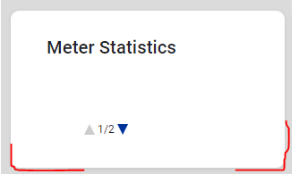
Description
Used for QnA vux-app dropdown menu shadow
Examples
--vux-bg-inverse-shadow-clr
|
CSS Variable Name |
--vux-bg-inverse-shadow-clr |
|---|---|
|
Light |

|
|
Dark |
|
Description
Used for shadow color
Examples
-
.webix_menu shadow color
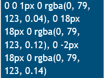
--vux-toggle-pressed-shadow-clr
|
CSS Variable Name |
--vux-toggle-pressed-shadow-clr |
|---|---|
|
Light |

|
|
Dark |

|
Description
Used for toggle button pressed shadow color, which include opacity.
Examples

Contact App Orchid | Disclaimer