Intended audience: end-users analysts developers administrators
AO Platform: 4.4
Overview
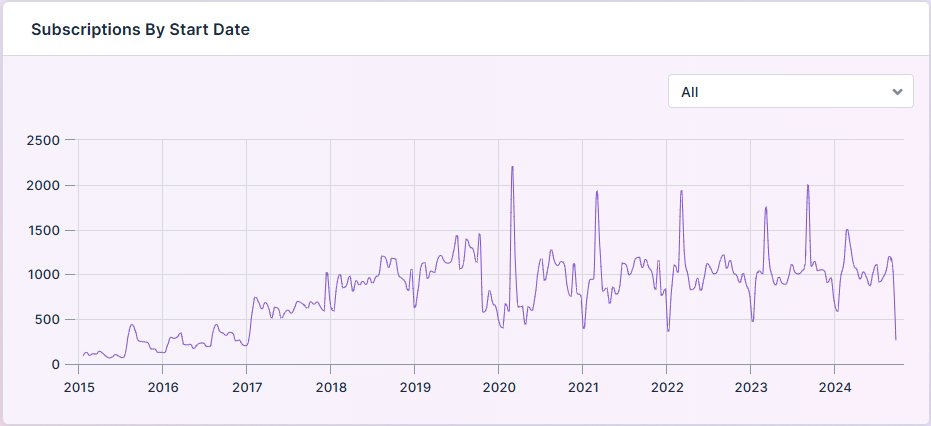
This section provides an overview of a Serverside XY Time Series Chart for a Curation Micro Application. A Server-Side XY Time Series Chart is a visualization tool designed to display temporal data trends and relationships on an XY axis.
Example
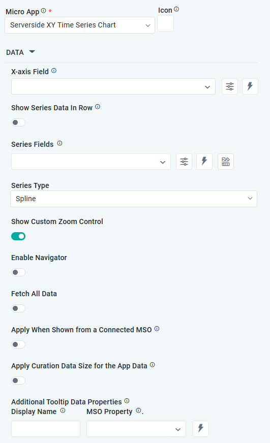
Configuration of Serverside XY Time Series Chart
DATA Properties
|
|
|
Label |
UI Widget |
Default |
Description |
|---|---|---|---|
|
Dropdown w/Expression option |
|
The X-axis Field allows users to select the MSO Field Property to represent the X-axis values in the Chart. |
|
ON/OFF Toggle |
OFF |
If enabled, select a single Series Type and Series Field below. If disabled, select one or more Series Fields below. |
|
Repeater Dropdown w/Additional Properties, Expression, and Color options |
|
The Series Fields allow users to select an MSO Field Property to represent the Series Field. |
|
… Active |
ON/OFF Toggle |
ON |
If enabled, the feature or data series is active and will be applied or shown in the column chart. |
|
… Use Series Field to Apply Data Styles |
ON/OFF Toggle |
OFF |
The ON/OFF toggle refers to enabling or disabling the application of data styles to the series field. |
|
… Series Name |
Text Field |
|
The Series Name allows users to enter Series Names that will be used to identify the data Series in the Legend. |
|
… Y-Axis Name |
Text Field |
|
The Y-Axis Name field displays the name of Y-Axis. |
|
… Exclude Zero Values |
ON/OFF Toggle |
OFF |
If enabled, zero values will be excluded. By default, this setting is disabled. |
|
… Additional Properties |
Key / Value - Text Fields |
|
Optional Additional Properties - expressed as a Key/Value pair. |
|
Dropdown w/Expression option |
|
The Series Type Field dropdown in polar chart curation allows users to specify a field that determines the type of series displayed in the chart. |
|
Dropdown w/Additional Properties and Expression options |
|
The Series Fields allow users to select an MSO Field Property to represent the Series Field. |
|
… Use Series Field to Apply Data Styles |
ON/OFF Toggle |
OFF |
The Use Series Field to Apply Data Styles ON/OFF Toggle controls whether data styles are applied based on the series field:
|
|
… Series Names |
Name / Display Name - Text Fields |
|
The Series Name allows users to enter Series Names that will be used to identify the data Series in the Legend. |
|
… Additional Properties |
Key / Value - Text Fields |
|
Optional Additional Properties - expressed as a Key/Value pair. |
|
Text Field w/Color Palette option |
|
The Colors allows users to select which color to use for the area of the series. See Curation - Field Properties - Data Styles | Selection of Color. |
|
Dropdown w/Expression option |
|
The Series Type Field dropdown in polar chart curation allows users to specify a field that determines the type of series displayed in the chart. |
|
ON/OFF Toggle |
OFF |
If enabled, allows users to display a custom Zoom control. |
|
ON/OFF Toggle |
ON |
If enabled, allows users to enable the navigator. |
|
ON/OFF Toggle |
ON |
If enabled, allows users to enable the range selector. |
|
ON/OFF Toggle |
OFF |
If enabled, allows users to fetch all the data. |
|
ON/OFF Toggle |
OFF |
The Apply When Shown from a Connected MSO ON/OFF Toggle determines whether the settings or actions are applied specifically when data is displayed through a connected MSO.
|
|
ON/OFF Toggle |
OFF |
If enabled, the Record Count rules will be applied. The series will not be shown if the Record Count rules are not met. |
|
Text Field Dropdown w/Expresson option |
|
Repeater section for adding additional data values to a Tooltip using a Display Name and value from the MSO Property. |
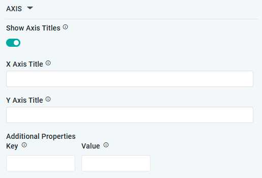
AXIS Properties
|
Label |
UI Widget |
Default |
Description |
|---|---|---|---|
|
ON/OFF Toggle |
ON |
If enabled, titles can be added to both the X-Axis and Y-Axis. If disabled, the X-Axis and Y-Axis will not have titles. |
|
Text Field |
|
Enter the Title for the X-Axis. |
|
Text Field |
|
Enter the Title for the Y-Axis. |
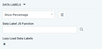
DATA LABELS Properties
|
Label |
UI Widget |
Default |
Description |
|---|---|---|---|
|
Dropdown w/Additional Properties option |
Show Percentage |
Optional Additional Properties - expressed as a Key/Value pair. |
|
… Additional Properties |
|
|
Optional Additional Properties - expressed as a Key/Value pair. |
|
Text Field w/Search |
|
The Data Label JS function allows users to search for and define JavaScript functions that control the display or behavior of data labels in a chart. |
|
ON/OFF Toggle |
OFF |
If enabled, in the bar chart curation controls whether data labels are loaded gradually as the chart is interacted. |
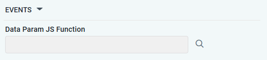
EVENTS Properties
|
Label |
UI Widget |
Default |
Description |
|---|---|---|---|
|
Text Field w/Search |
|
Add a JS Function. |
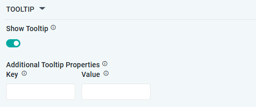
TOOLTIP Properties
|
Label |
UI Widget |
Default |
Description |
|---|---|---|---|
|
ON/OFF Toggle |
ON |
If enabled, a tooltip will be displayed when hovering over data in the App. |
|
Key / Value - Text Fields |
|
Optional Additional Tooltip Properties - expressed as a Key/Value pair. |
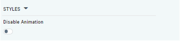
STYLES Properties
|
Label |
UI Widget |
Default |
Description |
|---|---|---|---|
|
ON/OFF Toggle |
OFF |
The Disable Animation toggle refers to turning off any animated transitions or effects that occur when the chart or visualization is rendered or updated. |
Contact App Orchid | Disclaimer