Intended audience: end-users analysts developers administrators
AO Platform: 4.4
Overview
This topic provides an overview of a multi-XY time Series Chart in which each data series is represented by its own XY axis. In this chart, the X-axis typically represents time, while the Y-axis represents the data values.
Example
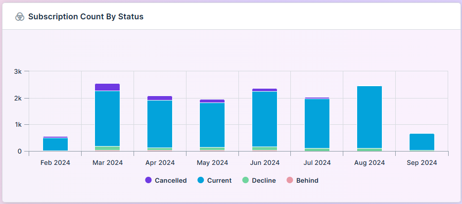
Configuration of Multi XY Time Series Chart
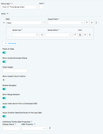
DATA Properties
|
|
|
Label |
UI Widget |
Default |
Description |
|---|---|---|---|
|
|
|
|
|
Dropdown w/Expression option |
|
The X-axis Field allows the user to select the MSO Field Property to represent the X-axis values in the Chart. |
|
Dropdown w/Expression option |
|
The Series Type Field dropdown in area chart curation allows the user to specify a field that determines the type of series displayed in the chart. |
|
Dropdown w/Additional Properties and Expression options |
|
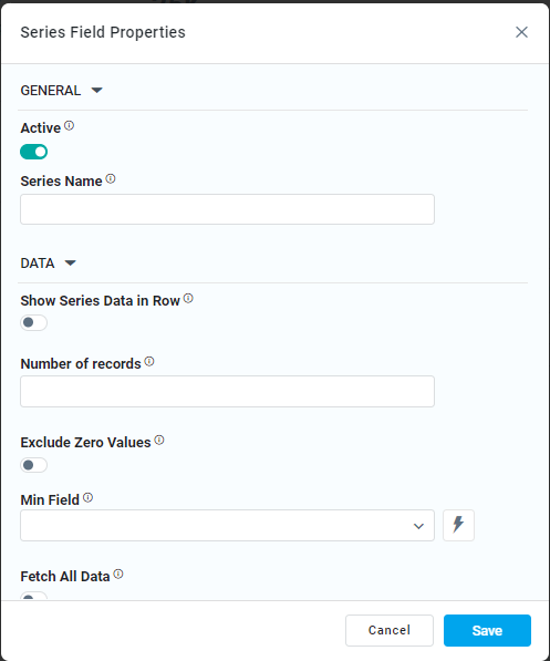
The Series Field allows the user to select an MSO Field Property to represent the Series Field. |
|
… Exclude Zero Values |
ON/OFF Toggle |
ON |
If enabled, zero values will be excluded. By default, this setting is disabled. |
|
Additional Properties |
Key / Value - Text Fields |
|
Optional Additional Properties - expressed as a Key/Value pair. |
|
Text Field w/Color Palette option |
|
The Colors allows the user to select which color to use for the multi XY series. See Curation - Field Properties - Data Styles | Selection of Color. |
|
Delete Series |
|
|
Deleting a series in a chart allows the user to delete the associated data series from the chart configuration |
|
ON/OFF Toggle |
ON |
If enabled, the Fetch All Data toggle retrieves all data points associated with multiple series from the data source. |
|
ON/OFF Toggle |
ON |
If enabled, multiple charts are displayed with linked interactions, ensuring synchronization for actions like zooming, panning, or highlighting. This functionality is especially valuable for real-time comparison of related datasets across multiple charts. |
|
Number Field |
|
The Chart Height allows the user to specify a numeric value for the chart's height. |
|
ON/OFF Toggle |
OFF |
If enabled, it allows the user to adjust the visible data range based on their preferences. |
|
ON/OFF Toggle |
ON |
If enabled, it allows the user to easily explore and adjust the visible data range. |
|
ON/OFF Toggle |
ON |
If enabled, it allows the user to display a specific range of data. |
|
ON/OFF Toggle |
ON |
The Apply When Shown from a Connected MSO ON/OFF Toggle determines whether the settings or actions are applied specifically when data is displayed through a connected MSO.
|
|
ON/OFF Toggle |
ON |
If enabled, the Record Count rules will be applied. If the Record Count rules are not met, the series will not be shown. |
|
Display Name - Text Field MSO Property - Dropdown |
|
The Additional Tooltip Data Properties allow the user to select one or more MSO Field Properties to display their values in the tooltip when the user hovers over a data point. |
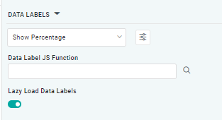
DATA LABELS Properties
|
Label |
UI Widget |
Default |
Description |
|---|---|---|---|
|
Dropdown w/Additional Properties option |
|
Optional Additional Properties - expressed as a Key/Value pair. |
|
… Additional Properties |
|
|
Optional Additional Properties - expressed as a Key/Value pair. |
|
Text Field w/Search |
|
The Data Label JS function allows the user to search for and define JavaScript functions that control the display or behavior of data labels in a chart. |
|
ON/OFF Toggle |
OFF |
If enabled, in the Bar Chart, curation controls whether data labels are loaded gradually as the chart is interacted. |
TOOLTIP Properties
|
Label |
UI Widget |
Default |
Description |
|---|---|---|---|
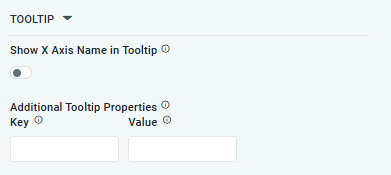
|
ON/OFF Toggle |
OFF |
If enabled, the tooltip displayed when hovering over data in the App will include the X-Axis name. If disabled, only the data value will be shown, without the X-Axis name |
|
Key / Value - Text Fields |
|
Optional Additional Tooltip Properties - expressed as a Key/Value pair. |
STYLES Properties
|
Label |
UI Widget |
Default |
Description |
|---|---|---|---|
|
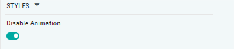
ON/OFF Toggle |
OFF |
The Disable Animation toggle refers to turning off any animated transitions or effects that occur when the chart or visualization is rendered or updated. |
Contact App Orchid | Disclaimer