Intended audience: end-users analysts developers administrators
AO Platform: 4.4
Overview
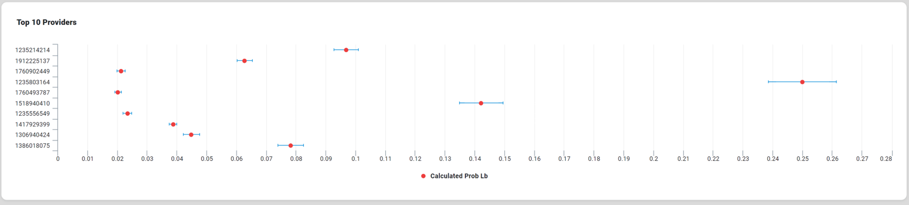
This section provides an overview of a Forest Chart. A Forest Chart is a circular visualization that displays relationships or dependencies between different categories or elements. It is beneficial for analyzing flows, connections, or hierarchies in datasets. A Forest Chart also compares multiple categories or groups by displaying their mean values and associated variability.
Example
Configuration of Forest Chart
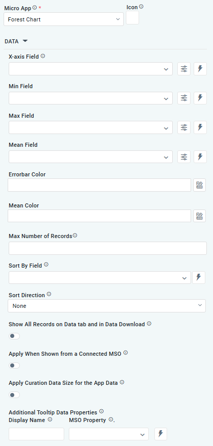
DATA Properties
|
Label |
UI Widget |
Default |
Description |
|---|---|---|---|
|
Dropdown w/Expression option |
|
The X-axis Field allows the user to select the MSO Field Property to represent the X-axis values in the Chart. |
|
Dropdown |
|
The Min Field in a Forest Chart within curation refers to the field specifying the dataset's minimum value for each category or group. |
|
Dropdown |
|
The Max Field in a Forest Chart within curation refers to the field specifying the dataset's maximum value for each category or group. |
|
Dropdown w/Expression option |
|
The Mean Field dropdown allows the user to select the central value or average (mean) of a particular dataset or group. |
|
|
|
The Errorbar Color allows the user to customize the color used to represent the error bars, which display variability or uncertainty around the mean values |
|
Text Field |
|
The Mean Color allows the user to select the color used to represent the mean values for each category or group. |
|
Key / Value - Text Fields |
|
Option to set a Max number of records to be used by the Chart. |
|
Dropdown w/Expression option |
|
The Sort By Field option allows the user to select a field to sort the data and also provides the flexibility to define a custom expression for more advanced sorting criteria. |
|
Dropdown |
|
Option to set the Sort order for data in the Chart to either Ascending or Descending. |
|
ON/OFF Toggle |
OFF |
If enabled, all records, otherwise excluded by the LIMIT clause when “Show TopN Plus Other” is enabled, and used by the App, will be shown on the App’s Data tab as well as in the Download Data option. |
|
ON/OFF Toggle |
OFF |
The Apply When Shown from a Connected MSO ON/OFF Toggle determines whether the settings or actions are applied specifically when data is displayed through a connected MSO.
|
|
ON/OFF Toggle |
OFF |
If enabled, the Record Count rules will be applied. If the Record Count rules are not met, the series will not be shown. |
|
Display Name - Text Field MSO Property - Dropdown |
|
The Additional Tooltip Data Properties allows the user to select one or more MSO Field Properties to display their values in the tooltip when the user hovers over a data point. |
|
Display Name - Text Field MSO Property - Dropdown |
|
The Additional Tooltip Data Properties allows the user to select one or more MSO Field Properties to display their values in the tooltip when the user hovers over a data point. |
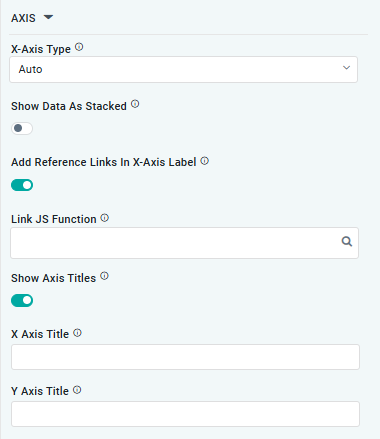
AXIS Properties
|
Label |
UI Widget |
Default |
Description |
|---|---|---|---|
|
Dropdown |
|
Option to select the format of the X-Axis, including Linear, Logarithmic, DateTime, Category, Color, and BellCurve. |
|
ON/OFF Toggle |
|
If enabled, titles can be added to both the X-Axis and Y-Axis. If disabled, they will not have titles. |
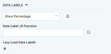
DATA LABELS Properties
|
Label |
UI Widget |
Default |
Description |
|---|---|---|---|
|
Dropdown w/Additional Properties option |
|
Optional Additional Properties - expressed as a Key/Value pair. |
|
… Additional Properties |
|
|
Optional Additional Properties - expressed as a Key/Value pair. |
|
Text Field w/Search |
|
The Data Label JS function allows the user to search for and define JavaScript functions that control the display or behavior of data labels in a chart. |
|
ON/OFF Toggle |
|
If enabled, in the Forest Chart curation controls whether data labels are loaded gradually as the chart is interacted. |
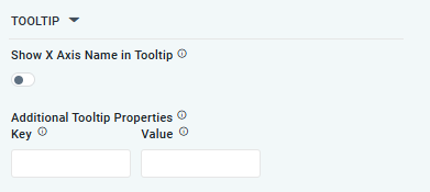
TOOLTIP Properties
|
Label |
UI Widget |
Default |
Description |
|---|---|---|---|
|
ON/OFF Toggle |
|
If enabled, the tooltip displayed when hovering over data in the App will include the X-Axis name. If disabled, only the data value will be shown, without the X-Axis name |
|
Key / Value - Text Fields |
|
Optional Additional Tooltip Properties - expressed as a Key/Value pair. |
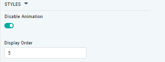
STYLES Properties
|
Label |
UI Widget |
Default |
Description |
|---|---|---|---|
|
ON/OFF Toggle |
|
The Disable Animation toggle refers to turning off any animated transitions or effects that occur when the chart or visualization is rendered or updated. |
Contact App Orchid | Disclaimer