Intended audience: end-users analysts developers administrators
AO Platform: 4.4
Overview
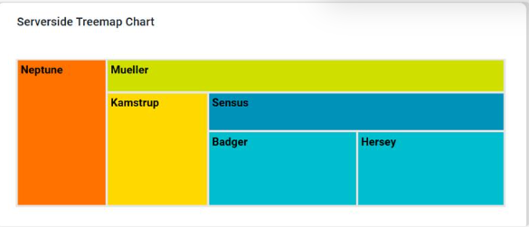
This section provides an overview of a Serverside Treemap Chart. The Serverside Treemap Chart is a hierarchical data visualization tool that processes and aggregates data on the server before rendering it in the application. It displays data in the form of nested rectangles, where the size and color of each rectangle represent quantitative metrics.
Example
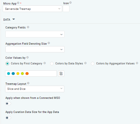
Configuration of Serverside Treemap Chart
DATA Properties
|
Label |
Description |
|
|
|---|---|---|---|
|
Dropdown w/Expression option |
|
The Category Fields are columns or attributes in the dataset that represent the grouping levels in the treemap. Each field corresponds to a layer in the hierarchy, with higher-level categories nesting lower-level ones. |
|
Dropdown w/Expression option |
|
The Aggregation Field Denoting Size dropdown allows users to determine the size of each rectangle in the treemap. It typically represents a quantitative metric and other numerical values, and is aggregated to calculate the total value for each category or subcategory. |
|
|
|
|
|
Radio button |
|
The Colors by First Category allows users to visually distinguish the main groups in the dataset at a glance while maintaining consistency across subcategories through inherited color shades or tones. |
|
Radio button |
|
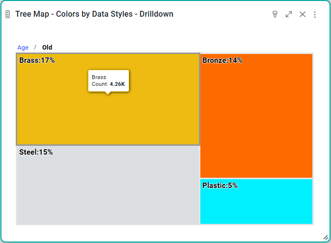
The Colors by Data Styles refers to a feature where the color of each rectangle is determined by specific data values or styles applied to the dataset. This approach provides an additional layer of meaning to the visualization, allowing users to interpret the data more effectively based on color variations. |
|
Radio button |
|
The Colors by Aggregate Values refers to assigning colors to rectangles based on aggregated numerical values for each category or subcategory. This method uses aggregated data, such as totals, averages, or counts, to define the color intensity, gradient, or specific hues, visually representing the data's magnitude or category. |
|
ON/OFF Toggle |
|
If enabled, allows users to drill down to see group details in the treemap. |
|
Dropdown |
|
The Treemap Layout dropdown allows users to choose from layout options such as Slice and Dice, Stripes, Squarified, and Strip. |
|
ON/OFF Toggle |
|
The Apply When Shown from a Connected MSO ON/OFF Toggle determines whether the settings or actions are applied specifically when data is displayed through a connected MSO.
|
|
ON/OFF Toggle |
|
If enabled, the Record Count rules will be applied. If the Record Count rules are not met, the series will not be shown. |
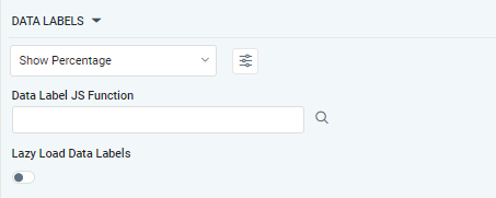
DATA LABELS Properties
|
Label |
Description |
|
|
|---|---|---|---|
|
Dropdown w/Additional Properties option |
Show Percentage |
Optional Additional Properties - expressed as a Key/Value pair. |
|
… Additional Properties |
|
|
Optional Additional Properties - expressed as a Key/Value pair. |
|
Text Field w/Search |
|
The Data Label JS function allows the user to search for and define JavaScript functions that control the display or behavior of data labels in a chart. |
|
ON/OFF Toggle |
OFF |
If enabled, in the Scatter Chart curation controls whether data labels are loaded gradually as the chart is interacted. |
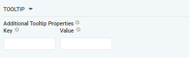
TOOLTIP Properties
|
Label |
Description |
|
|
|---|---|---|---|
|
Key / Value - Text Fields |
|
Optional Additional Tooltip Properties - expressed as a Key/Value pair. |
Contact App Orchid | Disclaimer