Intended audience: end-users analysts developers administrators
AO Platform: 4.4
Overview
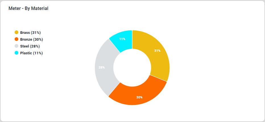
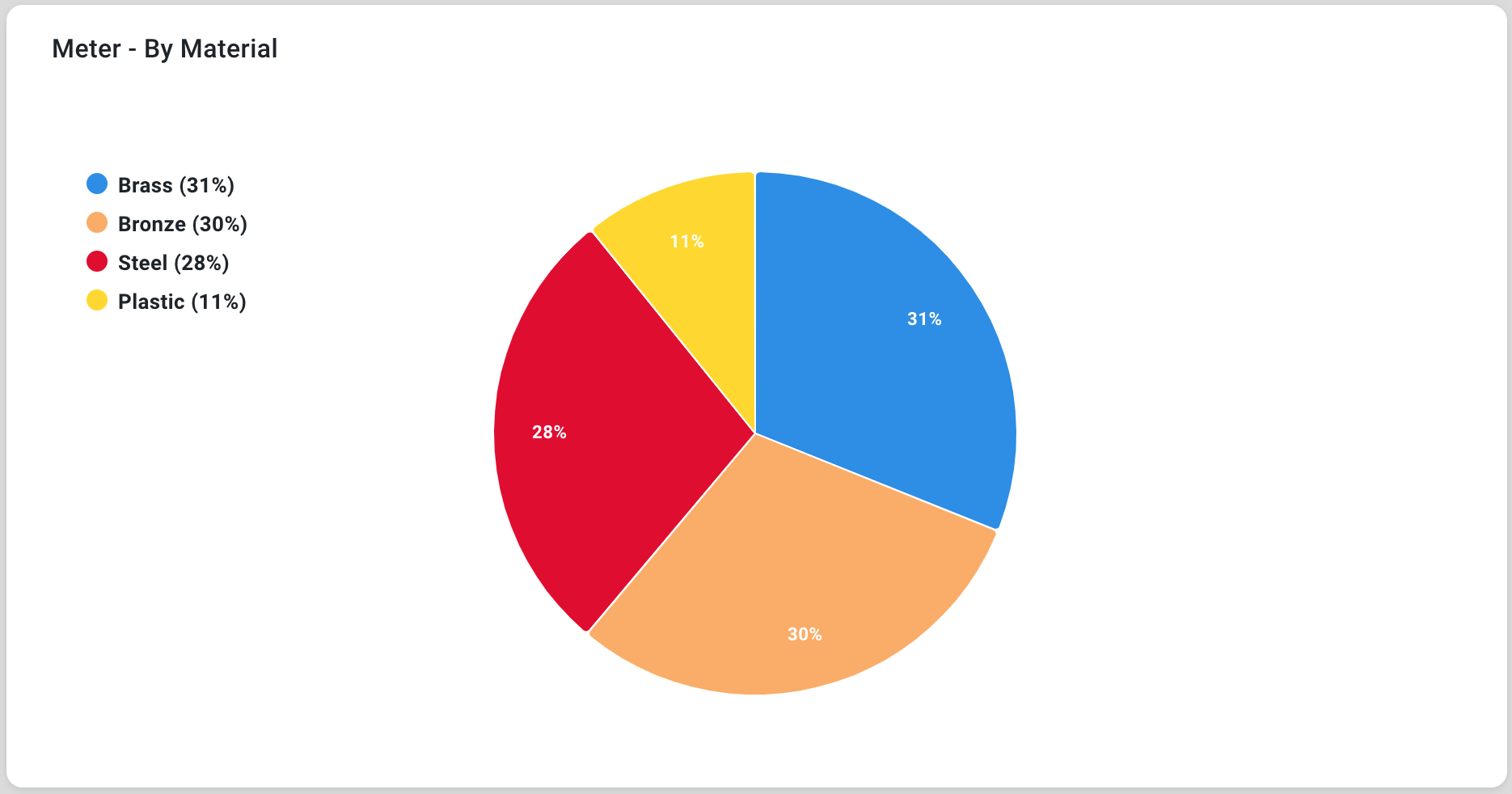
This section offers an overview of the Pie Chart. A Pie Chart is a circular chart divided into slices, where each slice represents a proportion of the whole. It is a simple and effective way to visualize the relative contributions of various categories to a total.
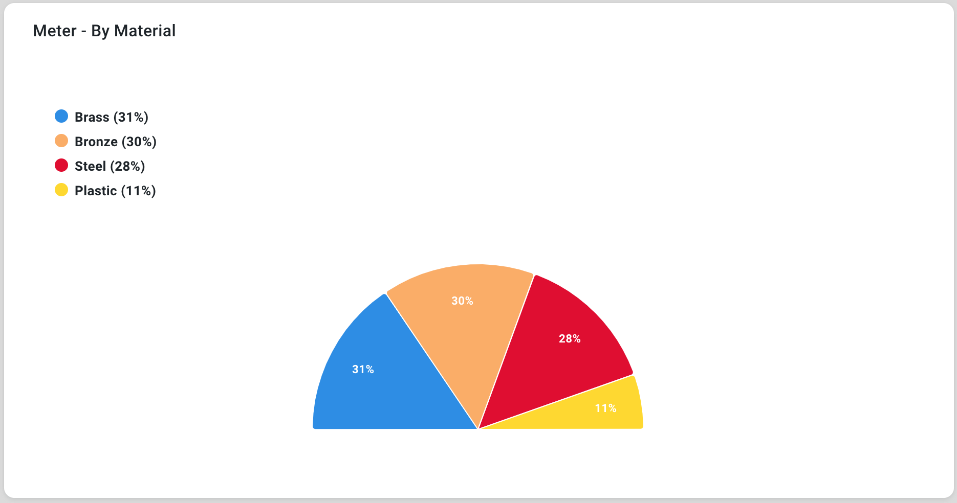
Examples
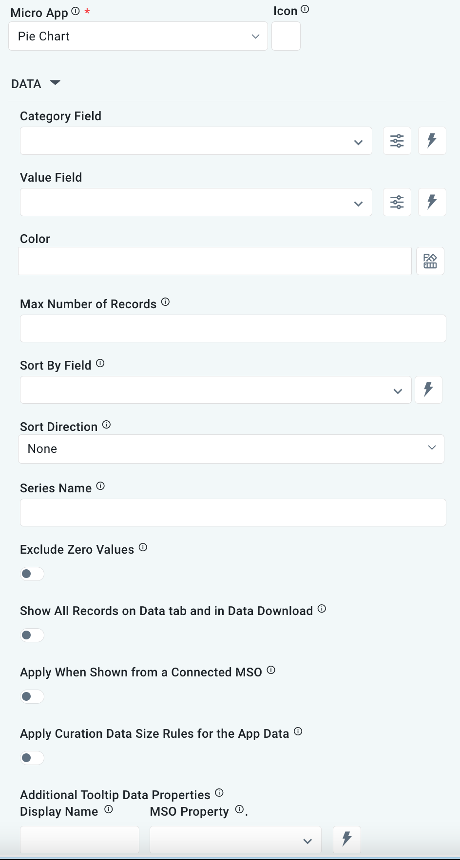
Configuration of Pie Chart
DATA Properties
|
Label |
UI Widget |
Default |
Description |
|---|---|---|---|
|
Dropdown w/Expression option |
|
The Category Field dropdown allows the user to select the category. |
|
…Display Name |
|
|
|
|
Dropdown w/Expression option |
|
The Value Field dropdown allows the user to select a value. |
|
… Display Name |
|
|
|
|
Text Field w/Color Palette option |
|
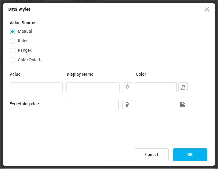
The Colors allows the user to select which color to use for the segments in the Pie Chart. See Curation - Field Properties - Data Styles | Selection of Color. |
|
Number Field |
|
Option to set a Max number of records to be used by the chart. |
|
Dropdown w/Expression option |
|
The Sort By Field option allows the user to select a field to sort the data and also provides the flexibility to define a custom expression for more advanced sorting criteria. |
|
Dropdown |
|
Option to set the Sort order for data in the chart to either Ascending or Descending. |
|
Text Field |
|
The Series Name allows the user to enter Series Names that will be used to identify the data Series in Legend. |
|
ON/OFF Toggle |
OFF |
If enabled, zero values will be excluded. By default, this setting is disabled. |
|
ON/OFF Toggle |
OFF |
|
|
ON/OFF Toggle |
OFF |
The Apply When Shown from a Connected MSO ON/OFF Toggle determines whether the settings or actions are applied specifically when data is displayed through a connected MSO.
|
|
ON/OFF Toggle |
OFF |
If enabled, the Record Count rules will be applied. If the Record Count rules are not met, the series will not be shown. |
|
Display Name - Text Field MSO Property - Dropdown |
|
The Additional Tooltip Data Properties allow the user to select one or more MSO Field Properties to display their values in the tooltip when the user hovers over a data point. |
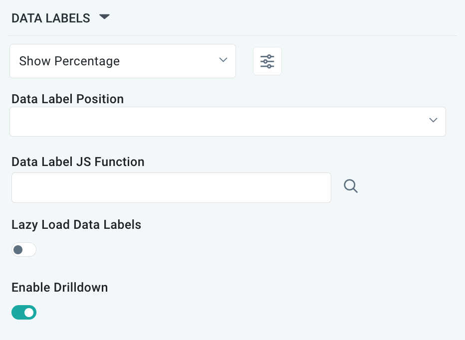
DATA LABELS Properties
|
Label |
UI Widget |
Default |
Description |
|---|---|---|---|
|
Dropdown w/Additional Properties option |
Show Percentage |
Optional Additional Properties - expressed as a Key/Value pair. |
|
… Additional Properties |
|
|
Optional Additional Properties - expressed as a Key/Value pair. |
|
Text Field w/Search |
|
The Data Label JS function allows the user to search for and define JavaScript functions that control the display or behavior of data labels in a chart. |
|
ON/OFF Toggle |
OFF |
If enabled, in the Pie Chart curation controls whether data labels are loaded gradually as the chart is interacted. |
|
ON/OFF Toggle |
ON |
If enabled, the chart will allow drilldown when clicking on data points. |
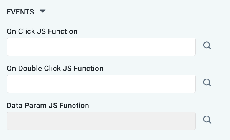
EVENTS Properties
|
Label |
UI Widget |
Default |
Description |
|---|---|---|---|
|
Text Field w/Search |
|
The On Click JS function allows users to search for and configure a JavaScript function that defines the behavior when the user clicks a data point in the chart. If left empty, the default behavior for the chart will be used. |
|
Text Field w/Search |
|
The On Double Click JS function allows users to search for and configure a JavaScript function that defines the behavior when the user double-clicks a data point in the chart. If left empty, the default behavior for the chart will be used. |
|
Text Field w/Search |
|
The Data Param JS Function allows users to search for and configure a JavaScript function that defines data parameters being used as input to the chart. |
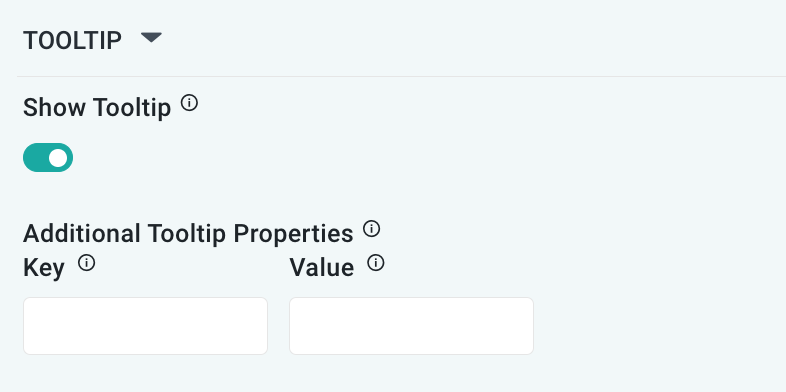
TOOLTIP Properties
|
Label |
UI Widget |
Default |
Description |
|---|---|---|---|
|
ON/OFF Toggle |
ON |
If enabled, a tooltip will show on hover of data values. |
|
Key / Value - Text Fields |
|
Optional Additional Tooltip Properties - expressed as a Key/Value pair. |
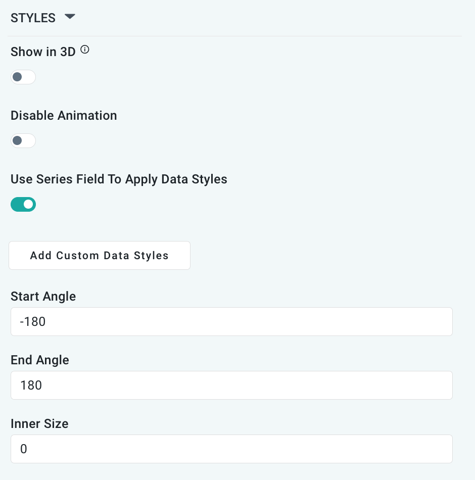
STYLES Properties
|
|
|
Label |
UI Widget |
Default |
Description |
|---|---|---|---|
|
ON/OFF Toggle |
OFF |
If enabled, it shows the Pie Chart with some depth and at a rotated angle. |
|
ON/OFF Toggle |
OFF |
The Disable Animation toggle refers to turning off any animated transitions or effects when the chart or visualization is rendered or updated. |
|
ON/OFF Toggle |
OFF |
|
|
Button |
|
Opens a dialog to allow the user to create Data Styles using Manual, Rules, Ranges, or Color Palette configurations for the value source. This dialog is equivalent to the Data Styles dialog when configuring MSO Field Properties. |
|
Number Field |
-180 |
A Start Angle of -180 makes the Pie Chart start at “6 o’clock” and draws the chart clockwise. -90 starts at “9 o’clock”. |
|
Number Field |
+180 |
An End Angle of +180 makes the Pie Chart end at “6 o’clock”. +90 ends at “3 o’clock”. |
|
Number Field |
0% |
An Inner Size of 0% means the Pie Chart draws the segments from the center. At 50% the Pie Chart becomes a Donut Chart, ie, with a big whole in the middle. |
CHART LEGEND Properties
|
Label |
UI Widget |
Default |
Description |
|---|---|---|---|
|
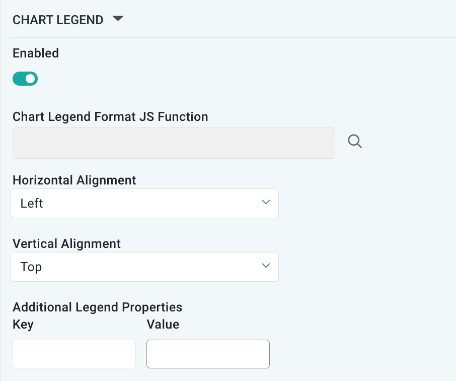
ON/OFF Toggle |
ON |
If enabled, the chart will include a chart legend showing what the color values show in the Heatmap Chart. |
|
Text Field w/Search |
|
|
|
Dropdown |
Left |
Select the horizontal alignment, including Left, Center, or Right. |
|
Dropdown |
Top |
Select the vertical alignment, including Top, Middle, or Bottom. |
|
|
|
Optional Additional Properties - expressed as a Key/Value pair. |
Contact App Orchid | Disclaimer