Intended audience: end-users developers
AO Platform: 4.4
Overview
To edit, select a Solution from the list on the main Solution page and click Edit on the Solution Card or in the More menu when in List view.
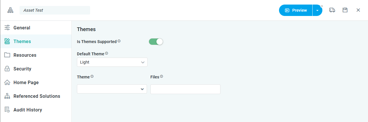
Once open, select the Themes page.
Themes
-
This page allows the user to enable/disable Themes. Four Themes are provided out-of-the-box: Light, Dark, High-Contrast, and Purple. Other Themes may be available as custom specific to an organization.
Properties
|
Label |
UI Widget |
Default |
Description |
|---|---|---|---|
|
Is Themes Supported |
ON/OFF Toggle |
OFF |
|
|
Dropdown |
|
If Is Themes Supported is ON, then a Default Theme can be selected for the Solution. |
|
Dropdown |
|
If Is Themes Supported is ON, then the user can select to further customize available Themes by adding a) the Theme to be customized, and b) the custom .JS or .CSS files. |
|
Dropdown |
|
If Is Themes Supported is ON, then the user can select to further customize available Themes by adding a) the Theme to be customized, and b) the custom .JS or .CSS files. Files will only be shown in this dropdown if they have first been uploaded on the Resources page. |
Contact App Orchid | Disclaimer