Intended audience: end-users analysts developers administrators
AO Platform: 4.4
Overview
This section offers an overview of the Waffle Chart for a Curation Micro Application. A Waffle Chart is a grid-based visualization tool used to display proportions, percentages, or counts in a visually engaging way. It divides data into a grid of squares or blocks, where each block represents a fixed unit of measurement, such as a percentage or a specific count.
Example
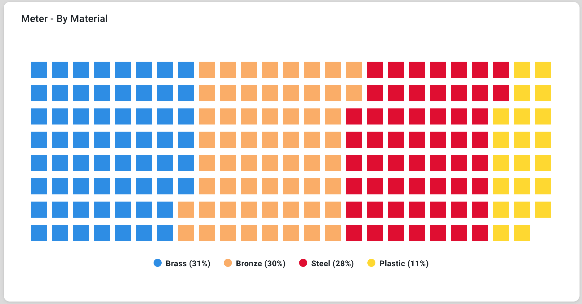
Configuration of Waffle Chart
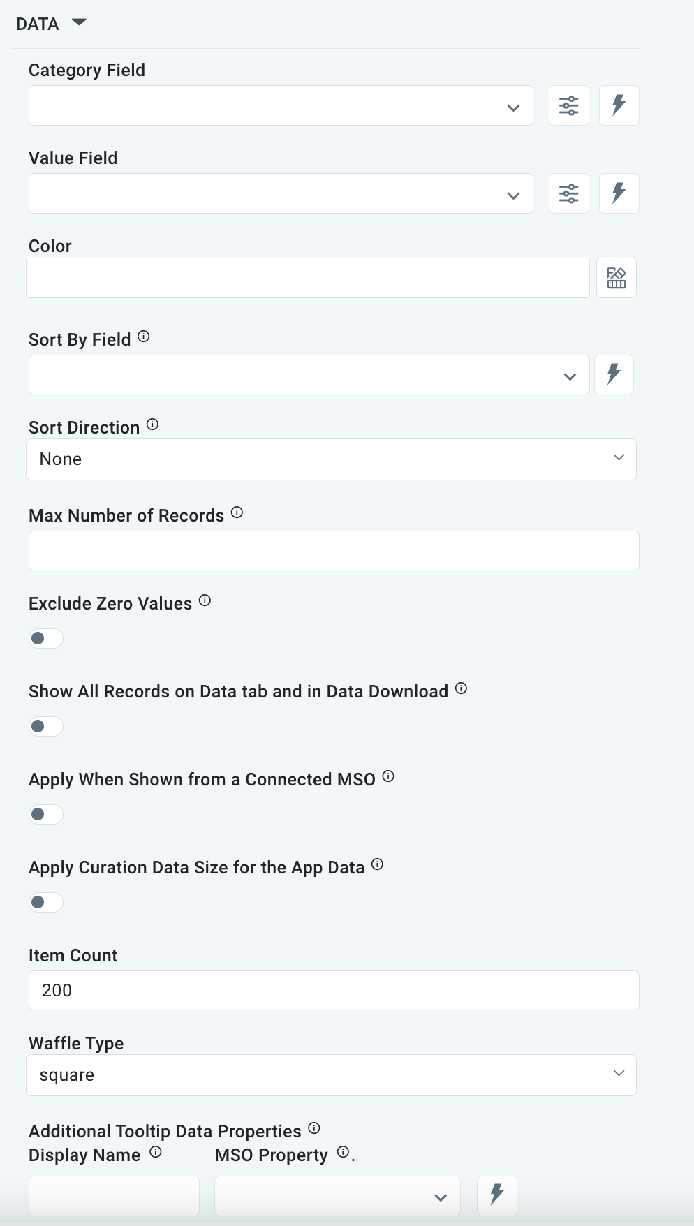
DATA Properties
|
Label |
Description |
|
|
|---|---|---|---|
|
Dropdown w/Expression option |
|
The Category Field dropdown allows users to select the category. |
|
Dropdown w/Expression option |
|
The Value Field dropdown allows users to select a value. |
|
Text Field w/Color Palette option |
|
The Colors allows user to select which color to use for the Pie of the chart. See Curation - Field Properties - Data Styles | Selection of Color. |
|
Dropdown w/Expression option |
|
The Sort By Field option allows users to select a field to sort the data and also provides the flexibility to define a custom expression for more advanced sorting criteria. |
|
Dropdown |
|
Option to set the Sort order for data in the Chart to either Ascending or Descending. |
|
Number Field |
|
Option to set a Max number of records to be used by the Chart. |
|
ON/OFF Toggle |
OFF |
|
|
ON/OFF Toggle |
OFF |
|
|
ON/OFF Toggle |
OFF |
The Apply When Shown from a Connected MSO ON/OFF Toggle determines whether the settings or actions are applied specifically when data is displayed through a connected MSO.
|
|
ON/OFF Toggle |
OFF |
If enabled, the Record Count rules will be applied. The series will not be shown if the Record Count rules are not met. |
|
Number Field |
|
The Item Count Field allows users to provide the number of individual data points or blocks displayed within the chart. |
|
Dropdown |
|
The Waffle Chart dropdown allows users to select the option Square or Circle. |
|
Display Name - Text Field MSO Property - Dropdown |
|
The Additional Tooltip Data Properties allow users to select one or more MSO Field Properties to display their values in the tooltip when the user hovers over a data point. |
EVENTS Properties

|
Label |
Description |
|
|
|---|---|---|---|
|
Text Field w/Search |
|
|
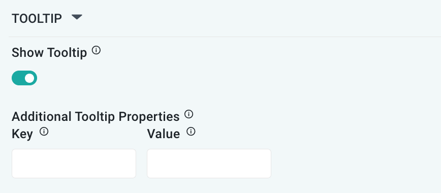
TOOLTIP Properties
|
Label |
Description |
|
|
|---|---|---|---|
|
TOOLTIP |
|
|
|
|
ON/OFF Toggle |
ON |
|
|
ON/OFF Toggle |
OFF |
If enabled, the tooltip displayed when hovering over data in the App will include the X-Axis name. If disabled, only the data value will be shown, without the X-Axis name |
|
Key / Value - Text Fields |
|
Optional Additional Tooltip Properties - expressed as a Key/Value pair. |
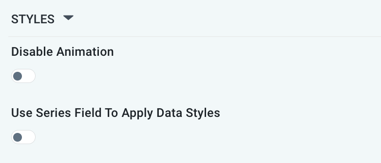
STYLES Properties
|
Label |
Description |
|
|
|---|---|---|---|
|
ON/OFF Toggle |
OFF |
The Disable Animation toggle refers to turning off any animated transitions or effects that occur when the chart or visualization is rendered or updated. |
|
ON/OFF Toggle |
OFF |
|
Contact App Orchid | Disclaimer