Intended audience: end-users analysts developers administrators
AO Platform: 4.4
Overview
This section offers an overview of the Quantitative Distribution Chart. A quantitative distribution chart in curation refers to a visual representation of the numerical distribution of curated data. It helps users analyze patterns, trends, and outliers in a dataset by displaying how values are distributed across different ranges or categories.
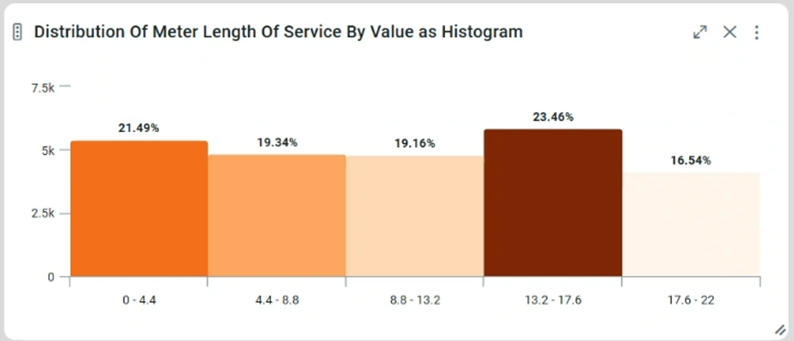
Example
Configuration of Quantitative Distribution Chart
DATA Properties
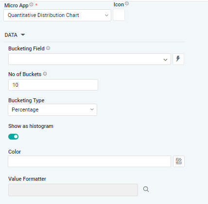
|
Label |
UI Widget |
Default |
Description |
|---|---|---|---|
|
Dropdown |
|
The Bucketing dropdown Field allows the user to select the MSO Field Property to represent the Distribution values in the Chart. |
|
Number Field |
|
The Number of Buckets dropdown field allows the user to enter the number of Buckets to show quantitative fields. |
|
Dropdown |
|
The dropdown Bucketing Type field allows the user to select an option such as Percentage or Value. |
|
ON/OFF Toggle |
ON |
If enabled, the show as histogram feature allows the user to switch between different ways of visualizing data. |
|
Text Field w/Color Palette option |
|
The Colors allows the user to select which color to use for the areas for the series. See Curation - Field Properties - Data Styles | Selection of Color. |
|
|
|
The Value Formatter modifies how data values are displayed without changing the underlying data. |
DATA LABELS Properties
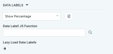
|
Label |
UI Widget |
Default |
Description |
|---|---|---|---|
|
Dropdown w/Additional Properties option |
Show Percentage |
Optional Additional Properties - expressed as a Key/Value pair. |
|
… Additional Properties |
|
|
Optional Additional Properties - expressed as a Key/Value pair. |
|
Text Field w/Search |
|
The Data Label JS function allows the user to search for and define JavaScript functions that control the display or behavior of data labels in a chart. |
|
ON/OFF Toggle |
OFF |
If enabled, Data Labels will be gradually rendered in the chart. |
STYLES Properties
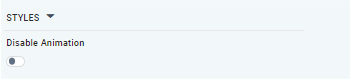
|
Label |
UI Widget |
Default |
Description |
|---|---|---|---|
|
ON/OFF Toggle |
OFFled |
If enabled, it shows the Quantitative Distribution Chart with some depth and at a rotated angle. |
|
ON/OFF Toggle |
OFF |
If enabled, the Disable Animation toggle refers to turning off any animated transitions or effects that occur when the chart or visualization is rendered or updated. |
Contact App Orchid | Disclaimer