Intended audience: end-users analysts developers administrators
AO Platform: 4.4
Overview
This section offers an overview of the Simple Datatable. The Simple DataTable provides a clean and effective way to display tabular data, with options for sorting and filtering to help users explore simpler datasets efficiently.
Example
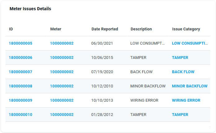
Configuration of Simple Datatable
|
|
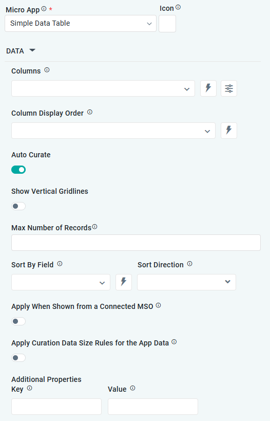
DATA Properties
|
Label |
UI Widget |
Default |
Description |
|---|---|---|---|
|
Dropdown w/Expression and Additional Properties |
|
The Column dropdown allows the user to select one or more MSO Field Properties to be included in the Simple Datatable App. |
|
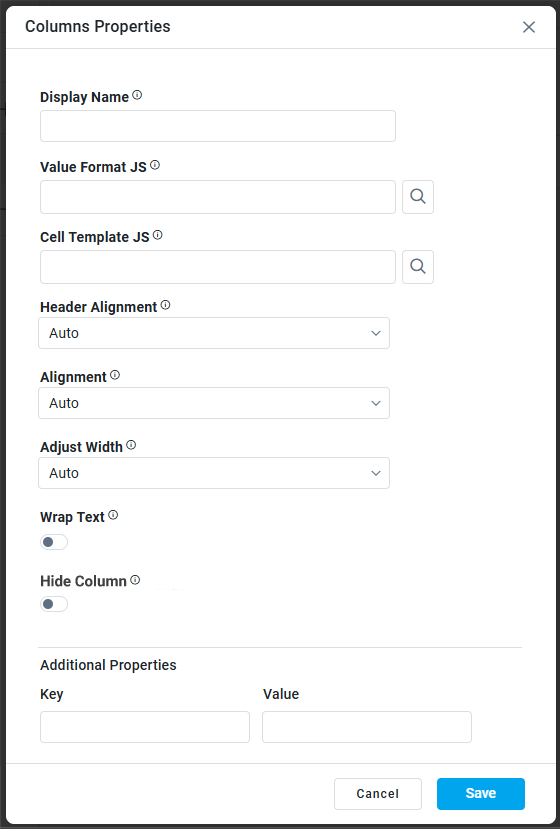
Column Properties |
|
|
|
|
Text Field |
|
The Display Name field displays the name. |
|
Text Field w/Search |
|
The Value Format JS in a Simple Datatable allows users to apply custom JavaScript code to format the values displayed in the table. |
|
Test Field w/Search |
|
The Cell Template JS allows users to customize the appearance and content of individual cells in a Simple Datatable using JavaScript. |
|
Dropdown |
Auto |
Select Alignment for Header, including Auto, Left, Center, or Right. |
|
Dropdown |
Auto |
Select Alignment for Column content, including Auto, Left, Center, or Right. |
|
Dropdown |
Auto |
Select how to Adjust Width, including Auto, By Pixels, or By Percentage. |
|
Number Field |
100 |
Enter the number of pixels for the Column Width. This property is only visible if the Adjust Width property value is By Pixels. |
|
ON/OFF Toggle |
OFF |
If enabled, the row height in the table will be based on the available text. |
|
ON/OFF Toggle |
OFF |
If enabled, the table column will not show in the app. |
|
Key / Value - Text Fields |
|
Optional Additional Properties - expressed as a Key/Value pair. |
|
|
|
The Column Display Order allows the user to select the display order for one or more selected MSO field properties. |
|
ON/OFF Toggle |
ON |
The Auto Curate Toggle allows the user to enable or disable automated data curation for a dataset. When enabled, the system applies predefined rules and logic to automatically process and organize the data. When disabled, users have full control and can manually curate the dataset. |
|
ON/OFF Toggle |
OFF |
|
|
Number Field |
|
Enter the maximum number of records to include in the App. |
|
Dropdown |
|
The Sory By Field option allows the user to select a field to sort the data and also provides the flexibility to define a custom expression for more advanced sorting criteria. |
|
Dropdown |
|
Option to set the Sort order for data in the chart to either Ascending or Descending. |
|
ON/OFF Toggle |
OFF |
If enabled, the data will be shown if it comes from a Connected MSO. If disabled, the curation will be suppressed. |
|
ON/OFF Toggle |
OFF |
If enabled, the Record Count rules will be applied. If the Record Count rules are not met, the series will not be shown. |
|
Key / Value - Text Fields |
|
Optional Additional Properties - expressed as a Key/Value pair. |
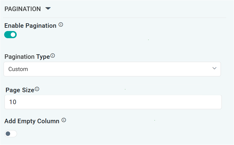
PAGINATION Properties
|
Label |
UI Widget |
Default |
Description |
|---|---|---|---|
|
ON/OFF Toggle |
ON |
If enabled, page numbers will be added as links below the table App
|
|
Dropdown |
Auto |
Select from available options, including Auto or Custom. If Custom, the number of records to be shown per page can be added in the Page Size property. |
|
Number Field |
10 |
Enter the number of records that will be shown in the table per “page”. |
|
ON/OFF Toggle |
OFF |
If enabled, an extra empty column will be added as the last column of a table. This is useful if only a few columns are shown in a table in order to push columns with values closer together. |
Contact App Orchid | Disclaimer