Intended audience: end-users analysts developers administrators
AO Platform: 4.4
Overview
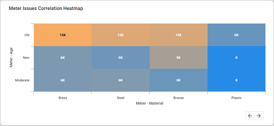
This section provides an overview of a Heatmap Chart. A Heatmap Chart is a visualization tool that uses colors to represent data values in a matrix-like layout, making it ideal for identifying patterns in large datasets.
Example
Configuration of Heatmap Chart
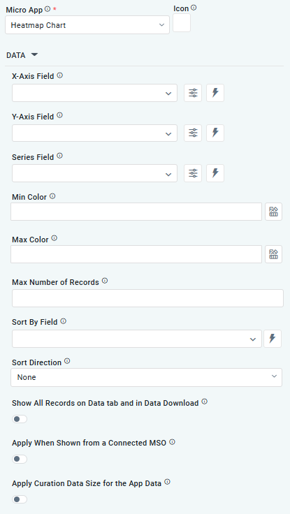
DATA Properties
|
Label |
UI Widget |
Default |
Description |
|---|---|---|---|
|
Dropdown w/Expression option |
|
The X-axis Field allows the user to select the MSO Field Property to represent the X-axis values in the Chart. |
|
Dropdown w/Expression option |
|
The Y-axis Field allows the user to select the MSO Field Property to represent the Y-axis values in the Chart. |
|
Repeater Dropdown w/Additional Properties, Expression, and Color options |
|
The Series Fields allow the user to select an MSO Field Property to represent the Series Field. |
|
|
|
Select a color value representing the lowest value in the Heatmap grid. Other values will be colored according to the range of values between the lowest and the highest value. |
|
|
|
Select a color value representing the highest value in the Heatmap grid. Other values will be colored according to the range of values between the lowest and the highest values. |
|
Number Field |
|
Option to set a Max number of records to be used by the Chart. |
|
Dropdown w/Expression option |
|
The Sort By Field option allows the user to select a field to sort the data and provides the flexibility to define a custom expression for more advanced sorting criteria. |
|
Dropdown |
|
Option to set the Sort order for data in the Chart to either Ascending or Descending. |
|
ON/OFF Toggle |
OFF |
If enabled, all records, otherwise excluded by the LIMIT clause when “Show TopN Plus Other” is enabled, and used by the App, will be shown on the App’s Data tab as well as in the Download Data option. |
|
ON/OFF Toggle |
OFF |
If enabled, the curation will be shown if data comes from a Connected MSO. If disabled, the curation will be suppressed. |
|
ON/OFF Toggle |
OFF |
If enabled, the Curation will only be shown if it matches the Record Count values selected for Curation Filters. |
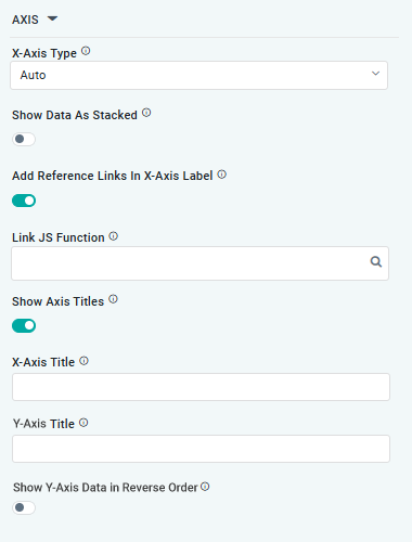
AXIS Properties
|
Label |
UI Widget |
Default |
Description |
|---|---|---|---|
|
Dropdown |
|
Option to select the format of the X-Axis, including Linear, Logarithmic, DateTime, Category, Color, and BellCurve. |
|
ON/OFF Toggle |
OFF |
If enabled, data for multiple series will be displayed as stacked for each X-Axis value. If disabled, the data will be shown as grouped. |
|
ON/OFF Toggle |
OFF |
If enabled, X-Axis labels will be converted into clickable links, with their content defined by the JavaScript in the Link JS Function. When disabled, the labels will not include links. |
|
Text Field w/Search |
|
The Link JS function allows the user to select from an existing JavaScript Function to be used to generate links for the X-Axis Labels |
|
ON/OFF Toggle |
ON |
If enabled, titles can be added to both the X-Axis and Y-Axis. If disabled, the X-Axis and Y-Axis will not have titles. |
|
… X-Axis Title |
Text Field |
|
Enter a Title for the X-Axis. |
|
… Y-Axis Title |
Text Field |
|
Enter a Title for the Y-Axis. |
|
… Show Y-Axis Data in Reverse Order |
ON/OFF Toggle |
OFF |
If enabled, the data displayed on Y-Axis will be displayed in reverse order. |
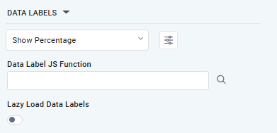
DATA LABELS Properties
|
Label |
UI Widget |
Default |
Description |
|---|---|---|---|
|
Dropdown w/Additional Properties option |
|
Optional Additional Properties - expressed as a Key/Value pair. |
|
… Additional Properties |
|
|
Optional Additional Properties - expressed as a Key/Value pair. |
|
Text Field w/Search |
|
The Data Label JS function allows the user to search for and define JavaScript functions that control the display or behavior of data labels in a chart. |
|
ON/OFF Toggle |
OFF |
If enabled, the Heatmap Chart curation controls whether data labels are loaded gradually as the chart is interacted. |
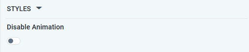
STYLES Properties
|
Label |
UI Widget |
Default |
Description |
|---|---|---|---|
|
ON/OFF Toggle |
|
The Disable Animation toggle refers to turning off any animated transitions or effects when the chart or visualization is rendered or updated. |
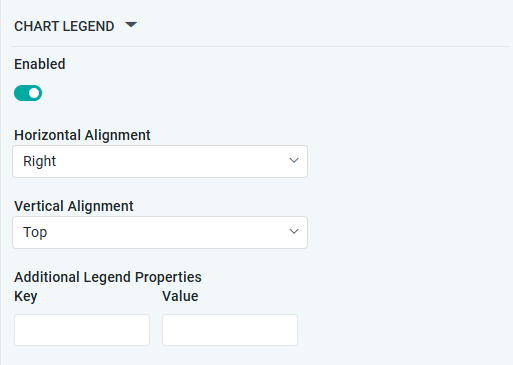
CHART LEGEND Properties
|
Label |
UI Widget |
Default |
Description |
|---|---|---|---|
|
ON/OFF Toggle |
ON |
If enabled, the chart will include a chart legend showing what the color values show in the Heatmap Chart. |
|
Dropdown |
Right |
Select the horizontal alignment, including Left, Center, or Right. |
|
Dropdown |
Top |
Select the vertical alignment, including Top, Middle, or Bottom. |
|
|
|
Optional Additional Properties - expressed as a Key/Value pair. |
Contact App Orchid | Disclaimer