Intended audience: end-users analysts developers administrators
AO Platform: 4.4
Overview
This section offers an overview of the Word Cloud Chart for a Curation Micro Application. A Word Cloud Chart is a visual representation of textual data where the size, color, and placement of each word correspond to its frequency or significance in the dataset.
Example
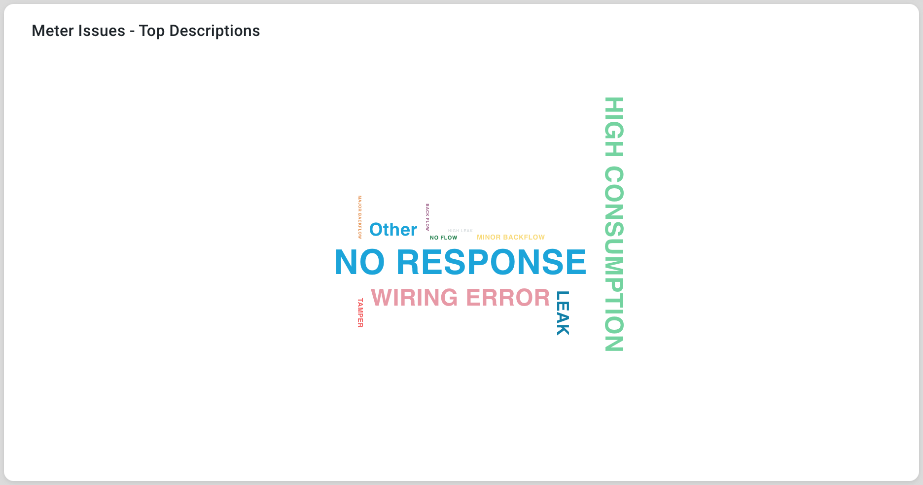
Configuration of Word Cloud Chart
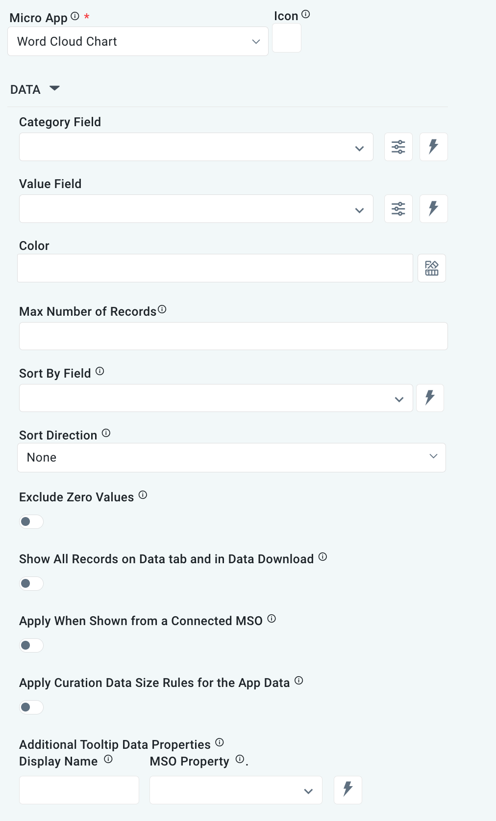
DATA Properties
|
Label |
UI Widget |
Default |
Description |
|---|---|---|---|
|
Dropdown w/Expression option |
|
The Category Field is the data field name allowing the user to construct categories. |
|
Dropdown w/Expression option |
|
The Value Field is the data field name allowing the user to set the series point value. |
|
Text Field w/Color Palette option |
|
The Colors is an array that contains the default colors for the Word Cloud categories. See Curation - Field Properties - Data Styles | Selection of Color. |
|
Number Field |
|
Option to set a maximum number of records to be used by the Word Cloud. |
|
Dropdown w/Expression option |
|
|
|
Dropdown w/Expression option |
|
Option to set the Sort order for data in the Word Cloud to either Ascending or Descending. |
|
ON/OFF Toggle |
OFF |
|
|
ON/OFF Toggle |
OFF |
|
|
ON/OFF Toggle |
OFF |
|
|
ON/OFF Toggle |
OFF |
If enabled, the Record Count rules will be applied. The series will not be shown if the Record Count rules are not met. |
|
Display Name - Text Field MSO Property - Dropdown |
|
The Additional Tooltip Data Properties allows the user to select one or more MSO Field Properties to display their values in the tooltip when the user hovers over a data point. |
|
ON/OFF Toggle |
|
If enabled, titles can be added to both the X-Axis and Y-Axis. If disabled, the X-Axis and Y-Axis will not have titles. |
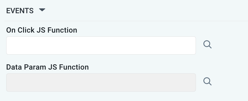
EVENTS Properties
|
Label |
UI Widget |
Default |
Description |
|---|---|---|---|
|
Text Field w/Search |
|
|
|
Text Field w/Search |
|
|
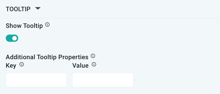
TOOLTIP Properties
|
Label |
UI Widget |
Default |
Description |
|---|---|---|---|
|
ON/OFF Toggle |
ON |
If enabled, the tooltip displayed when hovering over data in the App will include the X-Axis name. If disabled, only the data value will be shown, without the X-Axis name |
|
Key / Value - Text Fields |
|
Optional Additional Tooltip Properties - expressed as a Key/Value pair. |
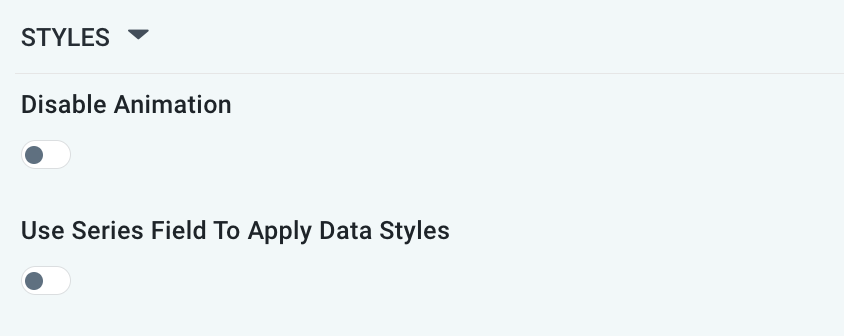
STYLES Properties
|
Label |
UI Widget |
Default |
Description |
|---|---|---|---|
|
ON/OFF Toggle |
OFF |
The Disable Animation toggle refers to turning off animated transitions or effects when the chart or visualization is rendered or updated. |
|
ON/OFF Toggle |
OFF |
|
Contact App Orchid | Disclaimer