Intended audience: end-users analysts developers administrators
AO Platform: 4.4
Overview
This topic provides an overview of a Calendar Heatmap Chart. A Calendar Heatmap Chart is a data visualization technique that helps users display data over time, especially when trying to highlight patterns, trends, or anomalies in a calendar-like structure. It is often used to represent the intensity of events, values, or frequencies across days, weeks, or months, tailored to the needs of the curation process. The Calendar Heatmap Chart allows drill-down between the different periods.
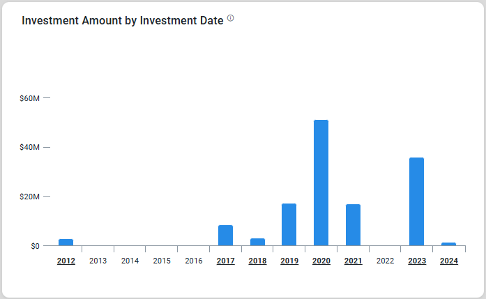
Example
Configuration of Calendar Heatmap Chart
DATA Properties
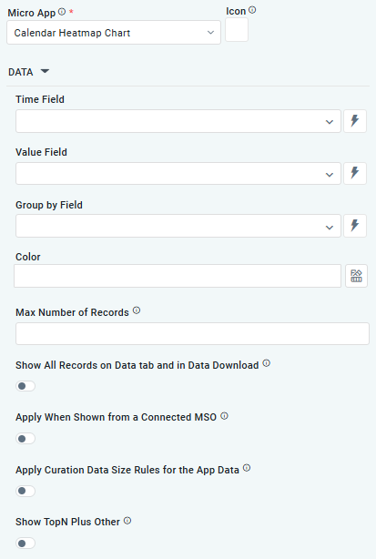
|
Label |
UI Widget |
Default |
Description |
|---|---|---|---|
|
Dropdown w/Expression option |
|
The Time Field allows the user to specify a column or attribute in the dataset that holds temporal information, such as dates or timestamps. This field is used to map and plot data on the heatmap in a calendar-style layout. |
|
Dropdown w/Expression option |
|
The Value Field allows the user to specify a column or attribute in the dataset that contains numerical or quantitative data. These values determine the intensity or color gradient of each cell in the calendar heatmap. |
|
Dropdown w/Expression option |
|
The Group By Field allows the user to specify a column or attribute in the dataset that defines categories, groups, or labels for the data points. Grouping data enables the chart to display variations across categories within the calendar layout |
|
Text Field w/Color Palette option |
|
The Colors allows the user to select which color to use for the columns of the chart. See Curation - Field Properties - Data Styles | Selection of Color. |
|
Number Field |
|
Option to set a Max number of records to be used by the chart. |
|
ON/OFF Toggle |
OFF |
If enabled, all records, otherwise excluded by the LIMIT clause when “Show TopN Plus Other” is enabled, and used by the App, will be shown on the App’s Data tab as well as in the Download Data option. |
|
ON/OFF Toggle |
OFF |
If enabled, the Apply When Shown from a Connected MSO ON/OFF Toggle determines whether the settings or actions are applied specifically when data is displayed through a connected MSO.
|
|
ON/OFF Toggle |
OFF |
If enabled, the Record Count rules are applied. If the criteria are not met, the series will not be displayed. |
|
ON/OFF Toggle |
OFF |
If Show TopN plus Other is enabled, the App will display only the Top N records and a single aggregated category representing all other records. An MSO Setting determines the number of records shown for the Top N in the Easy Answers section. If disabled, the App will display all records based on the user's query. |
STYLES Properties
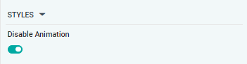
|
Label |
UI Widget |
Default |
Description |
|---|---|---|---|
|
ON/OFF Toggle |
OFF |
The Disable Animation toggle refers to turning off any animated transitions or effects that occur when the chart or visualization is rendered or updated. |
Contact App Orchid | Disclaimer