Intended audience: end-users analysts developers administrators
AO Platform: 4.4
Overview
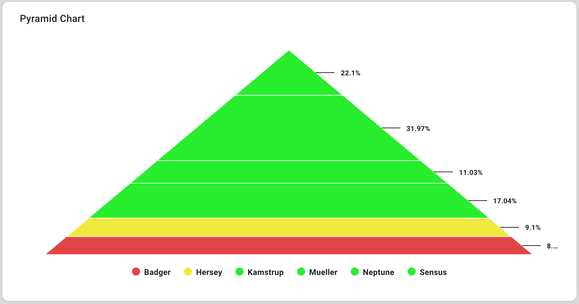
This section provides an overview of a Pyramid Chart. A Pyramid Chart is a triangular chart representing data in hierarchical or proportional order. It is designed to visualize data distribution across different levels, with the largest values at the base and progressively smaller values toward the apex.
Example
Configuration of Pyramid Chart
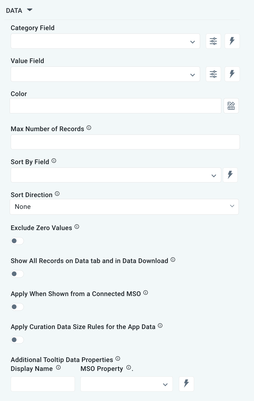
DATA Properties
|
Label |
UI Widget |
Default |
Description |
|---|---|---|---|
|
Dropdown w/Expression option |
|
The Category Field dropdown allows the user to select the category. |
|
…Display Name |
Text Field |
|
|
|
Dropdown w/Expression option |
|
The Value Field dropdown allows the user to select a value. |
|
…Display Name |
Text Field |
|
|
|
… Additional Properties |
|
|
Optional Additional Properties - expressed as a Key/Value pair. |
|
Text Field w/Color Palette option |
|
The Colors allows the user to select which color to use for the Pyramid Chart. See Curation - Field Properties - Data Styles | Selection of Color. |
|
Number Field |
|
Option to set a max number of records to be used by the chart. |
|
Dropdown w/Expression option |
|
The Sort By Field option allows users to select a field to sort the data and provides the flexibility to define a custom expression for more advanced sorting criteria. |
|
Dropdown |
|
Option to set the Sort order for data in the chart to either Ascending or Descending. |
|
ON/OFF Toggle |
OFF |
|
|
ON/OFF Toggle |
OFF |
|
|
ON/OFF Toggle |
OFF |
The Apply When Shown from a Connected MSO ON/OFF Toggle determines whether the settings or actions are applied specifically when data is displayed through a connected MSO.
|
|
ON/OFF Toggle |
OFF |
If enabled, the Record Count rules will be applied. The series will not be shown if the Record Count rules are not met. |
|
Display Name - Text Field MSO Property - Dropdown |
|
The Additional Tooltip Data Properties allow the user to select one or more MSO Field Properties to display their values in the tooltip when the user hovers over a data point. |
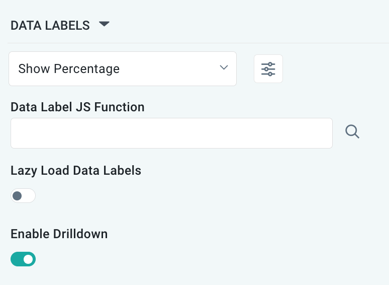
DATA LABELS Properties
|
Label |
UI Widget |
Default |
Description |
|---|---|---|---|
|
Dropdown w/Additional Properties option |
Show Percentage |
Optional Additional Properties - expressed as a Key/Value pair. |
|
… Additional Properties |
|
|
Optional Additional Properties - expressed as a Key/Value pair. |
|
Text Field w/Search |
|
The Data Label JS function allows the user to search for and configure a JavaScript function that defines the display or behavior of data labels in a chart. |
|
ON/OFF Toggle |
OFF |
If enabled, in the Pyramid Chart curation controls whether data labels are loaded gradually as the chart is interacted. |
|
ON/OFF Toggle |
ON |
If enabled, the chart will allow drilldown when clicking on data points. |
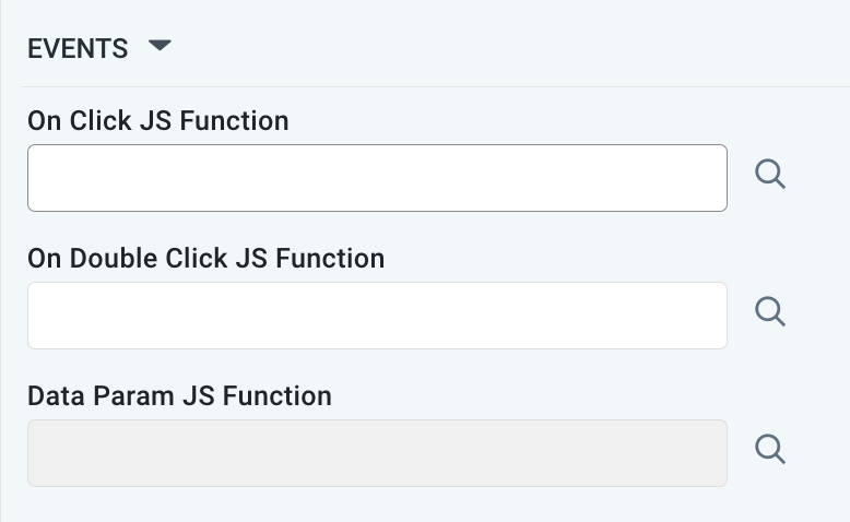
EVENT Properties
|
Label |
UI Widget |
Default |
Description |
|---|---|---|---|
|
Text Field w/Search |
|
The On Click JS function allows users to search for and configure a JavaScript function that defines the behavior when the user clicks a data point in the chart. If left empty, the default behavior for the chart will be used. |
|
Text Field w/Search |
|
The On Double Click JS function allows users to search for and configure a JavaScript function that defines the behavior when the user double-clicks a data point in the chart. If left empty, the default behavior for the chart will be used. |
|
Text Field w/Search |
|
The Data Param JS Function allows users to search for and configure a JavaScript function that defines data parameters being used as input to the chart. |
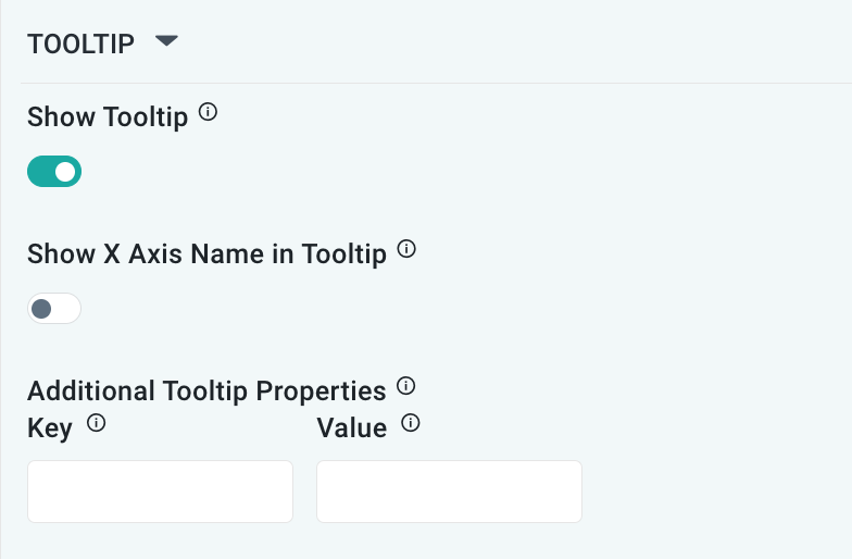
TOOLTIP Properties
|
Label |
UI Widget |
Default |
Description |
|---|---|---|---|
|
ON/OFF Toggle |
ON |
If enabled, a tooltip will show on hover of data values. |
|
ON/OFF Toggle |
OFF |
If enabled, the tooltip displayed when hovering over data in the App will include the X-Axis name. If disabled, only the data value will be shown, without the X-Axis name. |
|
Key / Value - Text Fields |
|
Optional Additional Tooltip Properties - expressed as a Key/Value pair. |
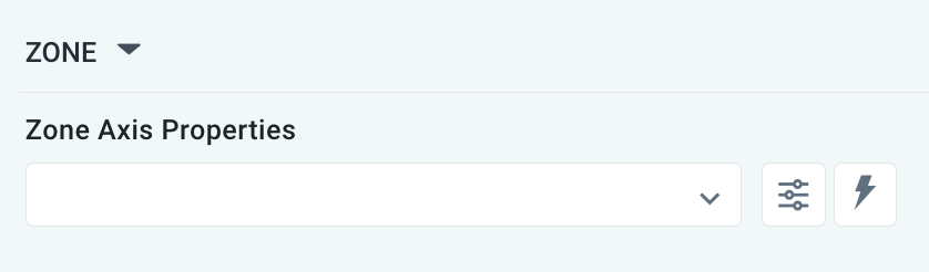
ZONE Properties
|
Label |
UI Widget |
Default |
Description |
|---|---|---|---|
|
Dropdown w/Additional Properties and Expression options |
|
The Zone Axis Properties dropdown allows the user to customize the properties of the Zone Axis. |
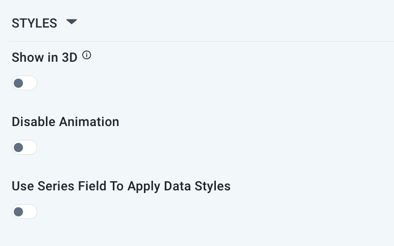
STYLES Properties
|
Label |
UI Widget |
Default |
Description |
|---|---|---|---|
|
ON/OFF Toggle |
OFF |
If enabled, it shows the Pyramid Chart with some depth and at a rotated angle. |
|
ON/OFF Toggle |
OFF |
The Disable Animation toggle refers to turning off any animated transitions or effects that occur when the chart or visualization is rendered or updated. |
|
ON/OFF Toggle |
OFF |
|
Contact App Orchid | Disclaimer