Intended audience: end-users analysts developers administrators
AO Platform: 4.4
Overview
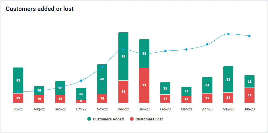
This section offers an overview of Multi XY Series Chart. The Multi XY Series Chart allows you to plot multiple data series on the same X and Y axes, making it ideal for comparing trends or relationships across different datasets.
Example
Configuration of Multi XY Series Chart
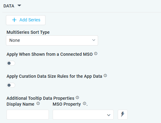
DATA Properties
|
Label |
UI Widget |
Default |
Description |
|---|---|---|---|
|
+ Add Series |
|
|
See the separate table below for Series Field Properties. |
|
Dropdown |
None |
Options include: None, Sort By Sort Field, or Sort by X-Axis Field. |
|
ON/OFF Toggle |
|
The Apply When Shown from a Connected MSO ON/OFF Toggle determines whether the settings or actions are applied specifically when data is displayed through a connected MSO.
|
|
ON/OFF Toggle |
|
If enabled, the Record Count rules will be applied. If the Record Count rules are not met, the series will not be shown. |
|
Display Name - Text Field MSO Property - Dropdown w/Expression option |
|
The Additional Tooltip Data Properties allow the user to select one or more MSO Field Properties to display their values in the tooltip when the user hovers over a data point. |
+ Add Series
|
Label |
UI Widget |
Default |
Description |
|---|---|---|---|
|
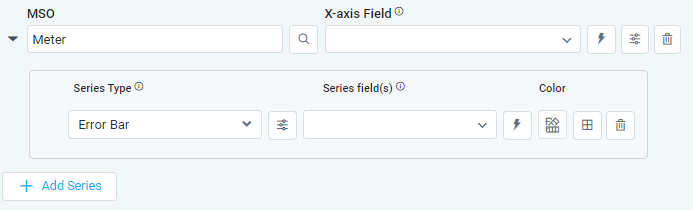
Search Field |
|
|
|
Dropdown w/Expression option |
|
The X-axis Field allows the user to select the MSO Field Property to represent the X-axis values in the Chart. |
|
Icon |
|
See the separate table below for X-Axis Properties. |
|
Icon |
|
Deletes the MSO/X-Axis Series in the chart and the associated Data Series from the chart configuration |
|
|
|
|
|
|
Dropdown |
|
The Series Type Field dropdown in area chart curation allows the user to specify a field that determines the type of series displayed in the chart. |
|
Icon |
|
See the separate table below for Series Type Properties. |
|
… Property / Value |
|
|
Repeater section. |
|
Dropdown w/Expression options |
|
The Series Field allows the user to select an MSO Field Property to represent the Series Field. |
|
Icon for Color selection |
|
The Colors allows the user to select which color to use for the multi XY series. See Curation - Field Properties - Data Styles | Selection of Color. |
|
Icon |
|
See the separate table below for Series Field Properties. |
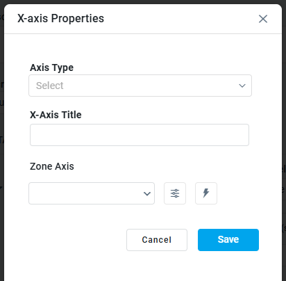
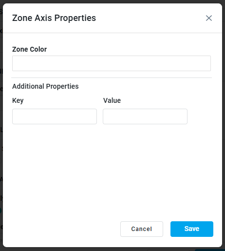
X-Axis Properties
|
X-Axis Properties |
Zone Axis Properties |
|---|---|
|
|
|
Label |
UI Widget |
Default |
Description |
|---|---|---|---|
|
Dropdown |
|
|
|
Text Field |
|
|
|
Dropdown w/Expression option |
|
|
|
Icon w/Dialog |
|
|
|
… Zone Color |
Color Field |
|
|
|
… Additional Properties - Key/Value |
Text Fields |
|
Repeater section. |
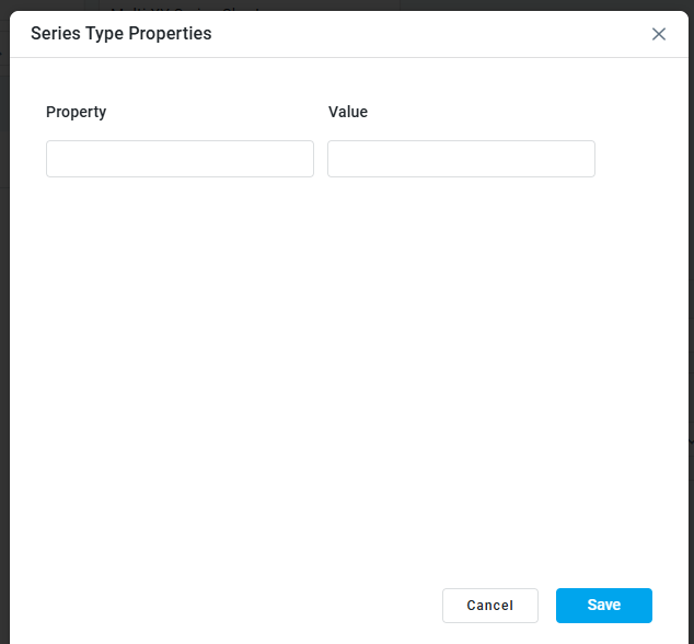
Series Type Properties
|
Label |
UI Widget |
Default |
Description |
|---|---|---|---|
|
… Property / Value |
Text Fields |
|
Repeater section. |
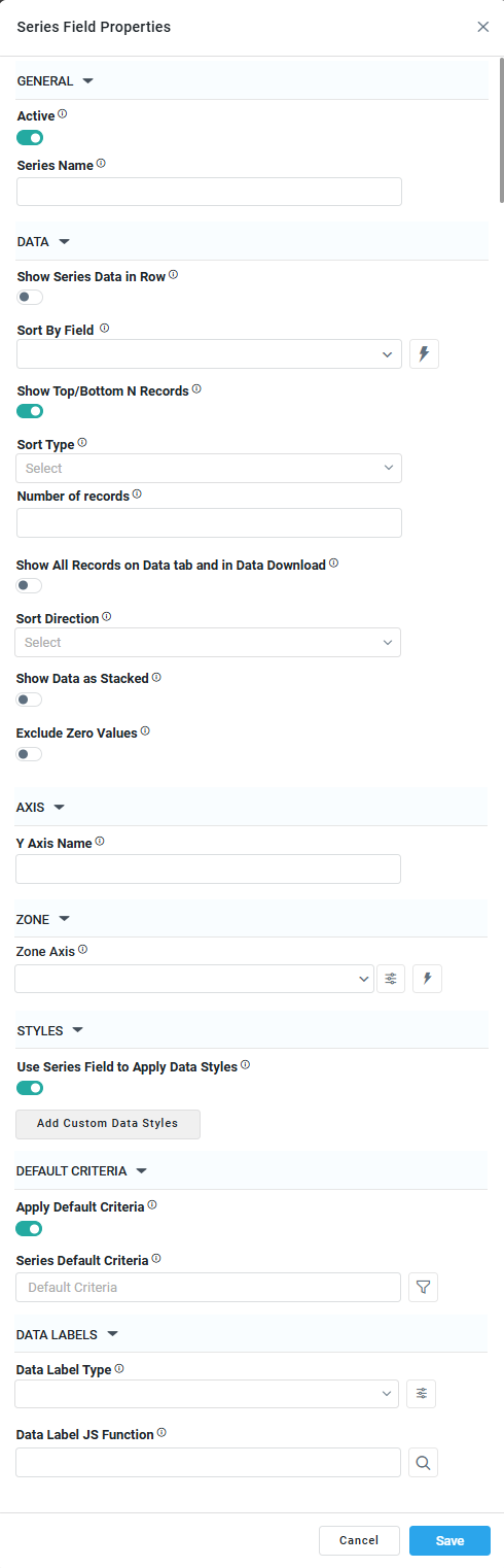
Series Field Properties
|
|
|
|
|---|---|---|
|
|
|
|
Label |
UI Widget |
Default |
Description |
|---|---|---|---|
|
GENERAL |
|
|
|
|
ON/OFF Toggle |
|
|
|
Text Field |
|
|
|
DATA |
|
|
|
|
ON/OFF Toggle |
OFF |
|
|
Dropdown w/Expression option |
|
|
|
|
OFF |
|
|
Dropdown |
|
|
|
ON/OFF Toggle |
OFF |
|
|
Dropdown |
|
|
|
ON/OFF Toggle |
OFF |
|
|
ON/OFF Toggle |
OFF |
|
|
AXIS |
|
|
|
|
Text Field |
|
|
|
ZONE |
|
|
|
|
Dropdown w/Expression option |
|
|
|
Icon w/Dialog |
|
See Zone Axis Color screenshot with options above. |
|
STYLES |
|
|
|
|
ON/OFF Toggle |
OFF |
|
|
Button w/Dialog |
|
|
|
DEFAULT CRITERIA |
|
|
|
|
ON/OFF Toggle |
OFF |
|
|
Text Field w/Query Builder option |
|
See Query Builder functionality in Getting Started section. |
|
DATA LABELS |
|
|
|
|
Dropdown |
|
|
|
Icon w/Dialog |
|
See Data Label Type screenshot with options above. |
|
Text Field w/Search |
|
|
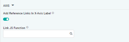
AXIS Properties
|
Label |
UI Widget |
Default |
Description |
|---|---|---|---|
|
ON/OFF Toggle |
OFF |
|
|
Text Field w/Search |
|
The Link JS function allows the user to select from an existing JavaScript Function to be used to generate links for the X-Axis Labels |
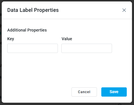
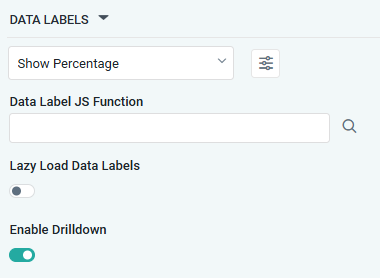
DATA LABELS Properties
|
Label |
UI Widget |
Default |
Description |
|---|---|---|---|
|
Dropdown w/Additional Properties option |
|
Optional Additional Properties - expressed as a Key/Value pair. |
|
… Additional Properties |
|
|
Optional Additional Properties - expressed as a Key/Value pair. |
|
Text Field w/Search |
|
The Data Label JS function allows the user to search for and define JavaScript functions that control the display or behavior of data labels in a chart. |
|
ON/OFF Toggle |
OFF |
If enabled, in the chart curation controls whether data labels are loaded gradually as the chart is interacted. |
|
ON/OFF Toggle |
ON |
|
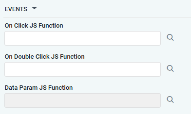
EVENTS Properties
|
Label |
UI Widget |
Default |
Description |
|---|---|---|---|
|
Text Field w/Search |
|
|
|
Text Field w/Search |
|
|
|
Text Field w/Search |
|
|
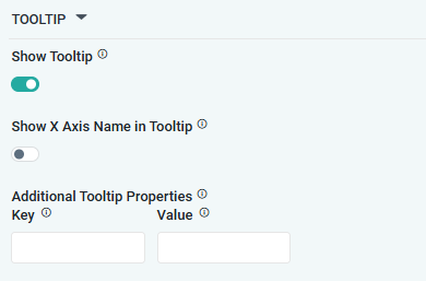
TOOLTIP Properties
|
Label |
UI Widget |
Default |
Description |
|---|---|---|---|
|
ON/OFF Toggle |
ON |
|
|
ON/OFF Toggle |
OFF |
|
|
|
|
Optional Additional Properties - expressed as a Key/Value pair. |
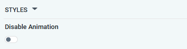
STYLES Properties
|
Label |
UI Widget |
Default |
Description |
|---|---|---|---|
|
ON/OFF Toggle |
OFF |
The Disable Animation toggle refers to turning off any animated transitions or effects when the chart or visualization is rendered or updated. |
CHART LEGEND Properties
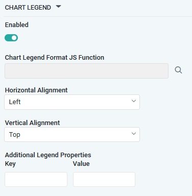
|
Label |
UI Widget |
Default |
Description |
|---|---|---|---|
|
ON/OFF Toggle |
ON |
|
|
Text Field w/Search |
|
|
|
Dropdown |
Left |
|
|
Dropdown |
Top |
|
|
|
|
Optional Additional Properties - expressed as a Key/Value pair. |
Contact App Orchid | Disclaimer