Intended audience: end-users analysts developers administrators
AO Platform: 4.4
Overview
This section provides an overview of Highcharts Map. The Highcharts Maps is a feature-rich visualization type designed for creating interactive and customizable maps.
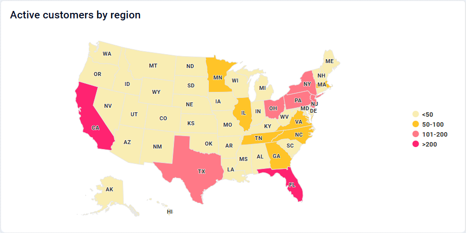
Example
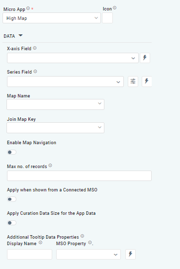
Configuration of Highcharts Map
DATA Properties
|
Label |
UI Widget |
Default |
Description |
|---|---|---|---|
|
Dropdown w/Expression option |
|
The X-axis Field allows the user to select the MSO Field Property to represent the X-axis values in the Chart. |
|
Repeater Dropdown w/Expression option |
|
The Series Fields allows the user to select an MSO Field Property to represent the Series Field. |
|
Icon w/Dialog |
|
See the separate section for Series Field Properties below. |
|
Dropdown |
|
The Map Name field dropdown in the Highcharts Map configuration allows users to select one of the option from US States Map, World Map, and India Maps to visualize in their chart. |
|
Dropdown |
|
The Join Map Key acts as a bridge between the dataset and the map by matching a specific column in your data to the map's geographic identifiers. |
|
ON/OFF Toggle |
OFF |
If enabled, allows the user to interact with the map dynamically and the user can zoom, pan, and explore the map for a more detailed view of specific regions or data points. |
|
Key / Value - Text Fields |
|
Option to set a Max number of records to be used by the Chart. |
|
ON/OFF Toggle |
OFF |
The Apply When Shown from a Connected MSO ON/OFF Toggle determines whether the settings or actions are applied specifically when data is displayed through a connected MSO.
|
|
ON/OFF Toggle |
OFF |
If enabled, the Record Count rules will be applied. If the Record Count rules are not met, the series will not be shown. |
|
Display Name - Text Field MSO Property - Dropdown |
|
The Additional Tooltip Data Properties allow the user to select one or more MSO Field Properties to display their values in the tooltip when the user hovers over a data point. |
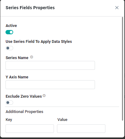
Series Field Properties
|
Label |
UI Widget |
Default |
Description |
|---|---|---|---|
|
ON/OFF Toggle |
ON |
|
|
ON/OFF Toggle |
OFF |
|
|
Text Field |
|
|
|
Text Field |
|
|
|
ON/OFF Toggle |
OFF |
|
|
Key / Value - Text Fields |
|
Optional Additional Properties - expressed as a Key/Value pair. |
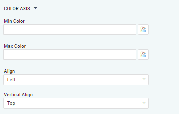
COLOR AXIS Properties
|
Label |
UI Widget |
Default |
Description |
|---|---|---|---|
|
Text Field w/Color selection |
|
The Min color in a Heatmap Chart within curation allows the user to define the color that represents the lowest value in the dataset. |
|
Text Field w/Color selection |
|
The Max Color in the Heatmap Chart within curation allows the user to define the color that represents the highest value in the dataset. |
|
Dropdown |
Left |
The Align dropdown allows the user to choose from three alignment options: Left, Center, and Right. |
|
Dropdown |
Top |
The Vertical Align dropdown allows the user to choose from three vertical alignment options: Top, Middle, and Bottom. |
TOOLTIP Properties
|
Label |
UI Widget |
Default |
Description |
|---|---|---|---|
|
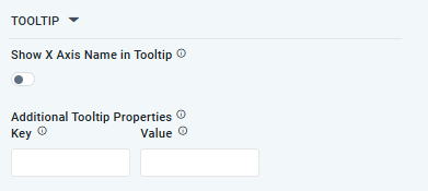
ON/OFF Toggle |
OFF |
If enabled, the tooltip displayed when hovering over data in the App will include the X-Axis name. If disabled, only the data value will be shown, without the X-Axis name |
|
Key / Value - Text Fields |
|
Optional Additional Tooltip Properties - expressed as a Key/Value pair. |
STYLES Properties
|
Label |
UI Widget |
Default |
Description |
|---|---|---|---|
|
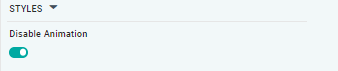
ON/OFF Toggle |
|
The Disable Animation toggle refers to turning off any animated transitions or effects that occur when the chart or visualization is rendered or updated. |
Contact App Orchid | Disclaimer