Intended audience: end-users analysts developers administrators
AO Platform: 4.4
Overview
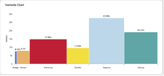
This section offers an overview of the Variwide Chart. A Variwide Chart (also known as a variable-width column chart) is a powerful visualization that extends the traditional bar or column chart by incorporating a third dimension: the width of the columns.
Example
Configuration of Variwide Chart
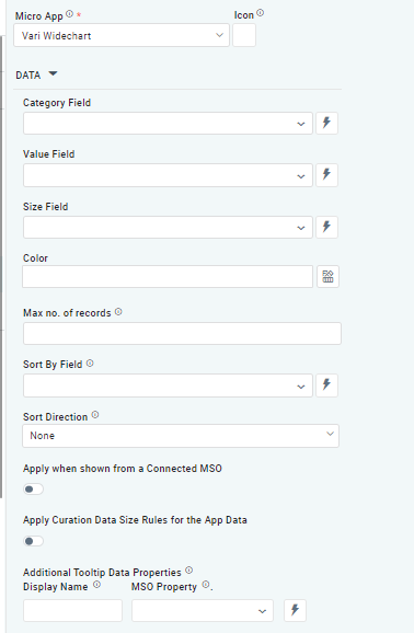
DATA Properties
|
Label |
UI Widget |
Default |
Description |
|---|---|---|---|
|
Dropdown w/Expression option |
|
The Category Field dropdown allows the user to select the category. |
|
Dropdown w/Expression option |
|
The Value Field dropdown allows the user to select a value. |
|
Dropdown w/Expression option |
|
The Size Field dropdown allows the user to select a size. |
|
Text Field w/Color Palette option |
|
The Colors allows the user to select which color to use for the Pie of the chart. See Curation - Field Properties - Data Styles | Selection of Color. |
|
Number Field |
|
Option to set a Max number of records to be used by the Chart. |
|
Dropdown w/Expression option |
|
The Sort By Field option allows the user to select a field to sort the data and also provides the flexibility to define a custom expression for more advanced sorting criteria. |
|
Dropdown |
|
Option to set the Sort order for data in the chart to either Ascending or Descending. |
|
ON/OFF Toggle |
OFF |
The Apply When Shown from a Connected MSO ON/OFF Toggle determines whether the settings or actions are applied specifically when data is displayed through a connected MSO.
|
|
ON/OFF Toggle |
OFF |
If enabled, the Record Count rules will be applied. The series will not be shown if the Record Count rules are not met. |
|
Display Name - Text Field MSO Property - Dropdown |
|
The Additional Tooltip Data Properties allow the user to select one or more MSO Field Properties to display their values in the tooltip when the user hovers over a data point. |
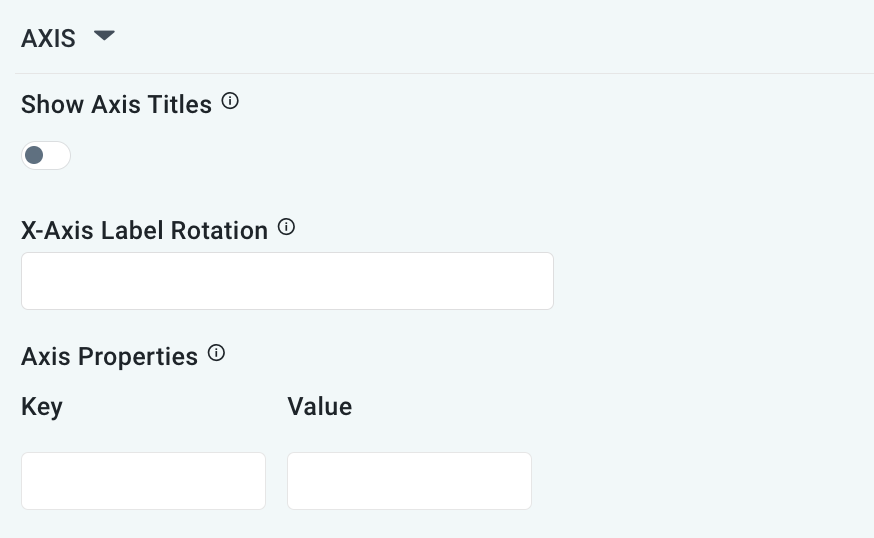
AXIS Properties
|
Label |
UI Widget |
Default |
Description |
|---|---|---|---|
|
ON/OFF Toggle |
OFF |
If enabled, titles can be added to both the X-Axis and Y-Axis. If disabled, the X-Axis and Y-Axis will not have titles. |
|
Text Field |
|
Enter a rotation value to influence how the axis labels are displayed. |
|
Key / Value - Text Fields |
|
Optional Axis Properties - expressed as a Key/Value pair. For instance, to change the linewidth to 10 for the Axis, add the following values:
|
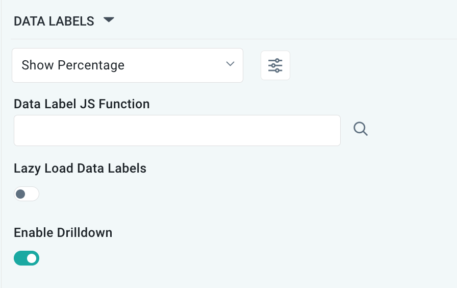
DATA LABELS Properties
|
Label |
UI Widget |
Default |
Description |
|---|---|---|---|
|
Dropdown w/Additional Properties option |
Show Percentage |
Optional Additional Properties - expressed as a Key/Value pair. |
|
… Additional Properties |
|
|
Optional Additional Properties - expressed as a Key/Value pair. |
|
Text Field w/Search |
|
The Data Label JS function allows the user to search for and define JavaScript functions that control the display or behavior of data labels in a chart. |
|
ON/OFF Toggle |
OFF |
If enabled, in the bar chart curation controls whether data labels are loaded gradually as the chart is interacted. |
|
ON/OFF Toggle |
ON |
|
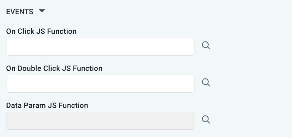
EVENTS Properties
|
Label |
UI Widget |
Default |
Description |
|---|---|---|---|
|
Text Field w/Search |
|
|
|
Text Field w/Search |
|
|
|
Text Field w/Search |
|
|
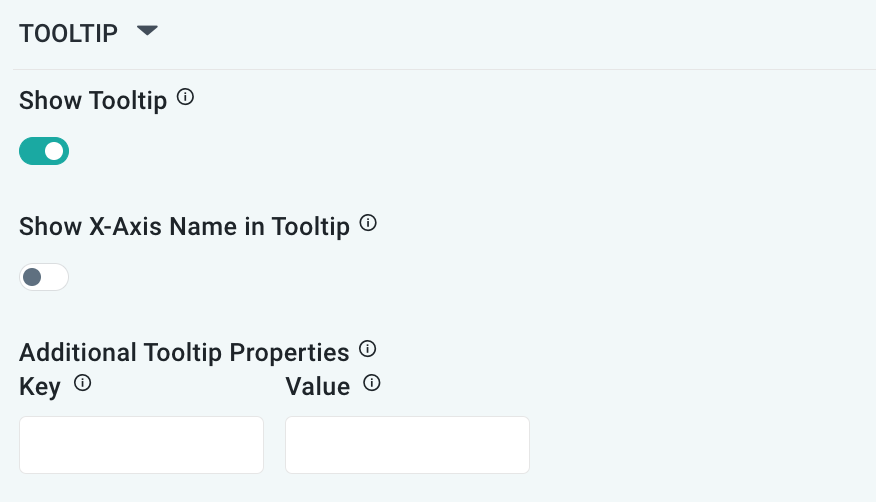
TOOLTIP Properties
|
Label |
UI Widget |
Default |
Description |
|---|---|---|---|
|
ON/OFF Toggle |
ON |
|
|
ON/OFF Toggle |
OFF |
If enabled, the tooltip displayed when hovering over data in the App will include the X-Axis name. If disabled, only the data value will be shown, without the X-Axis name |
|
Key / Value - Text Fields |
|
Optional Additional Tooltip Properties - expressed as a Key/Value pair. |
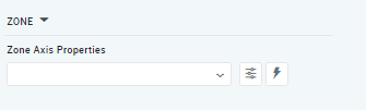
ZONE Properties
|
Label |
UI Widget |
Default |
Description |
|---|---|---|---|
|
Dropdown w/Additional Properties and Expression options |
|
The Zone Axis Properties dropdown allows the user to customize the properties of the Zone Axis in a Variwide Chart. |
|
… Zone Color |
Text Field |
|
The Zone color refers to the color applied to different zones within a chart or graph. |
|
… Additional Properties |
Key / Value - Text Fields |
|
Optional Additional Tooltip Properties - expressed as a Key/Value pair. |
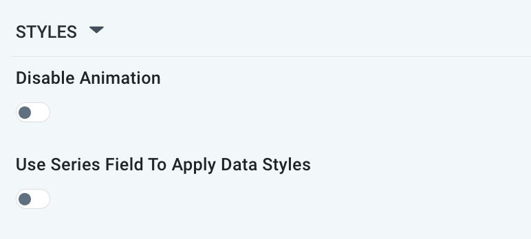
STYLES Properties
|
Label |
UI Widget |
Default |
Description |
|---|---|---|---|
|
ON/OFF Toggle |
OFF |
The Disable Animation toggle refers to turning off any animated transitions or effects that occur when the chart or visualization is rendered or updated. |
|
ON/OFF Toggle |
OFF |
|
Contact App Orchid | Disclaimer